Download to read offline

![8
8
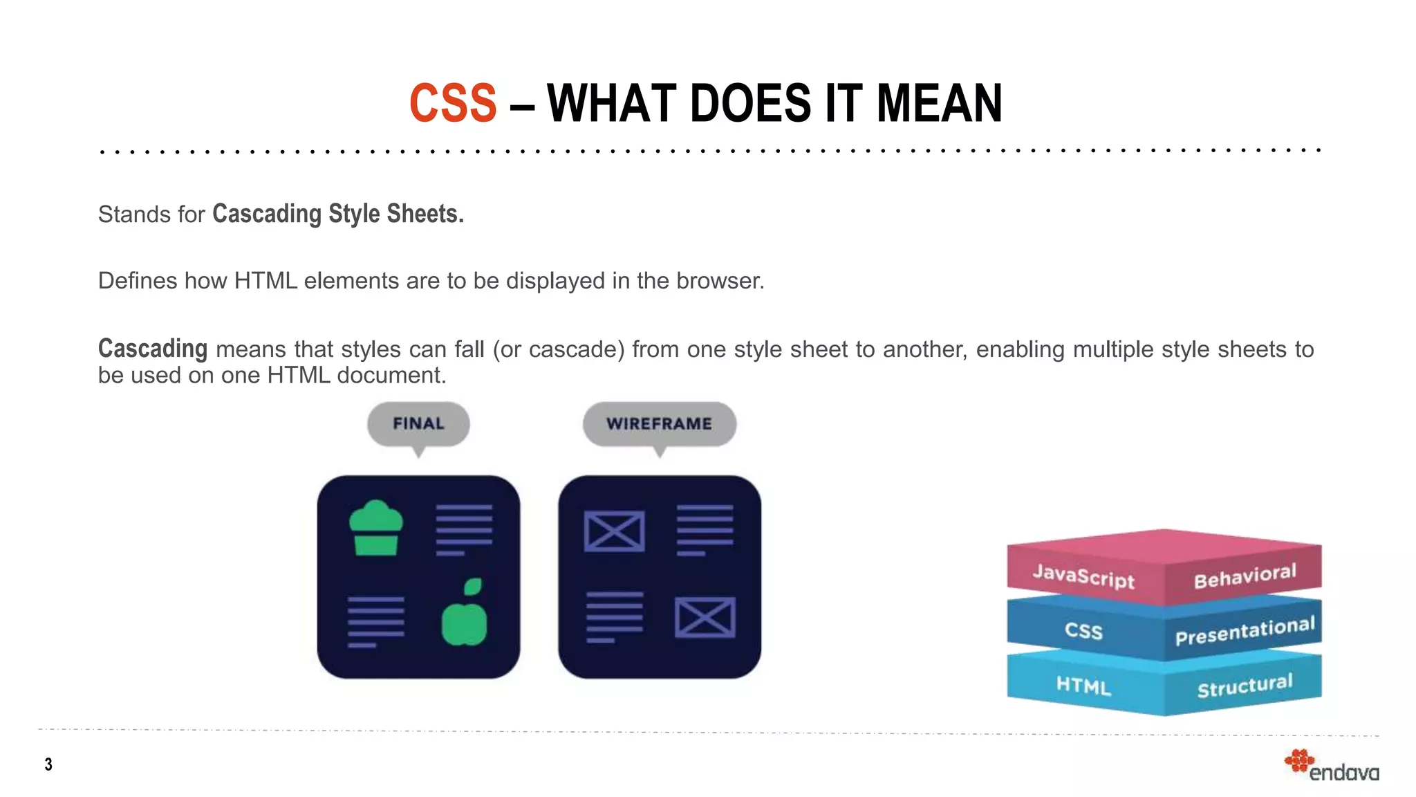
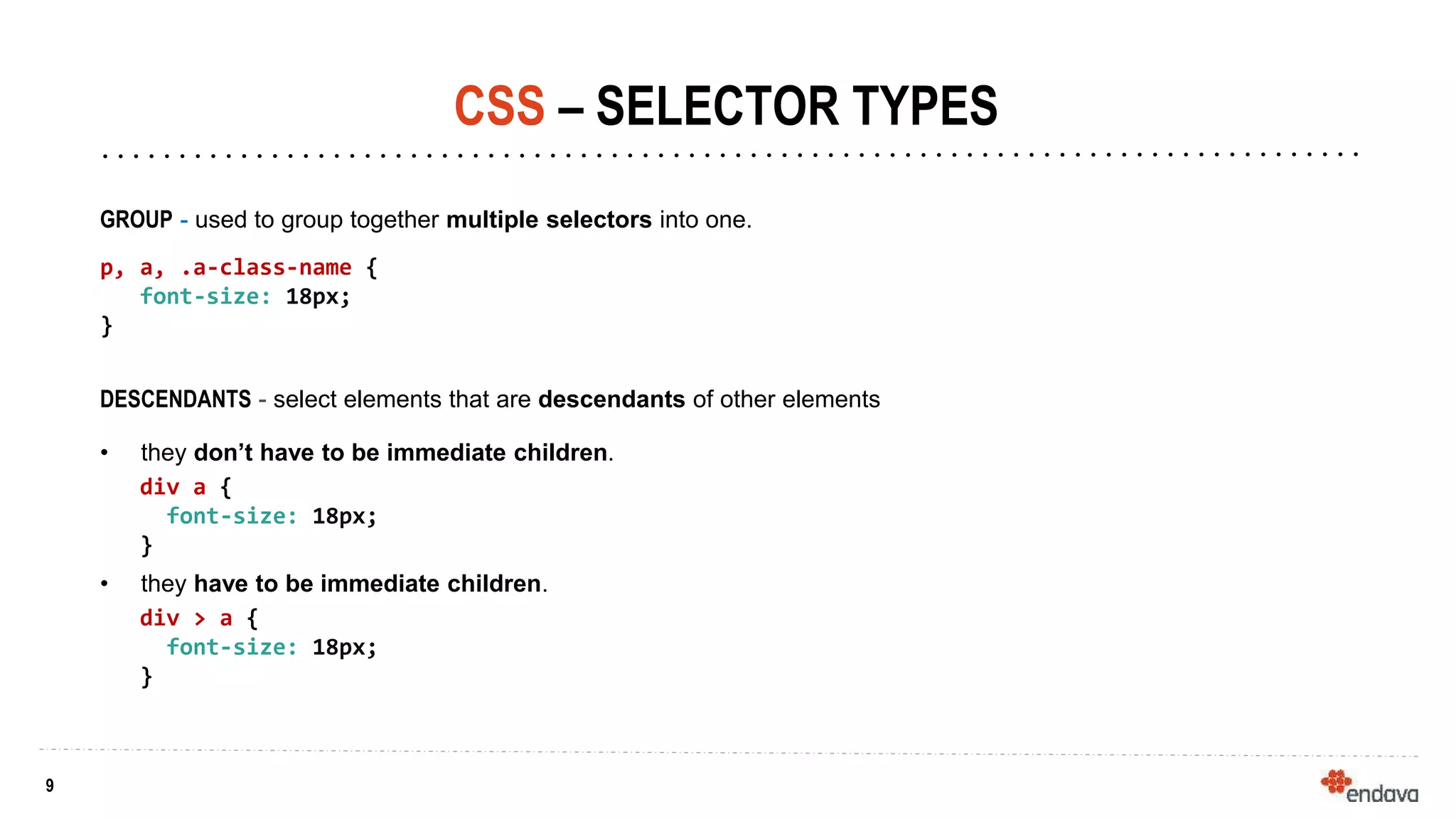
CSS – SELECTOR TYPES
TAG SELECTOR - matches element names.
h1, p, div, span {
display: block;
}
CLASS SELECTOR - selects elements which have
a given class
.box, div.box {
background: blue;
}
ID SELECTOR - selects elements which have a given id
#search {
border: 1px solid black;
}
ATTRIBUTE - selects elements by their attributes
[href] {
cursor: pointer;
}](https://image.slidesharecdn.com/css-endava-12sept2019-220212090242/85/CSS-Walktrough-Internship-Course-8-320.jpg)


![8
8
CSS – SELECTOR TYPES
TAG SELECTOR - matches element names.
h1, p, div, span {
display: block;
}
CLASS SELECTOR - selects elements which have
a given class
.box, div.box {
background: blue;
}
ID SELECTOR - selects elements which have a given id
#search {
border: 1px solid black;
}
ATTRIBUTE - selects elements by their attributes
[href] {
cursor: pointer;
}](https://image.slidesharecdn.com/css-endava-12sept2019-220212090242/75/CSS-Walktrough-Internship-Course-8-2048.jpg)


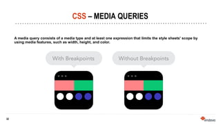
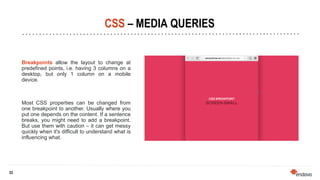
This document provides an overview of CSS (Cascading Style Sheets) and various CSS concepts. It begins with explaining what CSS is and how it is used to define styles for HTML elements. It then covers different methods for including CSS like inline, internal and external stylesheets. The document discusses CSS selectors, specificity, units and colors. It also explains the box model, positioning elements, z-index, and the display model. Flexbox and floats are described. Other topics covered include calc(), media queries and breakpoints.
![[Worskhop Summits] CSS3 Workshop](https://cdn.slidesharecdn.com/ss_thumbnails/schmitt-css3-v4-100114155033-phpapp02-thumbnail.jpg?width=600ounds&width=560&fit=bounds)


![[Romanian] Git Branching Strategies](https://cdn.slidesharecdn.com/ss_thumbnails/codecamp2-22016-220212083002-thumbnail.jpg?width=600ounds&width=560&fit=bounds)


![[Hungarian] HTML Course - Sapientia University](https://cdn.slidesharecdn.com/ss_thumbnails/html-iszlaizoltan-sysgenic-151227143536-thumbnail.jpg?width=600ounds&width=560&fit=bounds)
![[Hungarian] CSS Course - Sapientia University](https://cdn.slidesharecdn.com/ss_thumbnails/css-iszlaizoltan-sysgenic-151227143127-thumbnail.jpg?width=600ounds&width=560&fit=bounds)
![[Hungarian] Scrum Course - Sapientia University](https://cdn.slidesharecdn.com/ss_thumbnails/sapscrum-iszlaizoltan-sysgenic-151227142440-thumbnail.jpg?width=600ounds&width=560&fit=bounds)
![[Hungarian] Sysgenic Introduction - Sapientia University](https://cdn.slidesharecdn.com/ss_thumbnails/sysgenicbemutato-iszlaizoltan-sysgenic-151227141755-thumbnail.jpg?width=600ounds&width=560&fit=bounds)

![[Romanian] OOP and Design Patterns Internship Course](https://cdn.slidesharecdn.com/ss_thumbnails/cursoopsidp-iszlaizoltanv3-150510083334-lva1-app6892-thumbnail.jpg?width=600ounds&width=560&fit=bounds)
![[Romanian] HTML Internship Course](https://cdn.slidesharecdn.com/ss_thumbnails/curshtml-iszlaizoltanv3-150510082753-lva1-app6891-thumbnail.jpg?width=600ounds&width=560&fit=bounds)


![UiPath Automation Suite Installation (Hands-On) [2/3]](https://cdn.slidesharecdn.com/ss_thumbnails/automationsuitecommunitysession2-251015095633-a6d862f1-thumbnail.jpg?width=600ounds&width=560&fit=bounds)


