Downloaded 384 times


![ipython -pylab
Ipython is an extended version of the standard
python interpreter
It has a modality especially designed for pylab
The standard python interpreter doesn't support
very well plotting (not multithreading)
So if you want an interactive interpreter, use
ipython with the pylab option:
$: alias pylab=”ipython -pylab”
$: pylab
In [1]:](https://image.slidesharecdn.com/plottingpylab-091014151337-phpapp02/85/Plotting-data-with-python-and-pylab-6-320.jpg)
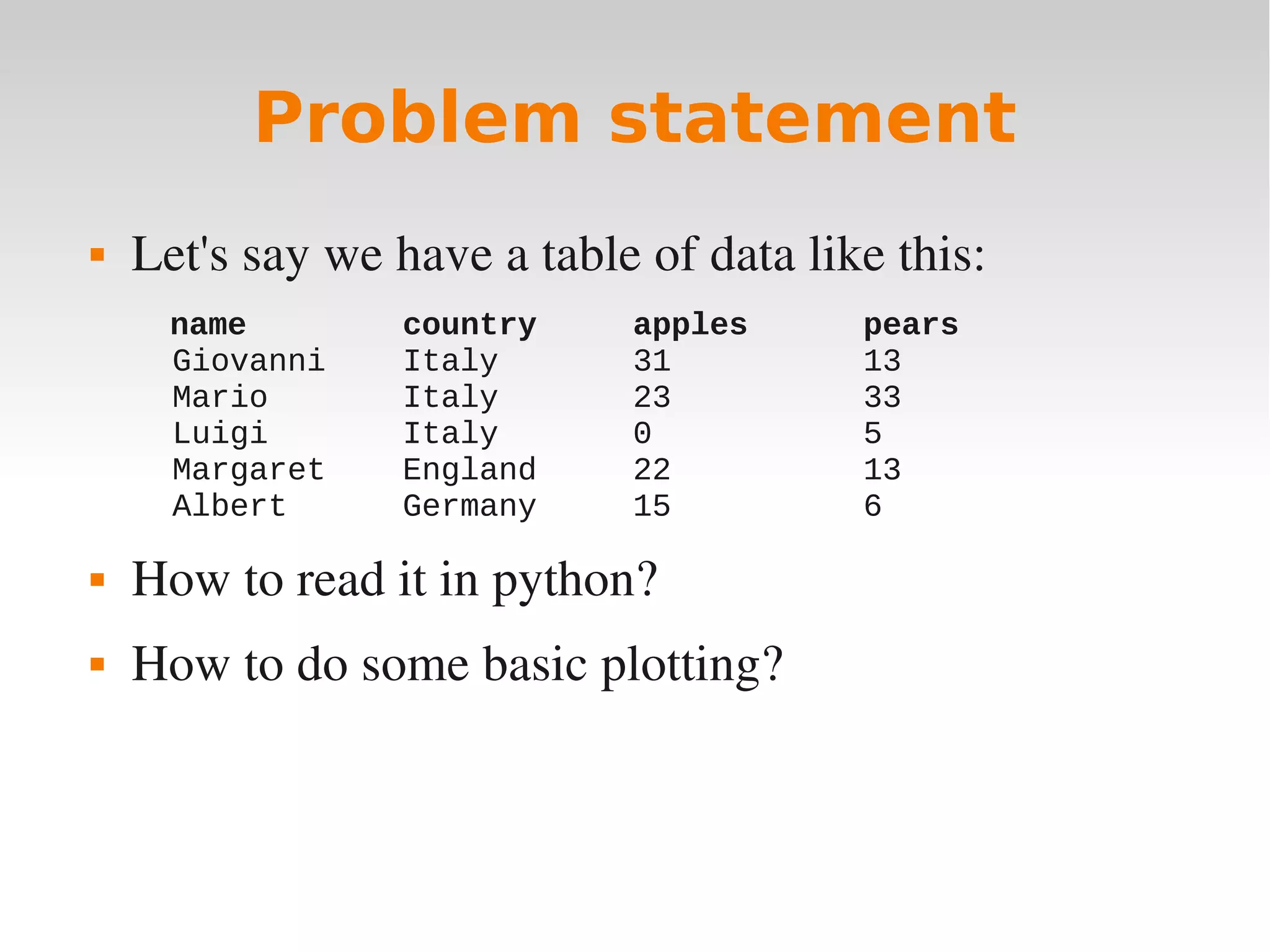
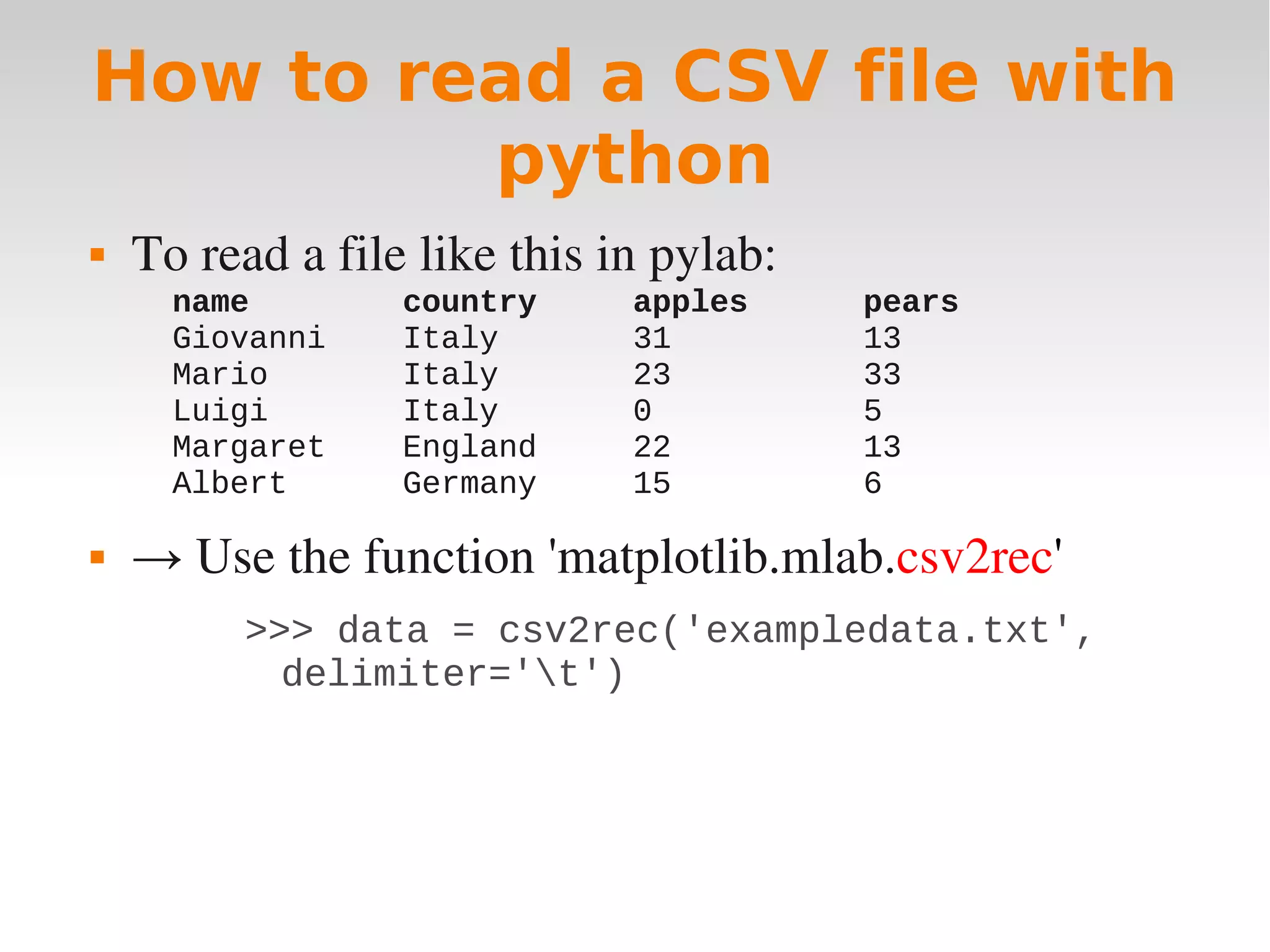
![Numpy - record arrays
csv2rec stores data in a numpy recarray object, where
you can access columns and rows easily:
>>> print data['name']
['Giovanni' 'Mario' 'Luigi' 'Margaret'
'Albert']
>>> data['apples']
array([31, 23, 0, 22, 15])
>>> data[1]
('Mario', 'Italy', 23, 33)](https://image.slidesharecdn.com/plottingpylab-091014151337-phpapp02/85/Plotting-data-with-python-and-pylab-9-320.jpg)
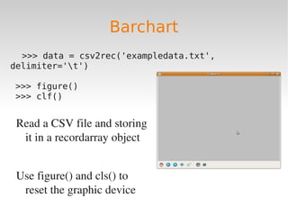
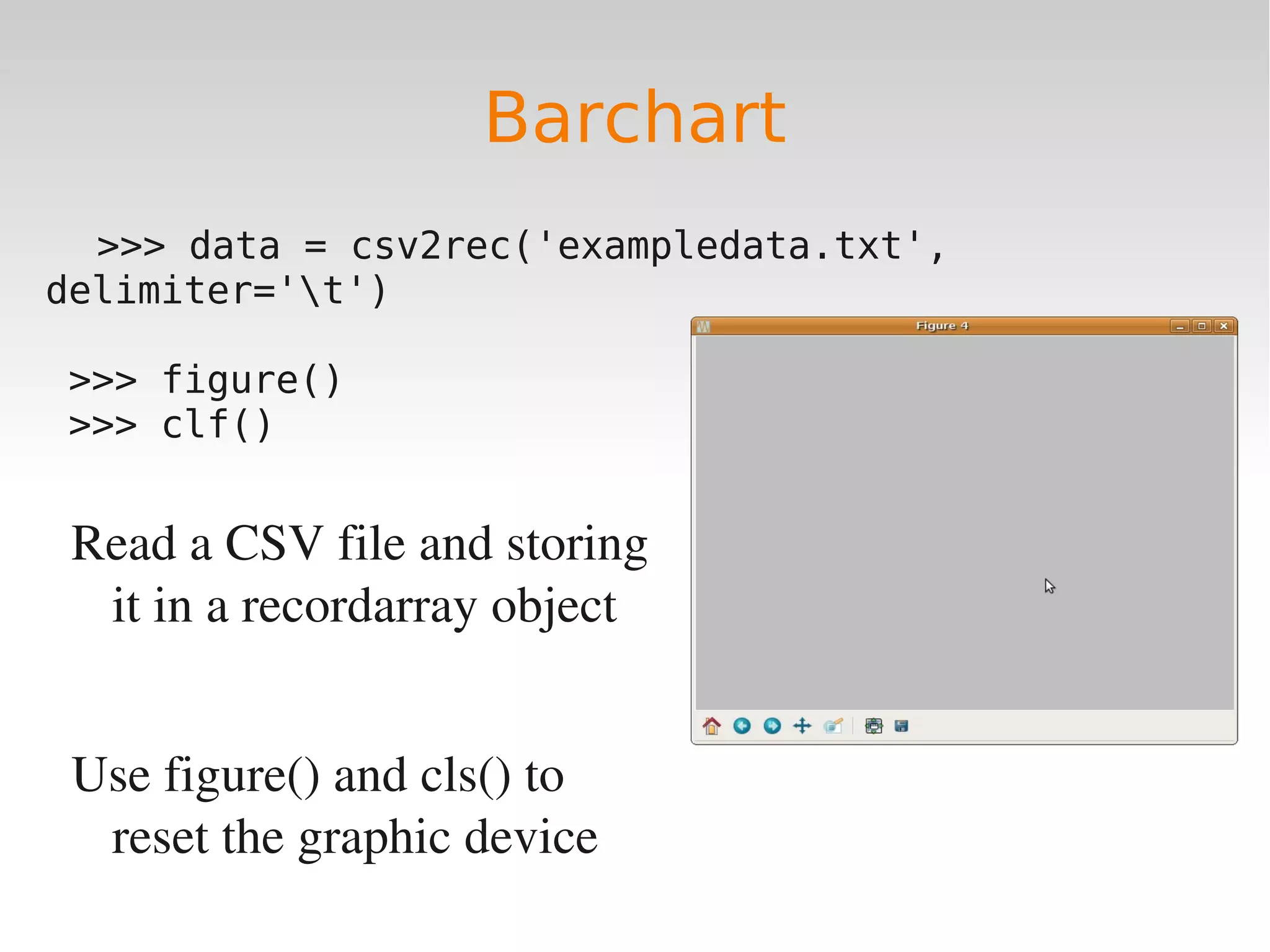
![Barchart
>>> data = csv2rec('exampledata.txt', delimiter='t')
>>> bar(arange(len(data)), data['apples'], color='red',
width=0.1, label='apples')
>>> bar(arange(len(data))+0.1, data['pears'],
color='blue', width=0.1, label='pears')
>>> xticks(range(len(data)), data['name'], )
>>> legend()
>>> grid('.')](https://image.slidesharecdn.com/plottingpylab-091014151337-phpapp02/85/Plotting-data-with-python-and-pylab-11-320.jpg)
![Barchart
>>> data = csv2rec('exampledata.txt',
delimiter='t')
>>> bar(x=arange(len(data)), y=data['apples'],
color='red', width=0.1, label='apples')
The bar function creates a
barchart](https://image.slidesharecdn.com/plottingpylab-091014151337-phpapp02/85/Plotting-data-with-python-and-pylab-13-320.jpg)
![Barchart
>>> data = csv2rec('exampledata.txt',
delimiter='t')
>>> bar(x=arange(len(data)), y=data['apples'],
color='red', width=0.1, label='apples')
>>> bar(arange(len(data))+0.1, data['pears'],
color='blue', width=0.1, label='pears')
This is the second barchart](https://image.slidesharecdn.com/plottingpylab-091014151337-phpapp02/85/Plotting-data-with-python-and-pylab-14-320.jpg)
![Barchart
>>> data = csv2rec('exampledata.txt',
delimiter='t')
>>> bar(x=arange(len(data)), y=data['apples'],
color='red', width=0.1, label='apples')
>>> bar(arange(len(data))+0.1, data['pears'],
color='blue', width=0.1, label='pears')
>>> xticks(range(len(data)), data['name'], )
Redefining the labels in the X axis
(xticks)](https://image.slidesharecdn.com/plottingpylab-091014151337-phpapp02/85/Plotting-data-with-python-and-pylab-15-320.jpg)
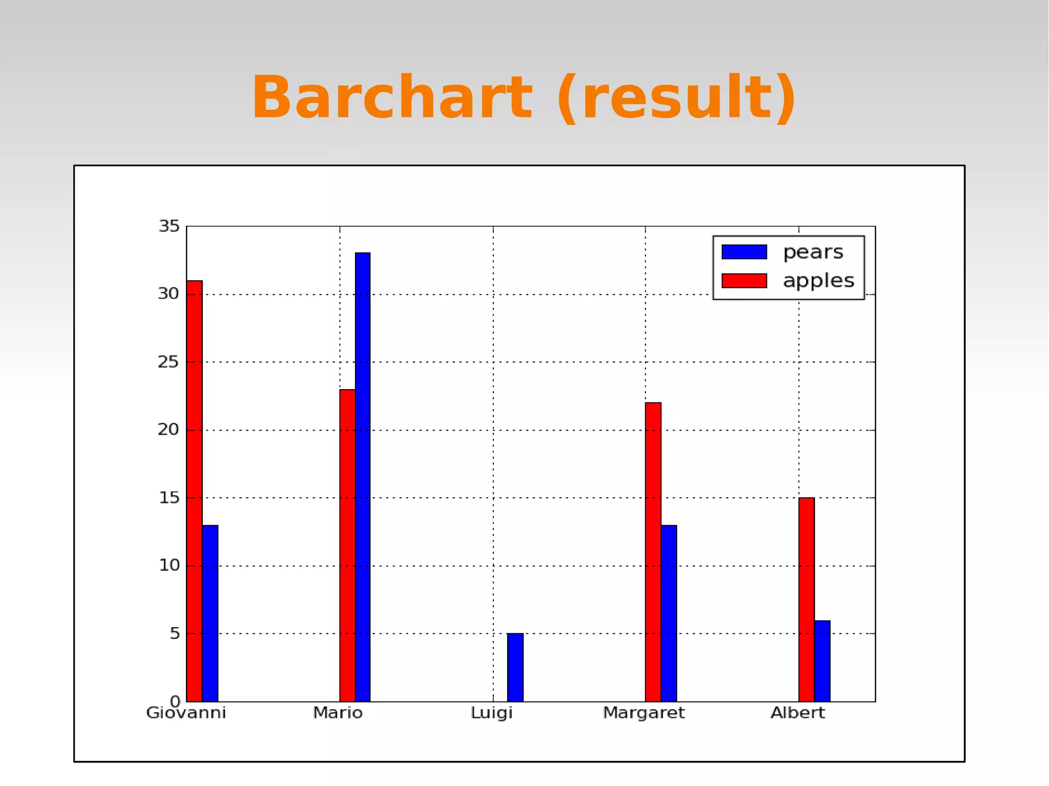
![Barchart
>>> data = csv2rec('exampledata.txt',
delimiter='t')
>>> bar(x=arange(len(data)), y=data['apples'],
color='red', width=0.1, label='apples')
>>> bar(arange(len(data))+0.1, data['pears'],
color='blue', width=0.1, label='pears')
>>> xticks(range(len(data)), data['name'], )
>>> legend()
>>> grid('.')
>>> title('apples and pears by person')
Adding legend, grid, title](https://image.slidesharecdn.com/plottingpylab-091014151337-phpapp02/85/Plotting-data-with-python-and-pylab-16-320.jpg)
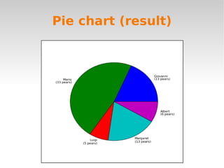
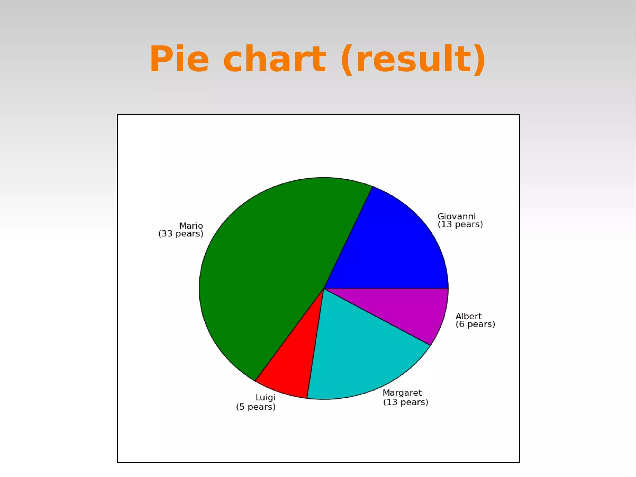
![Pie Chart
>>> pie(data['pears'], labels=data['name'])
>>> pie(data['pears'], labels=['%sn(%s
pears)' % (i,j) for (i, j) in
zip(data['name'], data['pears'])] )](https://image.slidesharecdn.com/plottingpylab-091014151337-phpapp02/85/Plotting-data-with-python-and-pylab-18-320.jpg)


![ipython -pylab
Ipython is an extended version of the standard
python interpreter
It has a modality especially designed for pylab
The standard python interpreter doesn't support
very well plotting (not multithreading)
So if you want an interactive interpreter, use
ipython with the pylab option:
$: alias pylab=”ipython -pylab”
$: pylab
In [1]:](https://image.slidesharecdn.com/plottingpylab-091014151337-phpapp02/75/Plotting-data-with-python-and-pylab-6-2048.jpg)
![Numpy - record arrays
csv2rec stores data in a numpy recarray object, where
you can access columns and rows easily:
>>> print data['name']
['Giovanni' 'Mario' 'Luigi' 'Margaret'
'Albert']
>>> data['apples']
array([31, 23, 0, 22, 15])
>>> data[1]
('Mario', 'Italy', 23, 33)](https://image.slidesharecdn.com/plottingpylab-091014151337-phpapp02/75/Plotting-data-with-python-and-pylab-9-2048.jpg)
![Barchart
>>> data = csv2rec('exampledata.txt', delimiter='t')
>>> bar(arange(len(data)), data['apples'], color='red',
width=0.1, label='apples')
>>> bar(arange(len(data))+0.1, data['pears'],
color='blue', width=0.1, label='pears')
>>> xticks(range(len(data)), data['name'], )
>>> legend()
>>> grid('.')](https://image.slidesharecdn.com/plottingpylab-091014151337-phpapp02/75/Plotting-data-with-python-and-pylab-11-2048.jpg)
![Barchart
>>> data = csv2rec('exampledata.txt',
delimiter='t')
>>> bar(x=arange(len(data)), y=data['apples'],
color='red', width=0.1, label='apples')
The bar function creates a
barchart](https://image.slidesharecdn.com/plottingpylab-091014151337-phpapp02/75/Plotting-data-with-python-and-pylab-13-2048.jpg)
![Barchart
>>> data = csv2rec('exampledata.txt',
delimiter='t')
>>> bar(x=arange(len(data)), y=data['apples'],
color='red', width=0.1, label='apples')
>>> bar(arange(len(data))+0.1, data['pears'],
color='blue', width=0.1, label='pears')
This is the second barchart](https://image.slidesharecdn.com/plottingpylab-091014151337-phpapp02/75/Plotting-data-with-python-and-pylab-14-2048.jpg)
![Barchart
>>> data = csv2rec('exampledata.txt',
delimiter='t')
>>> bar(x=arange(len(data)), y=data['apples'],
color='red', width=0.1, label='apples')
>>> bar(arange(len(data))+0.1, data['pears'],
color='blue', width=0.1, label='pears')
>>> xticks(range(len(data)), data['name'], )
Redefining the labels in the X axis
(xticks)](https://image.slidesharecdn.com/plottingpylab-091014151337-phpapp02/75/Plotting-data-with-python-and-pylab-15-2048.jpg)
![Barchart
>>> data = csv2rec('exampledata.txt',
delimiter='t')
>>> bar(x=arange(len(data)), y=data['apples'],
color='red', width=0.1, label='apples')
>>> bar(arange(len(data))+0.1, data['pears'],
color='blue', width=0.1, label='pears')
>>> xticks(range(len(data)), data['name'], )
>>> legend()
>>> grid('.')
>>> title('apples and pears by person')
Adding legend, grid, title](https://image.slidesharecdn.com/plottingpylab-091014151337-phpapp02/75/Plotting-data-with-python-and-pylab-16-2048.jpg)
![Pie Chart
>>> pie(data['pears'], labels=data['name'])
>>> pie(data['pears'], labels=['%sn(%s
pears)' % (i,j) for (i, j) in
zip(data['name'], data['pears'])] )](https://image.slidesharecdn.com/plottingpylab-091014151337-phpapp02/75/Plotting-data-with-python-and-pylab-18-2048.jpg)
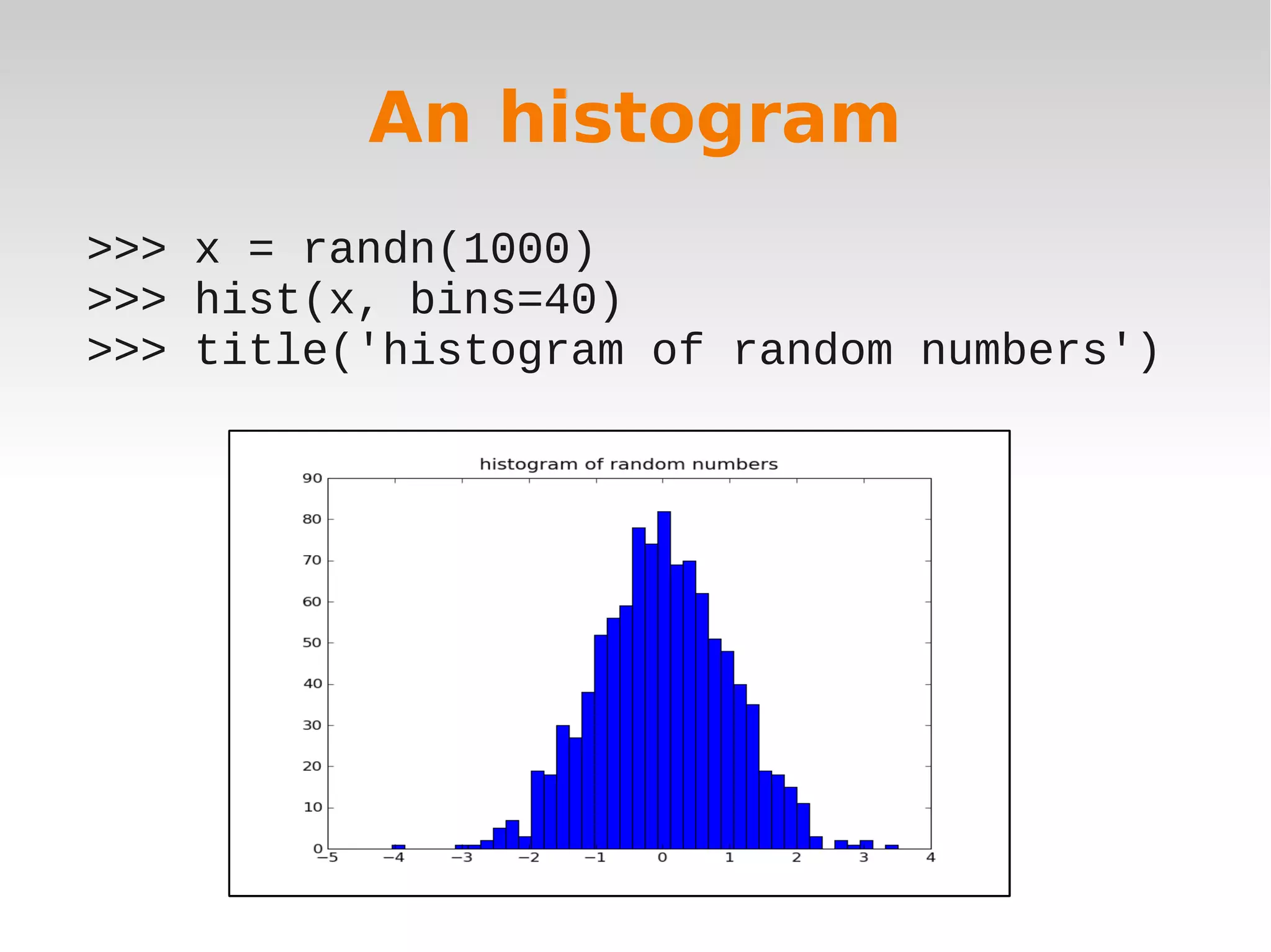


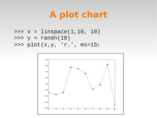
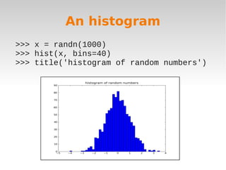
This document discusses plotting data with Python and Pylab. It begins by describing a sample data table and the problem of reading and plotting the data. It then reviews options for plotting in Python like Pylab, Enthought, RPy, and Sage. The remainder of the document demonstrates how to use Pylab to read CSV data, and create bar charts, pie charts, line plots, and histograms of the sample data.


![UiPath Automation Suite Installation (Hands-On) [2/3]](https://cdn.slidesharecdn.com/ss_thumbnails/automationsuitecommunitysession2-251015095633-a6d862f1-thumbnail.jpg?width=600ounds&width=560&fit=bounds)


