Download as PDF, PPTX

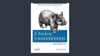

![Specificity
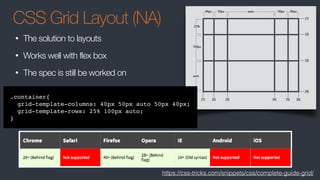
• What is the background color of the following element?
<div id="content" class="myContent" custom="true" style="background: white;">
This is my content
</div>
div{ background: yellow; }
.myContent{ background: darkred; }
div:first-child-of-type{ background: blue; }
#content{ background: black; }
div[custom="true"]{ background: orange; }
1
2
3
4
5
6
https://css-tricks.com/specifics-on-css-specificity/](https://image.slidesharecdn.com/css-170112210855/85/Dangerous-CSS-5-320.jpg)


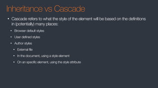
![REM & EM
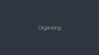
• px is a fixed width
• em is relative to its container size
• body{ font:10px} / body div{ font:0.5em} [5px] / body div div{ font:0.5em} [2.5px]
• rem is relative to root size
• body{ font:10px} / body div{ font:0.5em} [5px] / body div div{ font:0.5em} [5px]
• Use px for dimensions and borders
• Use a combination of em and rem for text, borders, and margins
• em works best for media queries
• Test all browsers - Safari is buggy
http://zellwk.com/blog/media-query-units/](https://image.slidesharecdn.com/css-170112210855/85/Dangerous-CSS-16-320.jpg)


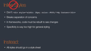
![Specificity
• What is the background color of the following element?
<div id="content" class="myContent" custom="true" style="background: white;">
This is my content
</div>
div{ background: yellow; }
.myContent{ background: darkred; }
div:first-child-of-type{ background: blue; }
#content{ background: black; }
div[custom="true"]{ background: orange; }
1
2
3
4
5
6
https://css-tricks.com/specifics-on-css-specificity/](https://image.slidesharecdn.com/css-170112210855/75/Dangerous-CSS-5-2048.jpg)

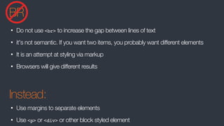
![REM & EM
• px is a fixed width
• em is relative to its container size
• body{ font:10px} / body div{ font:0.5em} [5px] / body div div{ font:0.5em} [2.5px]
• rem is relative to root size
• body{ font:10px} / body div{ font:0.5em} [5px] / body div div{ font:0.5em} [5px]
• Use px for dimensions and borders
• Use a combination of em and rem for text, borders, and margins
• em works best for media queries
• Test all browsers - Safari is buggy
http://zellwk.com/blog/media-query-units/](https://image.slidesharecdn.com/css-170112210855/75/Dangerous-CSS-16-2048.jpg)
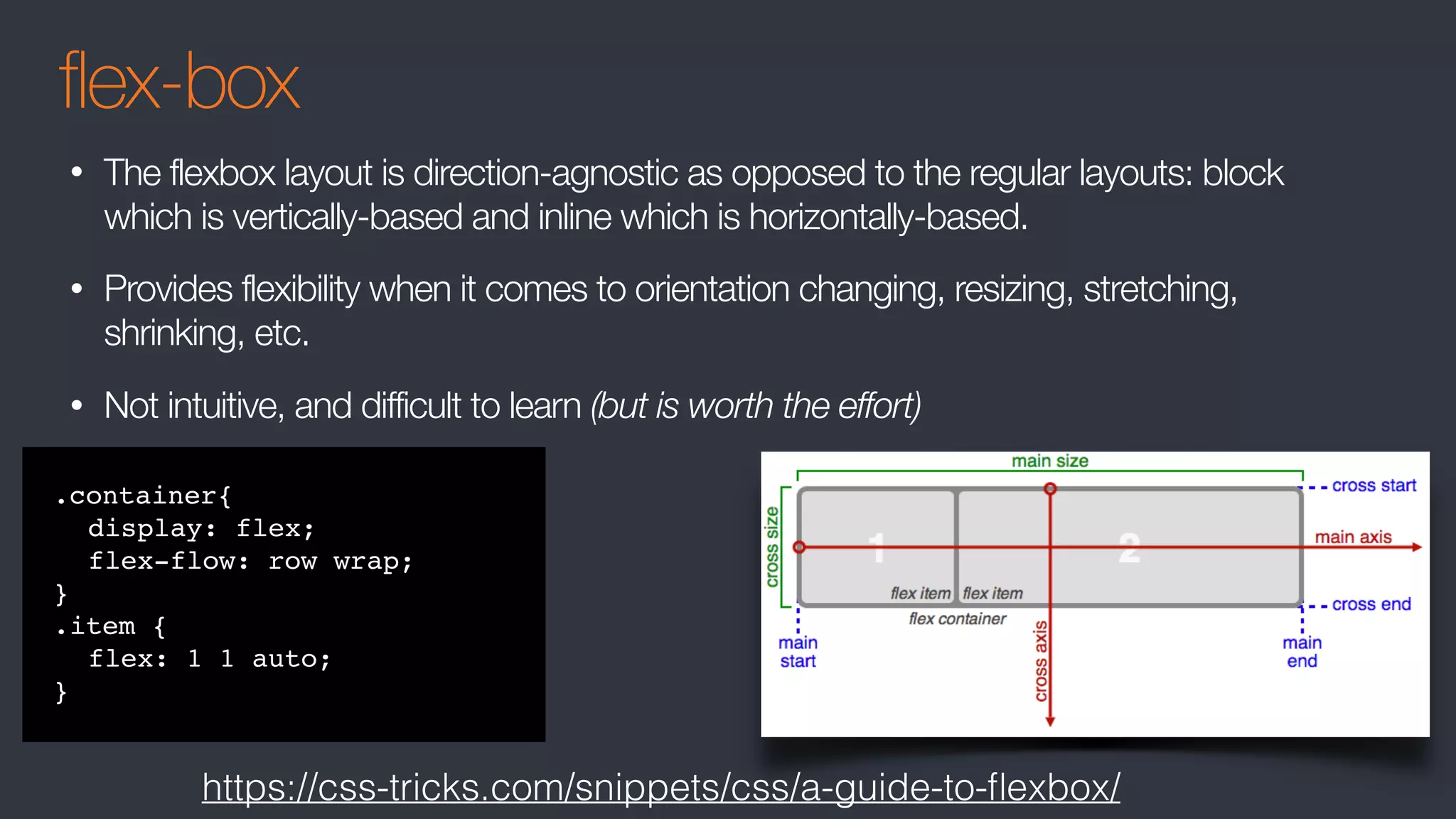
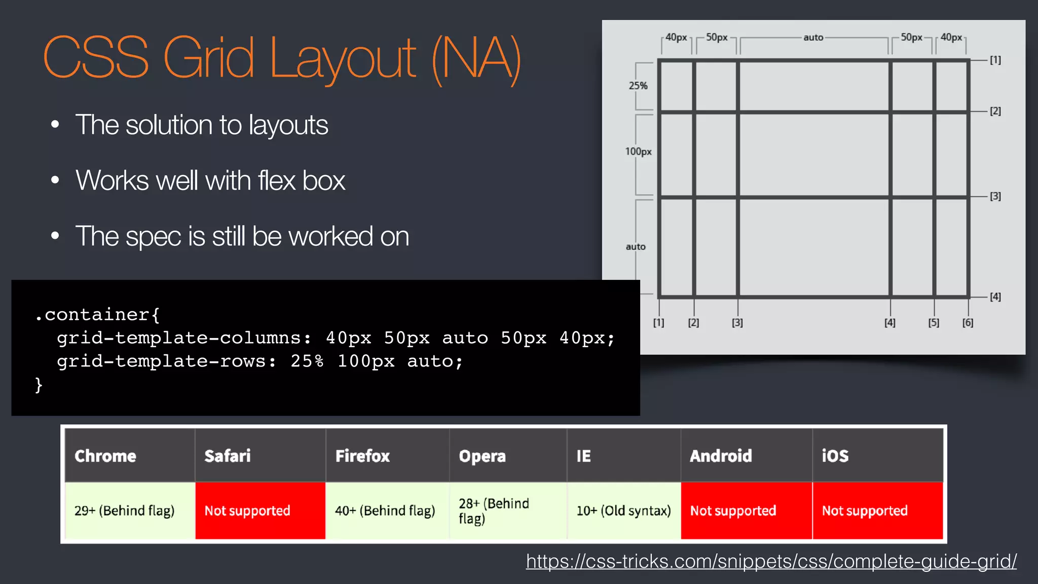

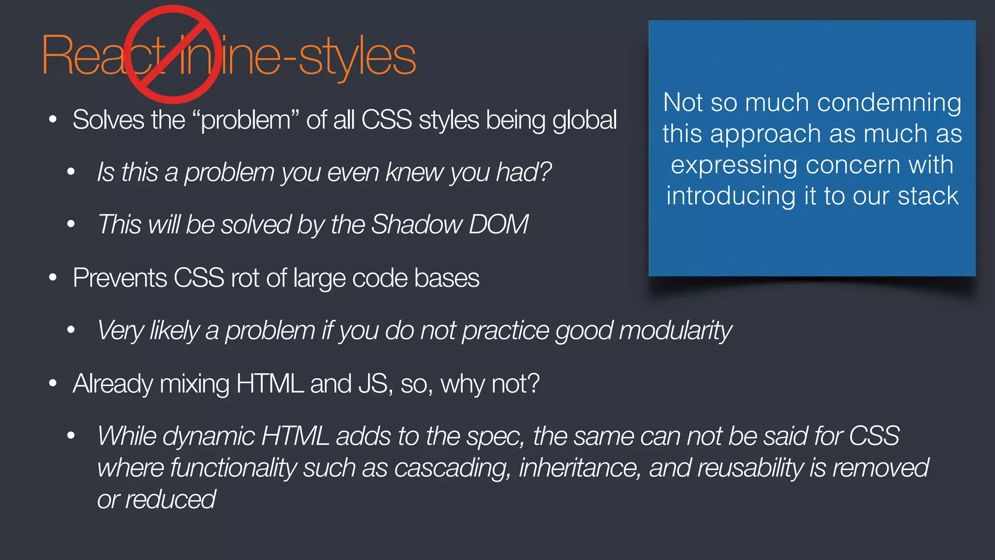

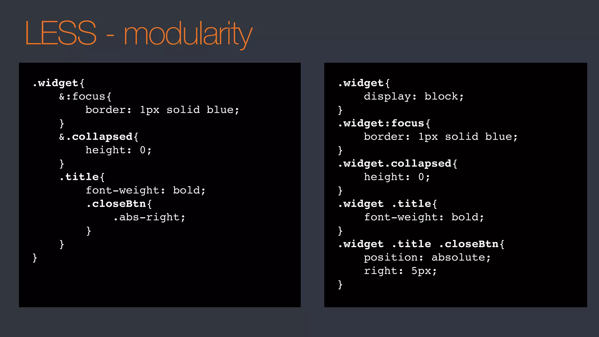


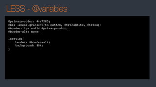
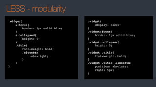
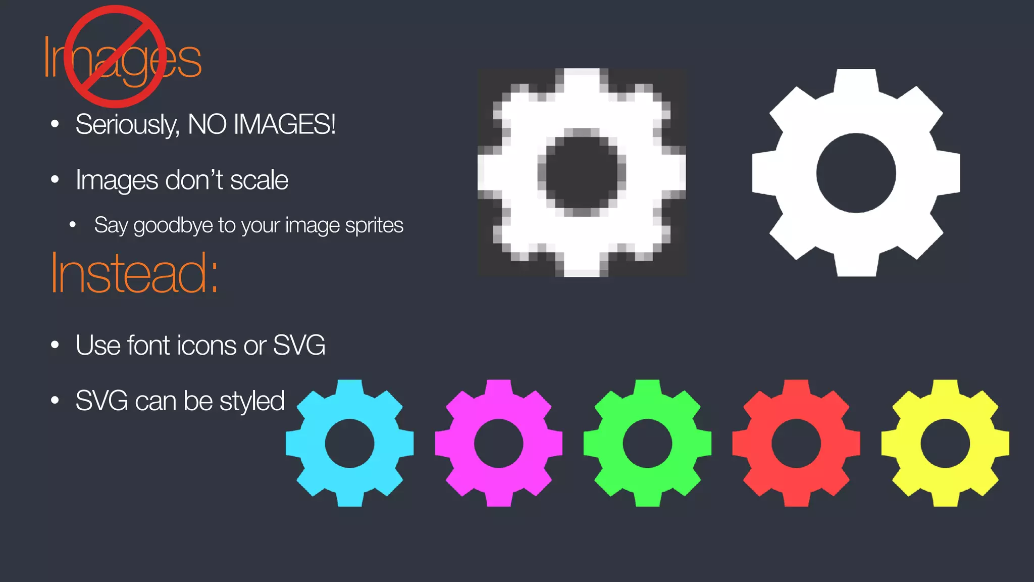
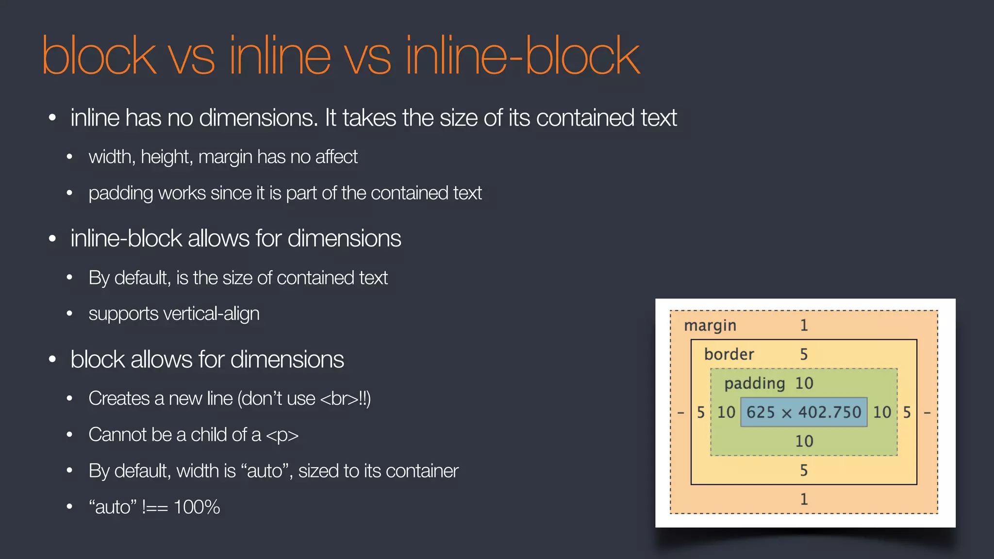
The document discusses best practices for organizing and structuring CSS code, including: 1. Using inheritance, cascading, and specificity principles to determine which styles take precedence. 2. Avoiding inline styles, <br> tags for spacing, for empty elements, and tables for layout as they harm semantics and structure. 3. Preferring class names over IDs due to lower specificity, and using flexbox, grid, rem/em units, and preprocessing with LESS/Sass for modularity and responsive design.


![UiPath Automation Suite Installation (Hands-On) [2/3]](https://cdn.slidesharecdn.com/ss_thumbnails/automationsuitecommunitysession2-251015095633-a6d862f1-thumbnail.jpg?width=600ounds&width=560&fit=bounds)


