Chapter 18: Transitions, Transforms, and Animation
This document provides an overview of CSS transitions, transforms, and animation. It discusses how to create smooth transitions between states using CSS transition properties like duration, timing function, and delay. It also covers 2D and 3D transforms using properties like translate, rotate, scale, and perspective to move, resize, and manipulate elements. Finally, it introduces CSS keyframe animation for defining animation sequences with multiple states called keyframes.
OVERVIEW
• Creating smoothtransitions
• Moving, rotating, and scaling elements
• Combining transitions and transforms
• 3-D transforms
• Keyframe animation overview
3.
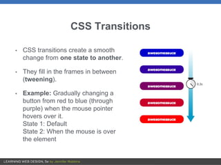
CSS Transitions
• CSStransitions create a smooth
change from one state to another.
• They fill in the frames in between
(tweening).
• Example: Gradually changing a
button from red to blue (through
purple) when the mouse pointer
hovers over it.
State 1: Default
State 2: When the mouse is over
the element
4.
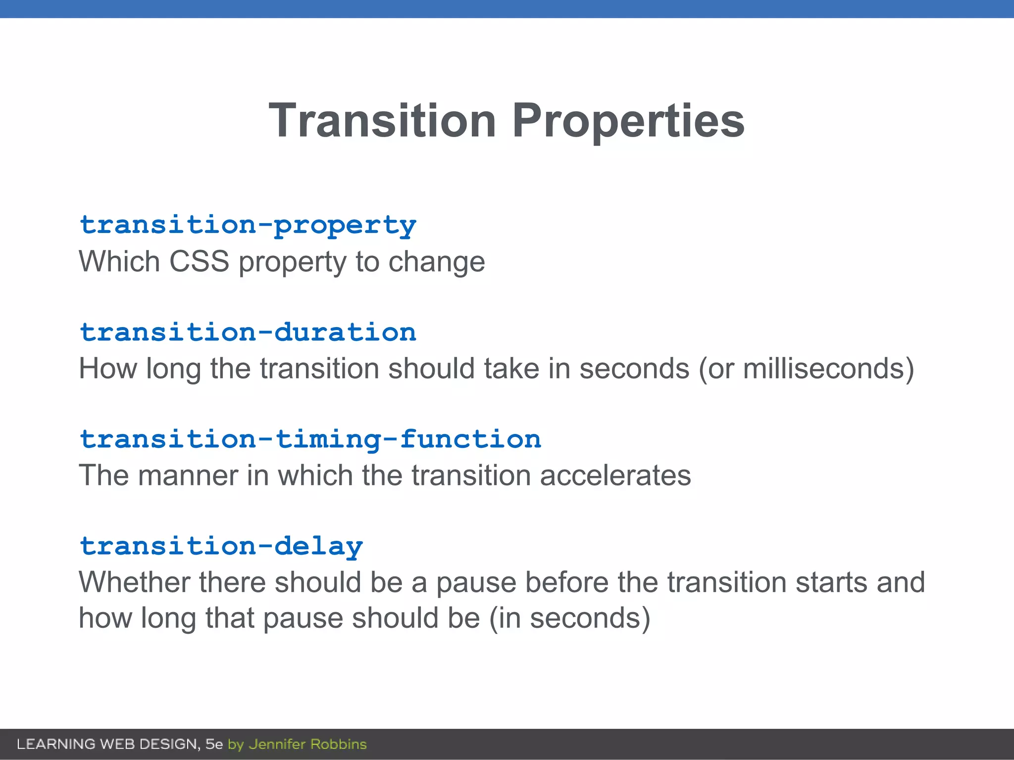
Transition Properties
transition-property
Which CSSproperty to change
transition-duration
How long the transition should take in seconds (or milliseconds)
transition-timing-function
The manner in which the transition accelerates
transition-delay
Whether there should be a pause before the transition starts and
how long that pause should be (in seconds)
5.
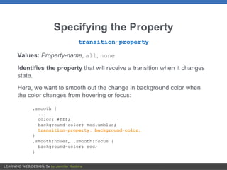
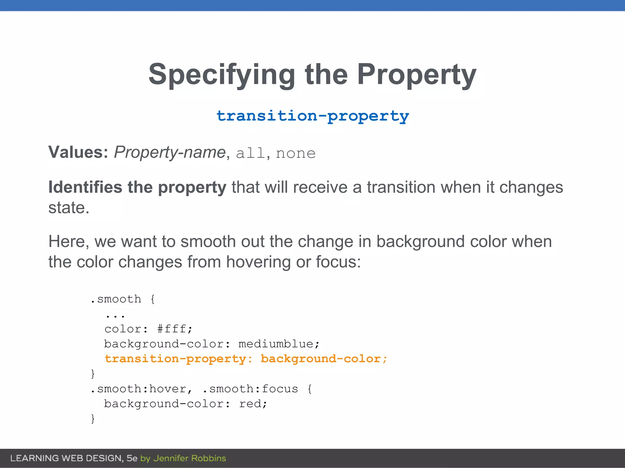
Specifying the Property
transition-property
Values:Property-name, all, none
Identifies the property that will receive a transition when it changes
state.
Here, we want to smooth out the change in background color when
the color changes from hovering or focus:
.smooth {
...
color: #fff;
background-color: mediumblue;
transition-property: background-color;
}
.smooth:hover, .smooth:focus {
background-color: red;
}
6.
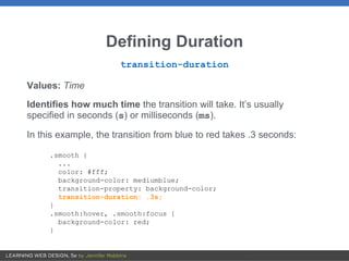
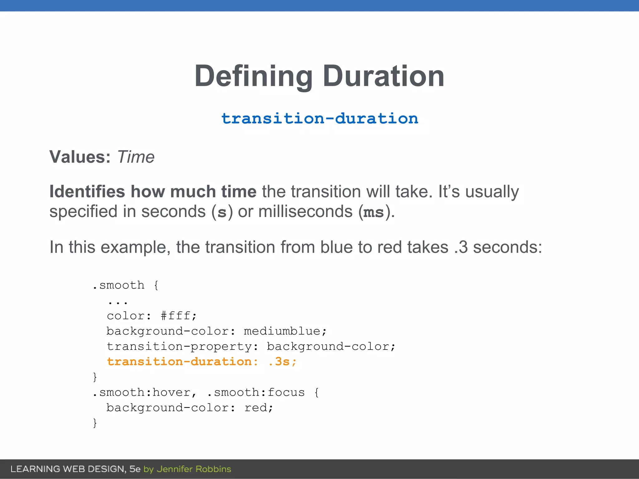
Defining Duration
transition-duration
Values: Time
Identifieshow much time the transition will take. It’s usually
specified in seconds (s) or milliseconds (ms).
In this example, the transition from blue to red takes .3 seconds:
.smooth {
...
color: #fff;
background-color: mediumblue;
transition-property: background-color;
transition-duration: .3s;
}
.smooth:hover, .smooth:focus {
background-color: red;
}
7.
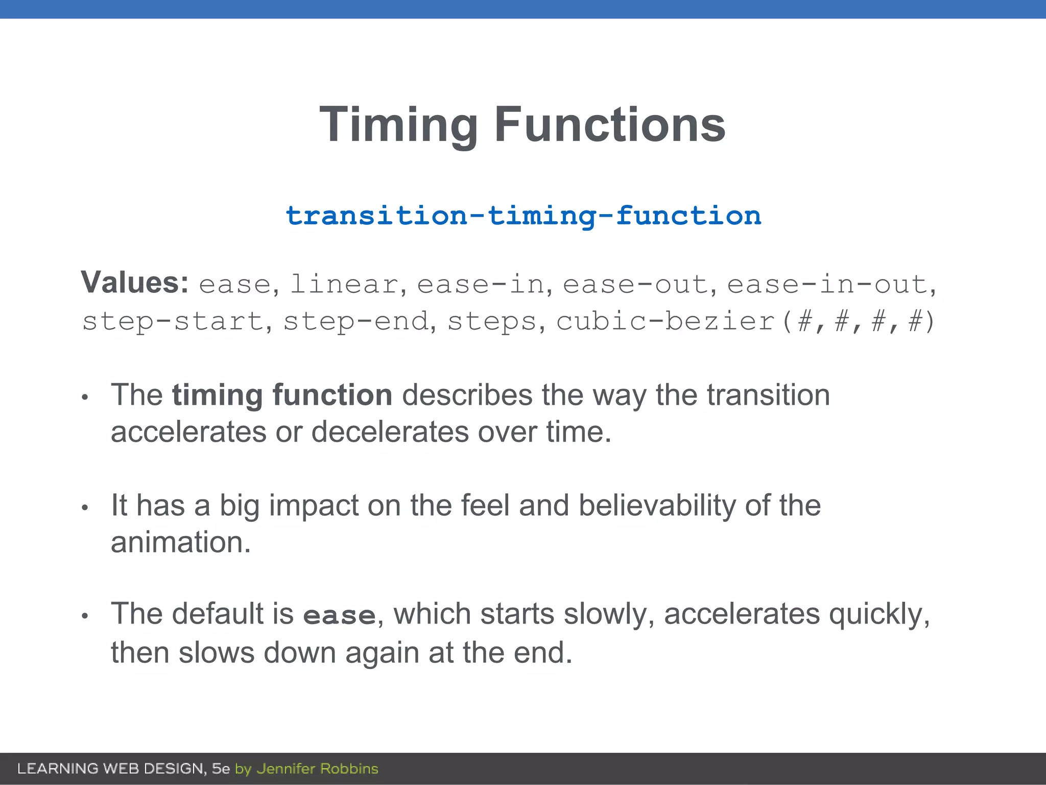
Timing Functions
transition-timing-function
Values: ease,linear, ease-in, ease-out, ease-in-out,
step-start, step-end, steps, cubic-bezier(#,#,#,#)
• The timing function describes the way the transition
accelerates or decelerates over time.
• It has a big impact on the feel and believability of the
animation.
• The default is ease, which starts slowly, accelerates quickly,
then slows down again at the end.
8.
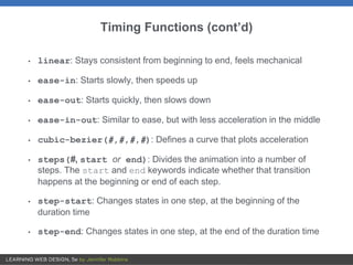
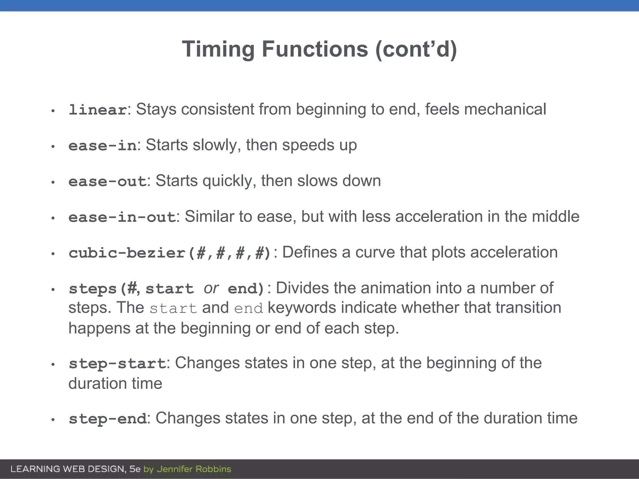
Timing Functions (cont’d)
•linear: Stays consistent from beginning to end, feels mechanical
• ease-in: Starts slowly, then speeds up
• ease-out: Starts quickly, then slows down
• ease-in-out: Similar to ease, but with less acceleration in the middle
• cubic-bezier(#,#,#,#): Defines a curve that plots acceleration
• steps(#, start or end): Divides the animation into a number of
steps. The start and end keywords indicate whether that transition
happens at the beginning or end of each step.
• step-start: Changes states in one step, at the beginning of the
duration time
• step-end: Changes states in one step, at the end of the duration time
9.
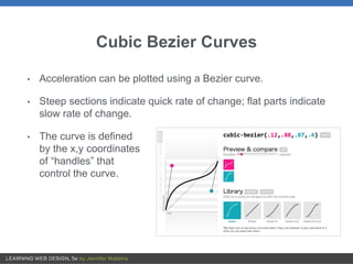
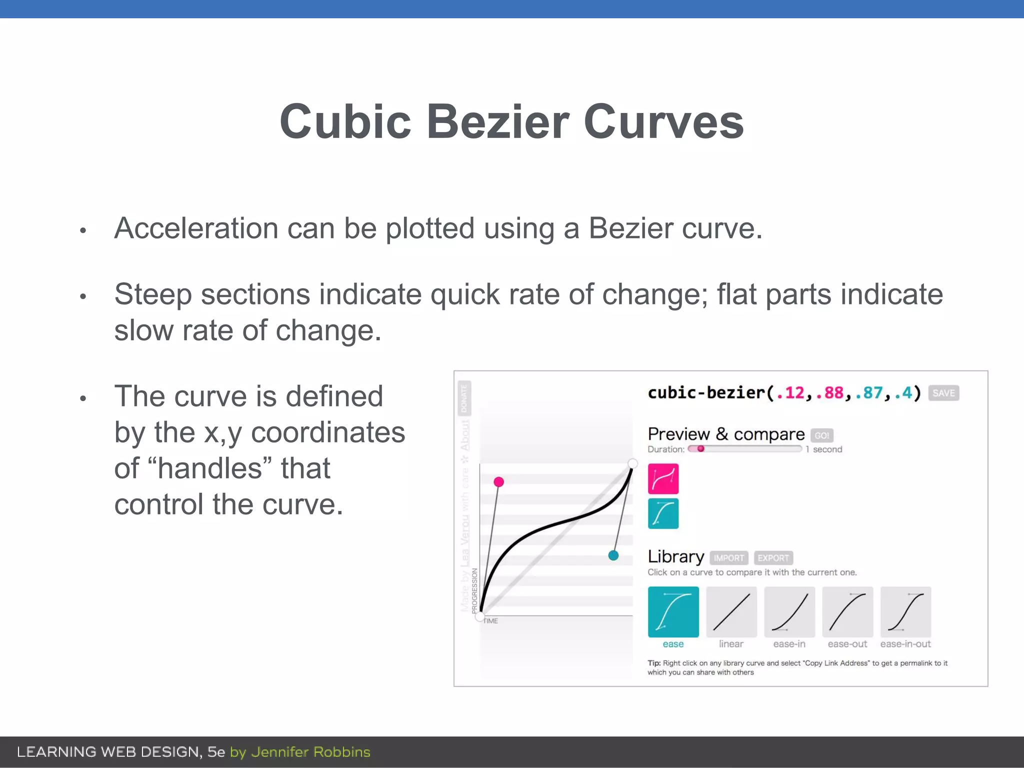
Cubic Bezier Curves
•Acceleration can be plotted using a Bezier curve.
• Steep sections indicate quick rate of change; flat parts indicate
slow rate of change.
• The curve is defined
by the x,y coordinates
of “handles” that
control the curve.
10.
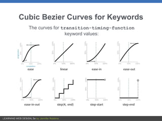
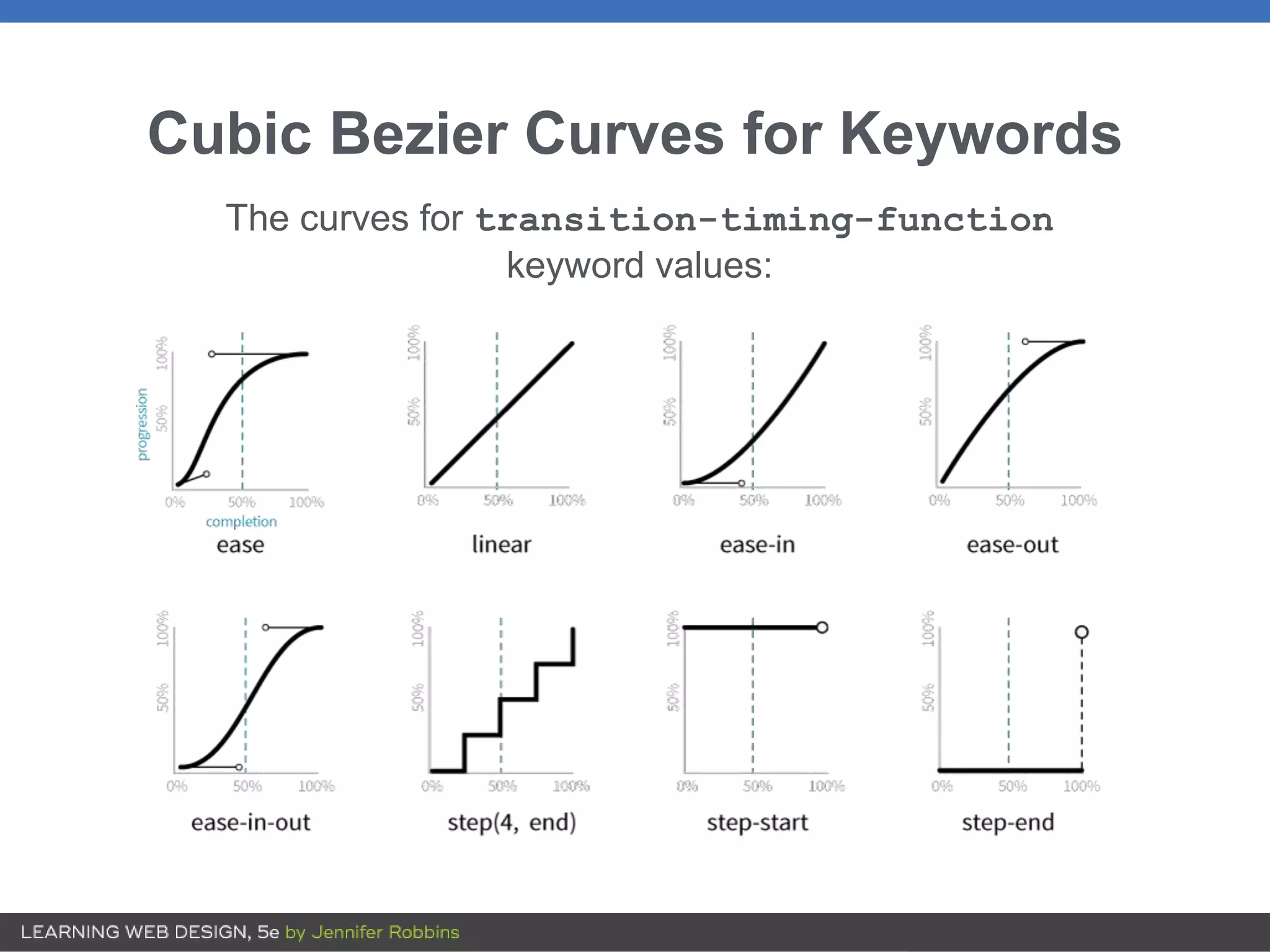
Cubic Bezier Curvesfor Keywords
The curves for transition-timing-function
keyword values:
11.
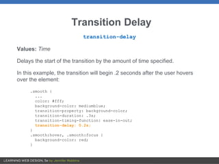
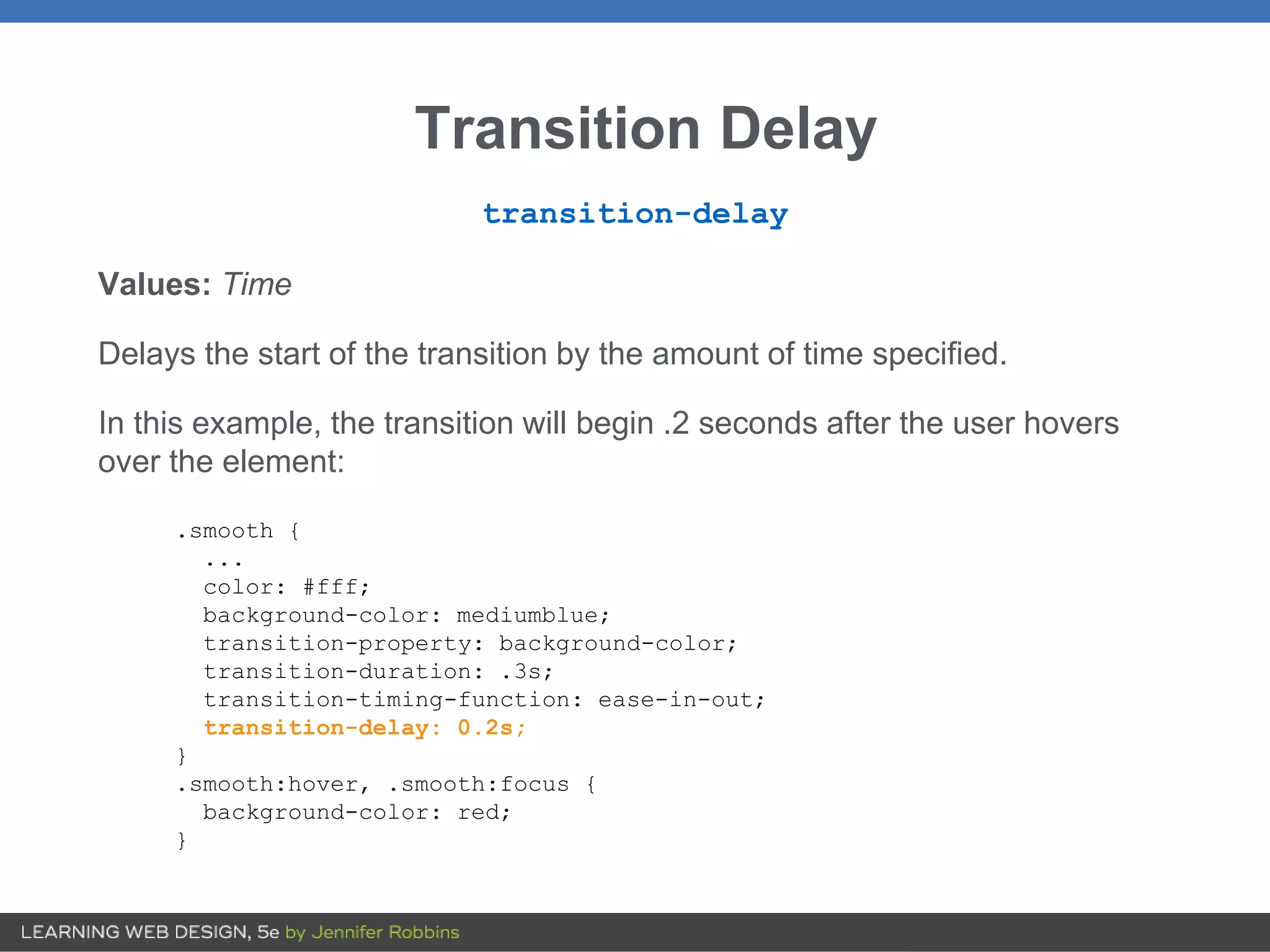
Transition Delay
transition-delay
Values: Time
Delaysthe start of the transition by the amount of time specified.
In this example, the transition will begin .2 seconds after the user hovers
over the element:
.smooth {
...
color: #fff;
background-color: mediumblue;
transition-property: background-color;
transition-duration: .3s;
transition-timing-function: ease-in-out;
transition-delay: 0.2s;
}
.smooth:hover, .smooth:focus {
background-color: red;
}
12.
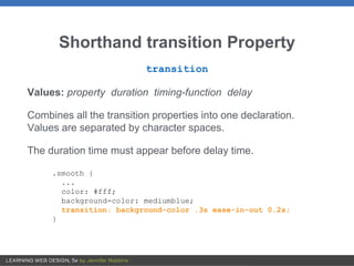
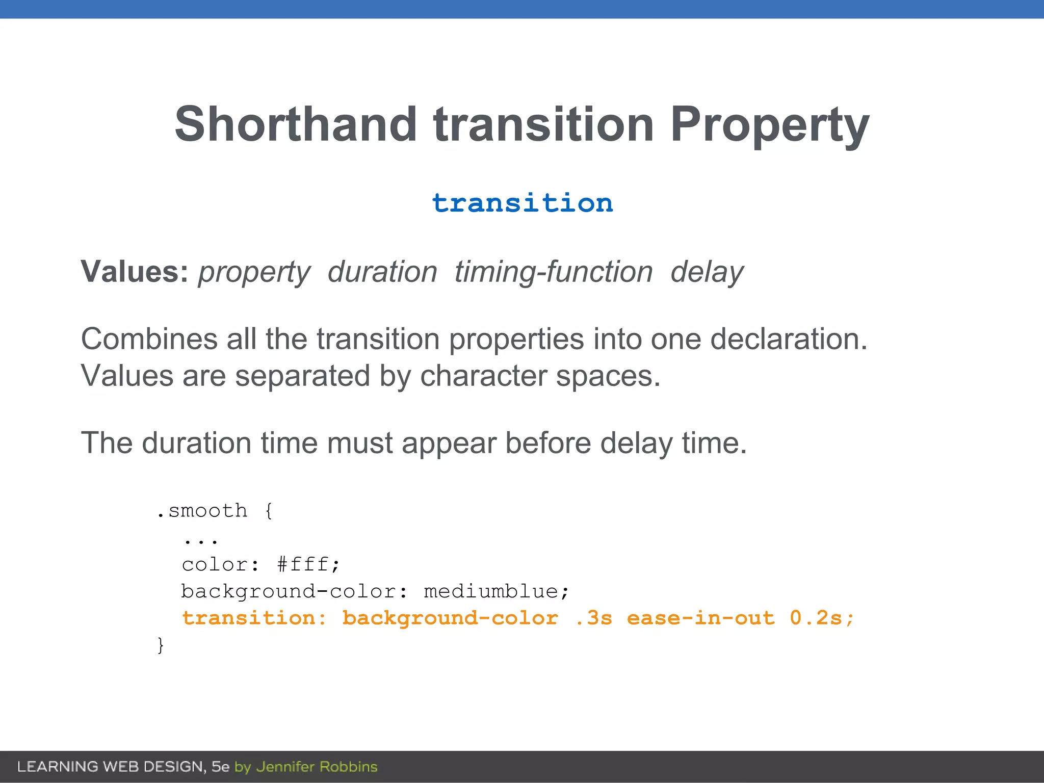
Shorthand transition Property
transition
Values:property duration timing-function delay
Combines all the transition properties into one declaration.
Values are separated by character spaces.
The duration time must appear before delay time.
.smooth {
...
color: #fff;
background-color: mediumblue;
transition: background-color .3s ease-in-out 0.2s;
}
13.
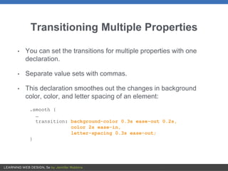
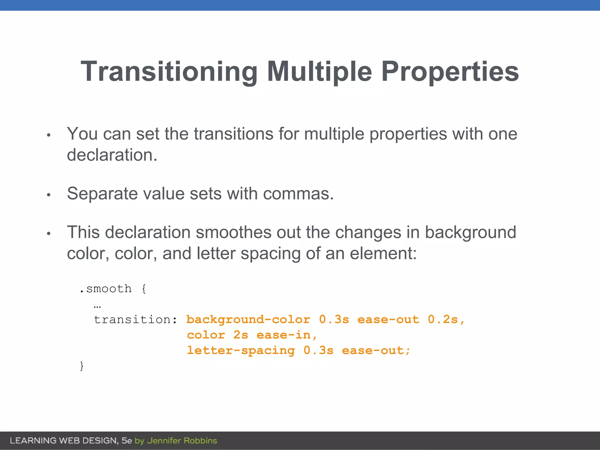
Transitioning Multiple Properties
•You can set the transitions for multiple properties with one
declaration.
• Separate value sets with commas.
• This declaration smoothes out the changes in background
color, color, and letter spacing of an element:
.smooth {
…
transition: background-color 0.3s ease-out 0.2s,
color 2s ease-in,
letter-spacing 0.3s ease-out;
}
14.
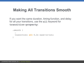
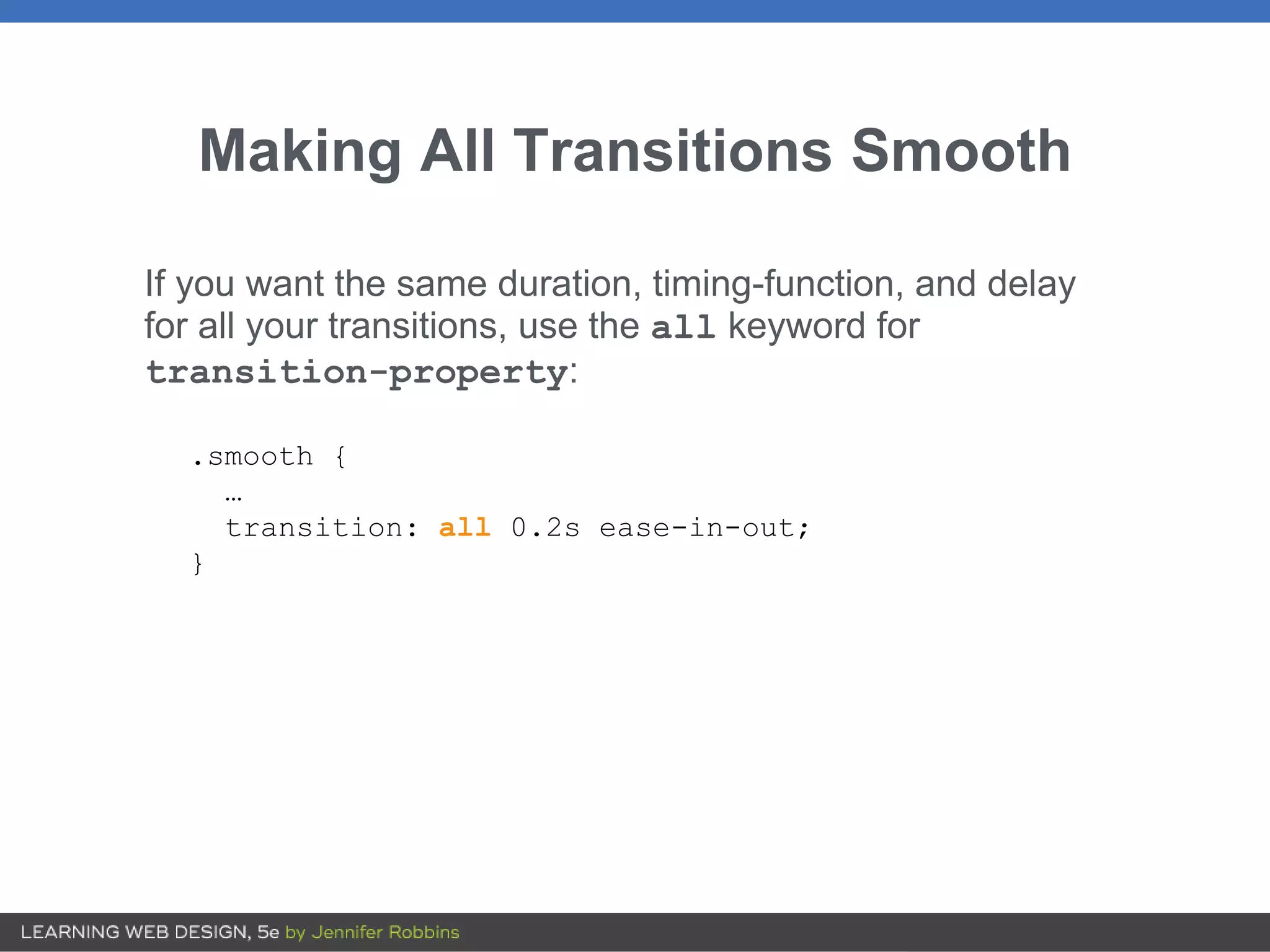
Making All TransitionsSmooth
If you want the same duration, timing-function, and delay
for all your transitions, use the all keyword for
transition-property:
.smooth {
…
transition: all 0.2s ease-in-out;
}
15.
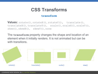
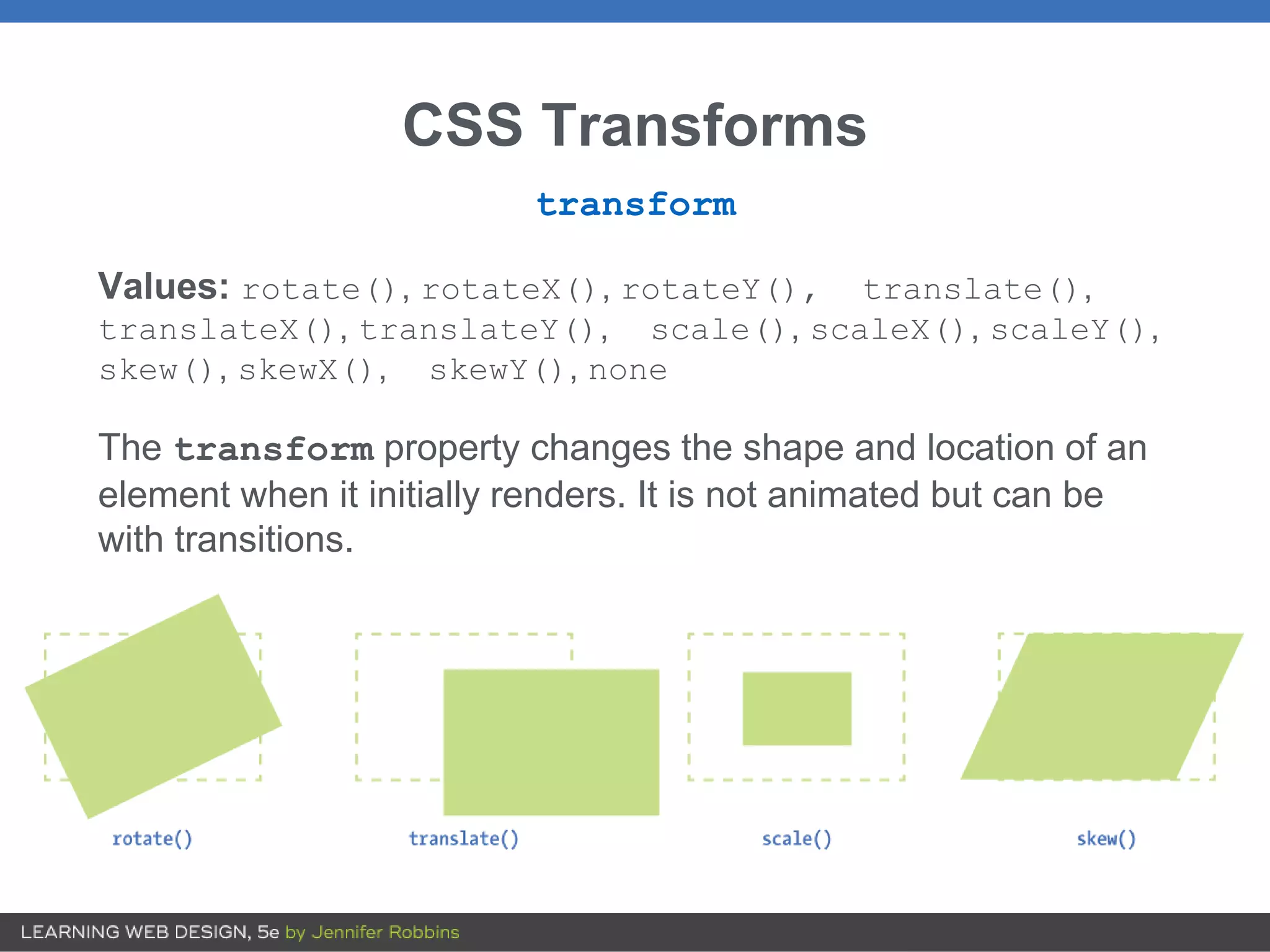
CSS Transforms
transform
Values: rotate(),rotateX(), rotateY(), translate(),
translateX(), translateY(), scale(), scaleX(), scaleY(),
skew(), skewX(), skewY(), none
The transform property changes the shape and location of an
element when it initially renders. It is not animated but can be
with transitions.
16.
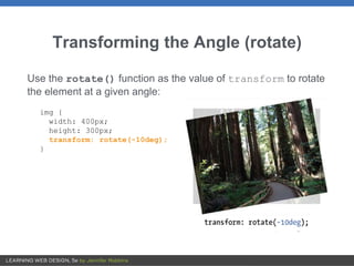
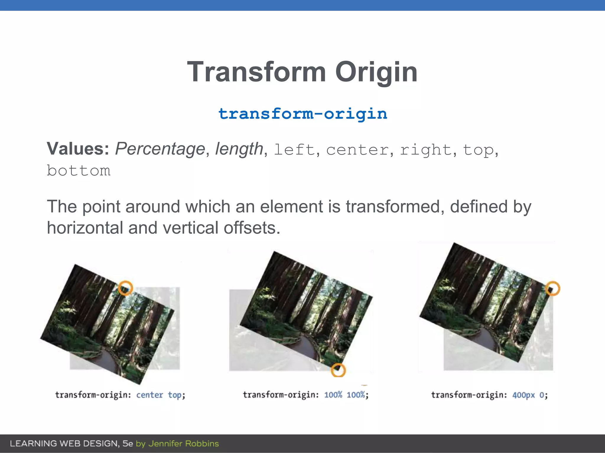
Transforming the Angle(rotate)
Use the rotate() function as the value of transform to rotate
the element at a given angle:
img {
width: 400px;
height: 300px;
transform: rotate(-10deg);
}
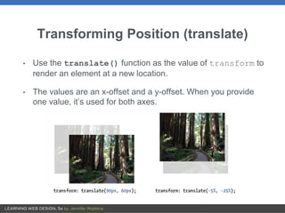
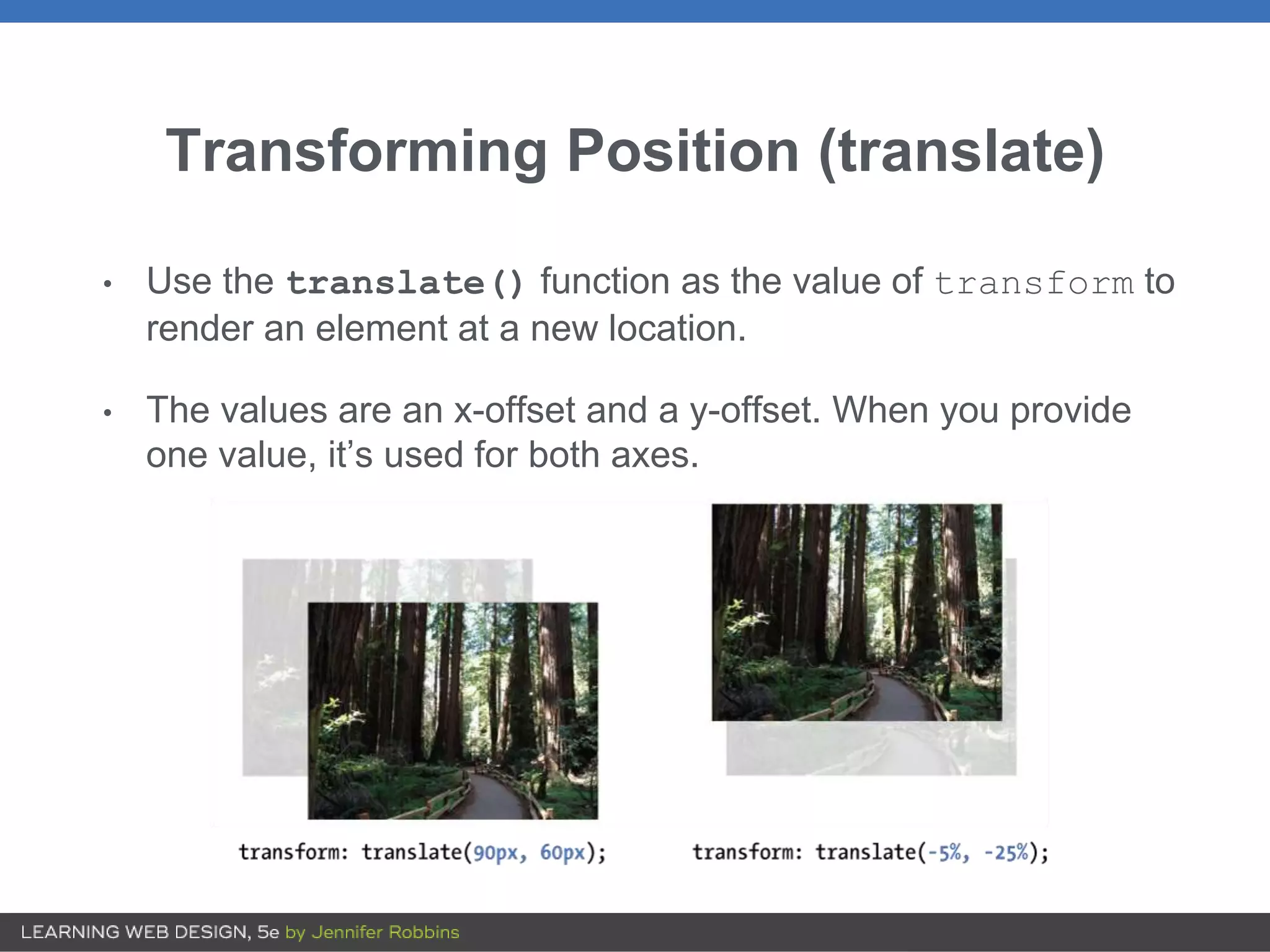
Transforming Position (translate)
•Use the translate() function as the value of transform to
render an element at a new location.
• The values are an x-offset and a y-offset. When you provide
one value, it’s used for both axes.
19.
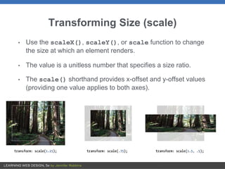
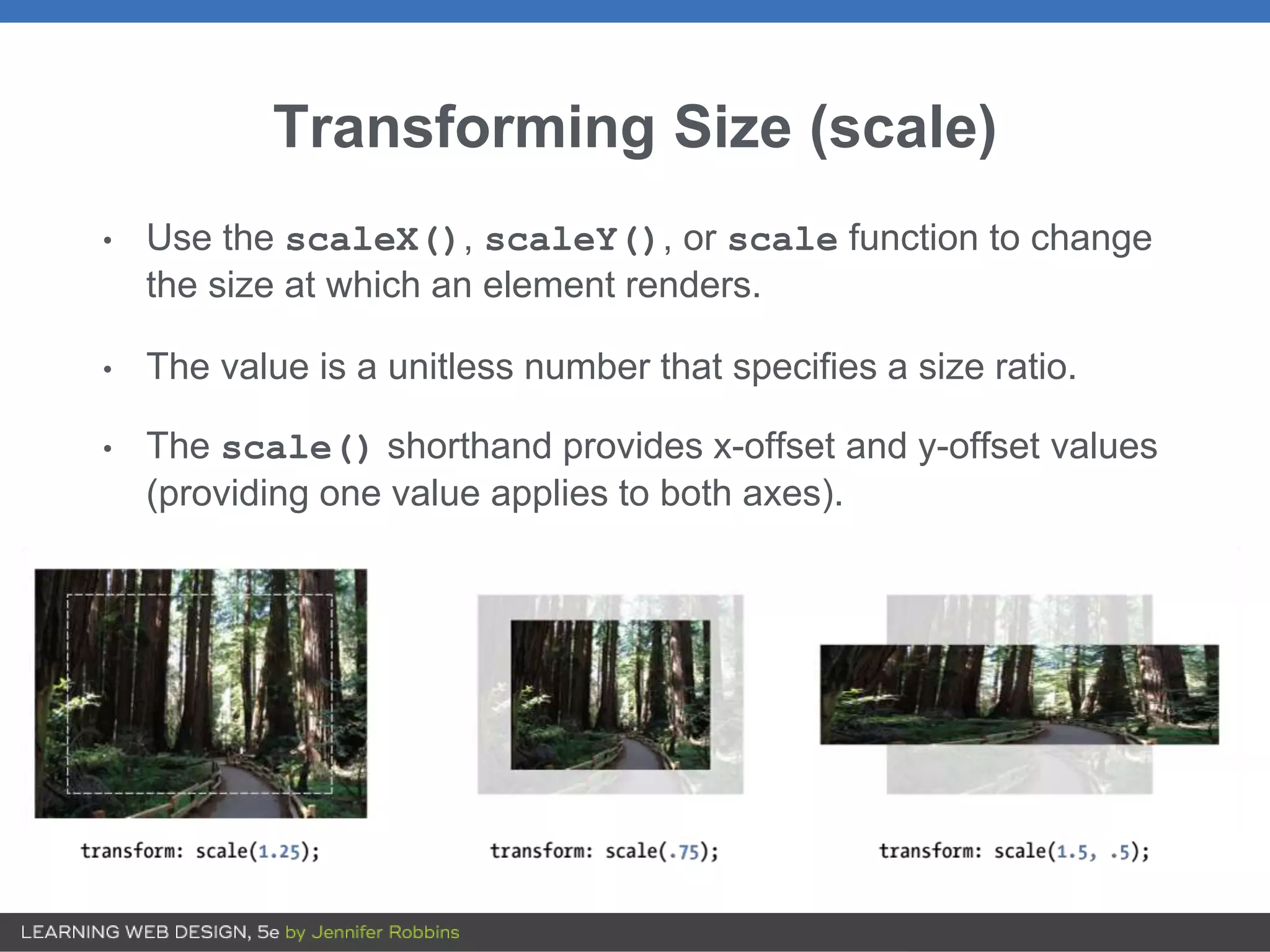
Transforming Size (scale)
•Use the scaleX(), scaleY(), or scale function to change
the size at which an element renders.
• The value is a unitless number that specifies a size ratio.
• The scale() shorthand provides x-offset and y-offset values
(providing one value applies to both axes).
20.
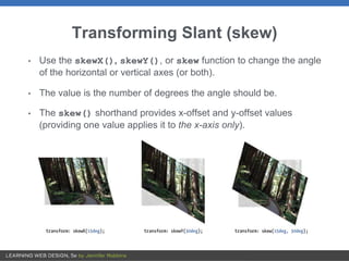
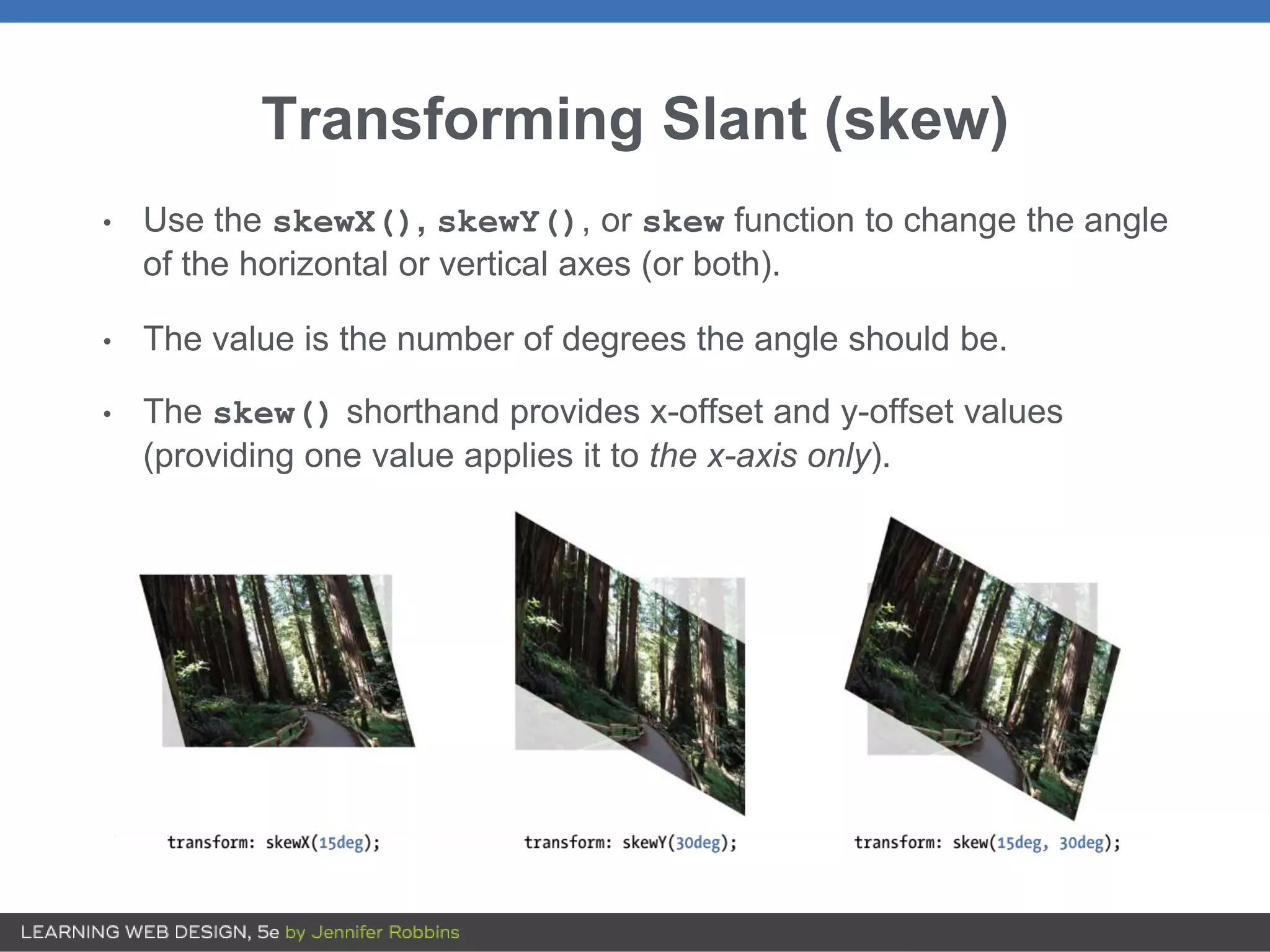
Transforming Slant (skew)
•Use the skewX(), skewY(), or skew function to change the angle
of the horizontal or vertical axes (or both).
• The value is the number of degrees the angle should be.
• The skew() shorthand provides x-offset and y-offset values
(providing one value applies it to the x-axis only).
21.
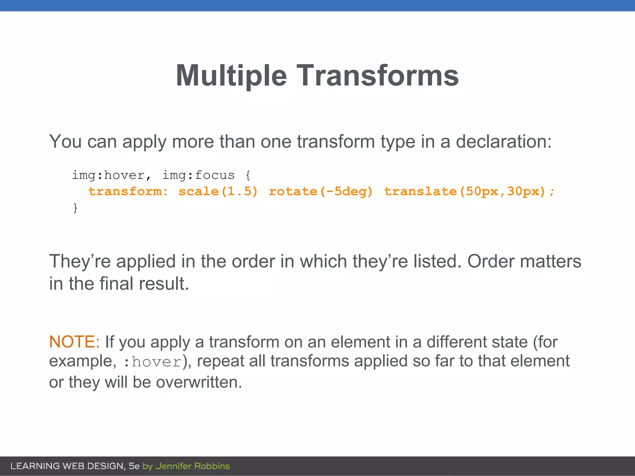
Multiple Transforms
You canapply more than one transform type in a declaration:
img:hover, img:focus {
transform: scale(1.5) rotate(-5deg) translate(50px,30px);
}
They’re applied in the order in which they’re listed. Order matters
in the final result.
NOTE: If you apply a transform on an element in a different state (for
example, :hover), repeat all transforms applied so far to that element
or they will be overwritten.
22.
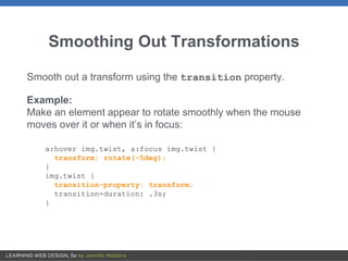
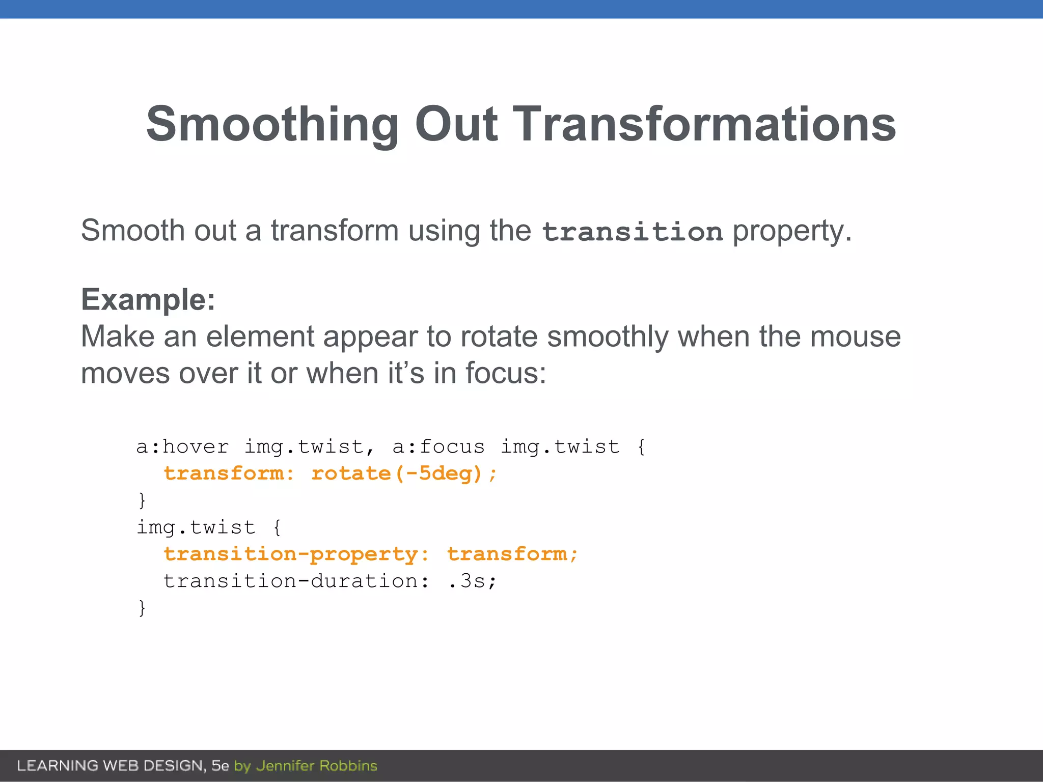
Smoothing Out Transformations
Smoothout a transform using the transition property.
Example:
Make an element appear to rotate smoothly when the mouse
moves over it or when it’s in focus:
a:hover img.twist, a:focus img.twist {
transform: rotate(-5deg);
}
img.twist {
transition-property: transform;
transition-duration: .3s;
}
23.
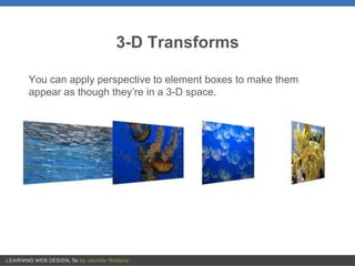
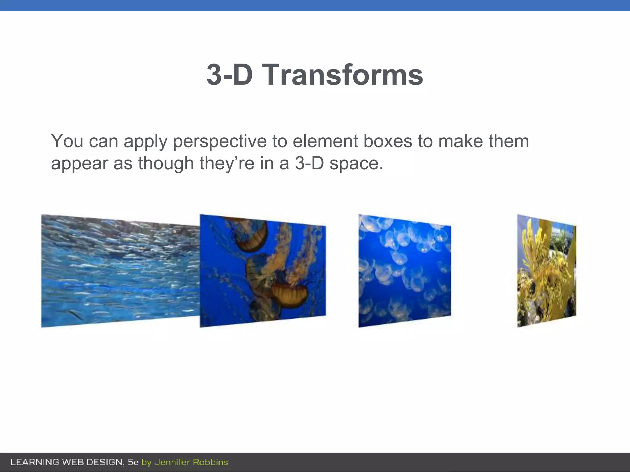
3-D Transforms
You canapply perspective to element boxes to make them
appear as though they’re in a 3-D space.
24.
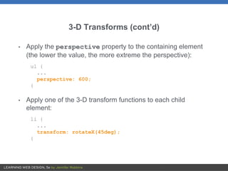
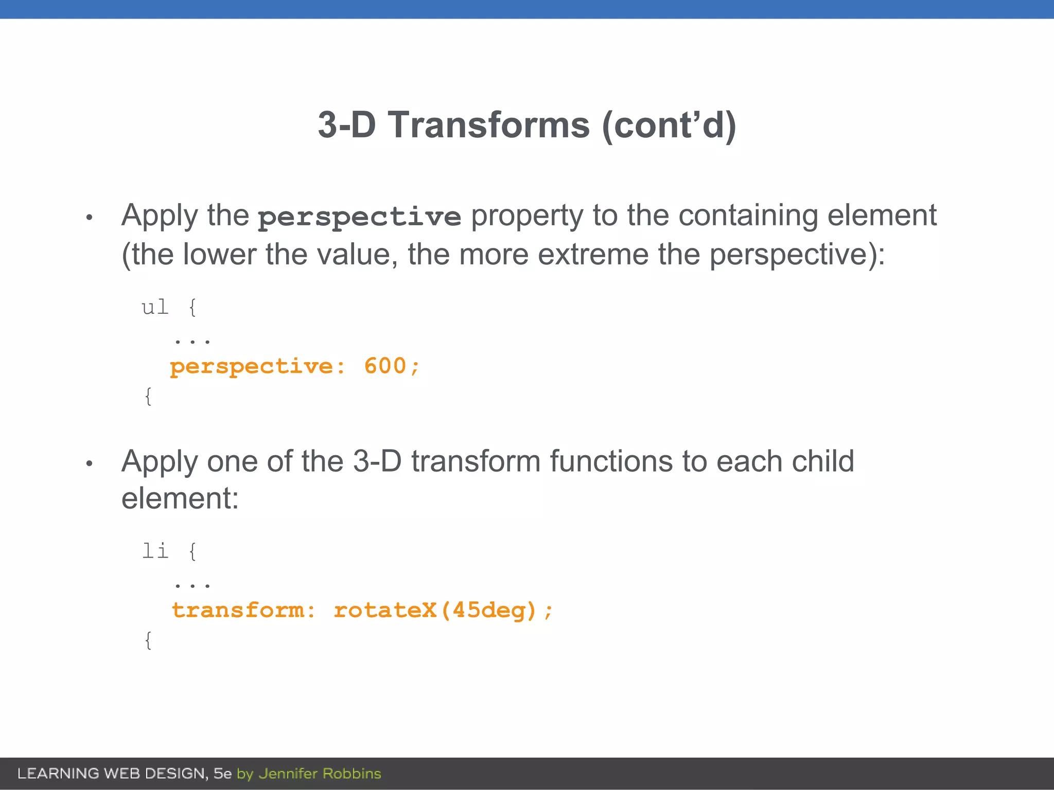
3-D Transforms (cont’d)
•Apply the perspective property to the containing element
(the lower the value, the more extreme the perspective):
ul {
...
perspective: 600;
{
• Apply one of the 3-D transform functions to each child
element:
li {
...
transform: rotateX(45deg);
{
25.
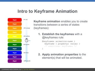
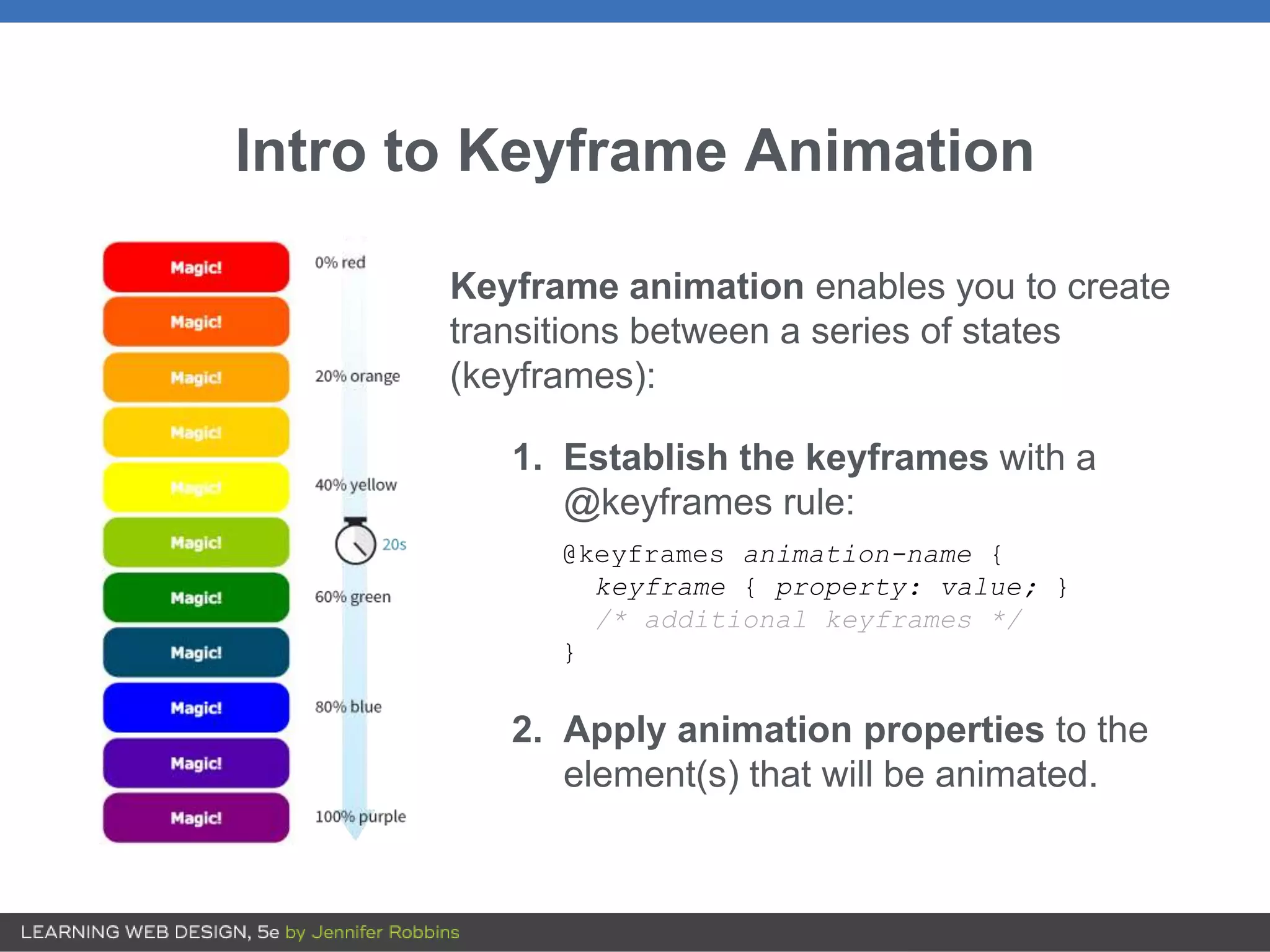
Intro to KeyframeAnimation
Keyframe animation enables you to create
transitions between a series of states
(keyframes):
1. Establish the keyframes with a
@keyframes rule:
@keyframes animation-name {
keyframe { property: value; }
/* additional keyframes */
}
2. Apply animation properties to the
element(s) that will be animated.
26.
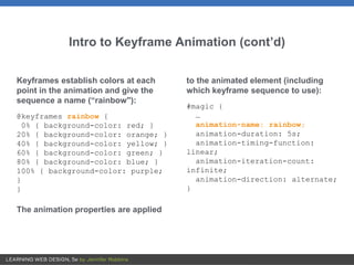
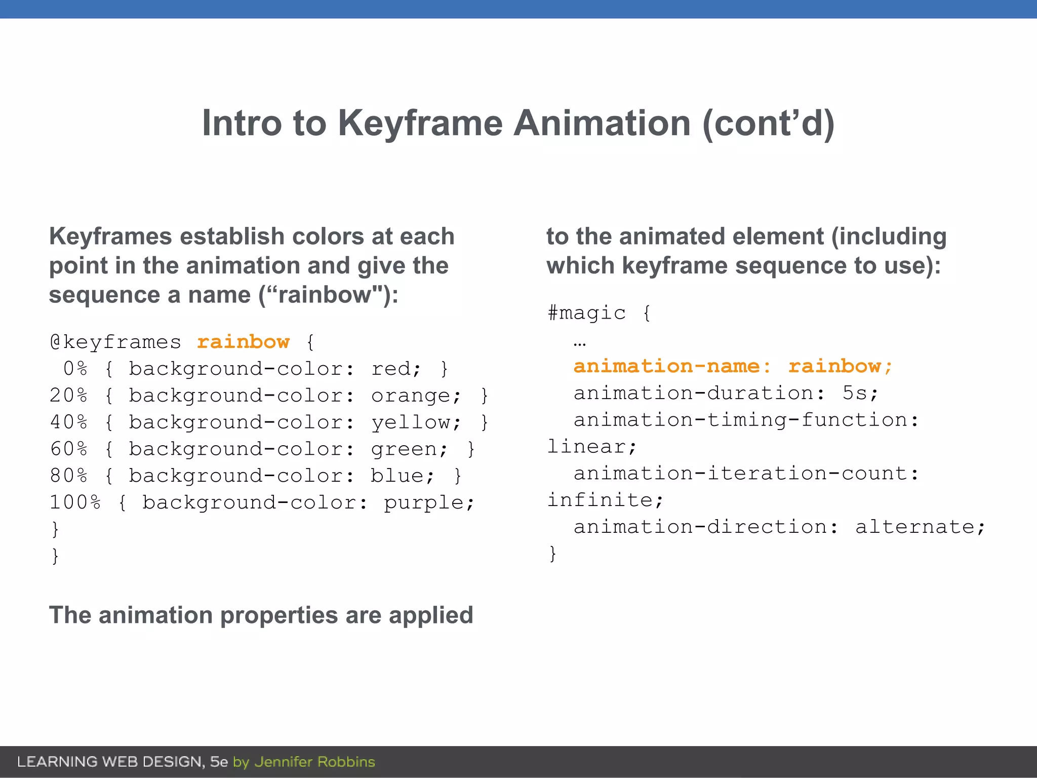
Intro to KeyframeAnimation (cont’d)
Keyframes establish colors at each
point in the animation and give the
sequence a name (“rainbow"):
@keyframes rainbow {
0% { background-color: red; }
20% { background-color: orange; }
40% { background-color: yellow; }
60% { background-color: green; }
80% { background-color: blue; }
100% { background-color: purple;
}
}
The animation properties are applied
to the animated element (including
which keyframe sequence to use):
#magic {
…
animation-name: rainbow;
animation-duration: 5s;
animation-timing-function:
linear;
animation-iteration-count:
infinite;
animation-direction: alternate;
}