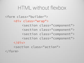
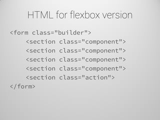
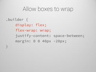
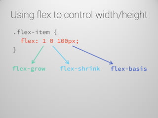
Download as PDF, PPTX


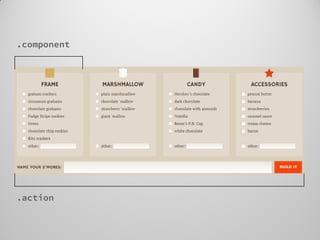
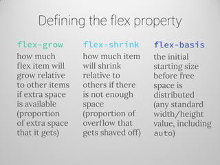
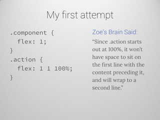

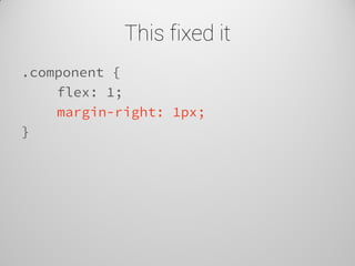
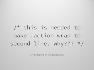
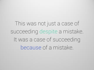
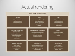
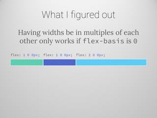
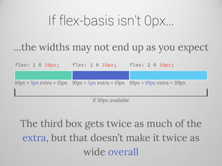
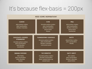

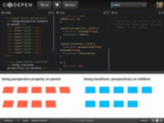
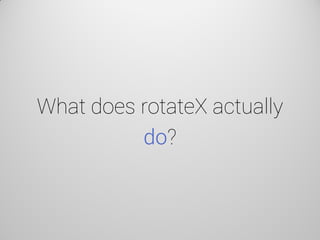
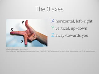
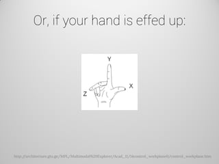
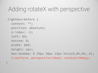
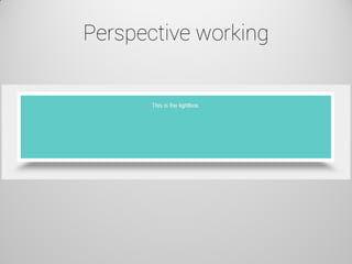
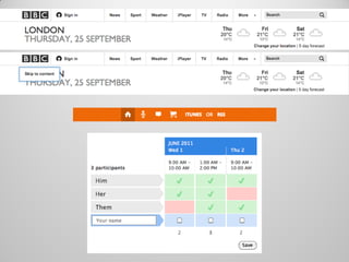

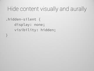


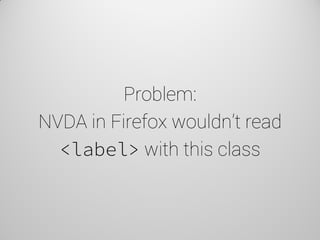
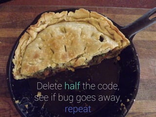
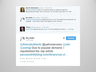
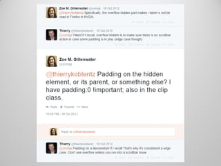
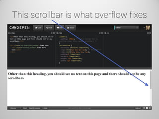
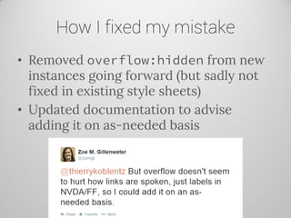
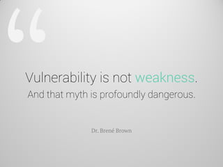
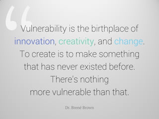
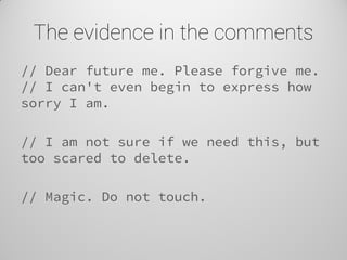
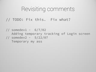

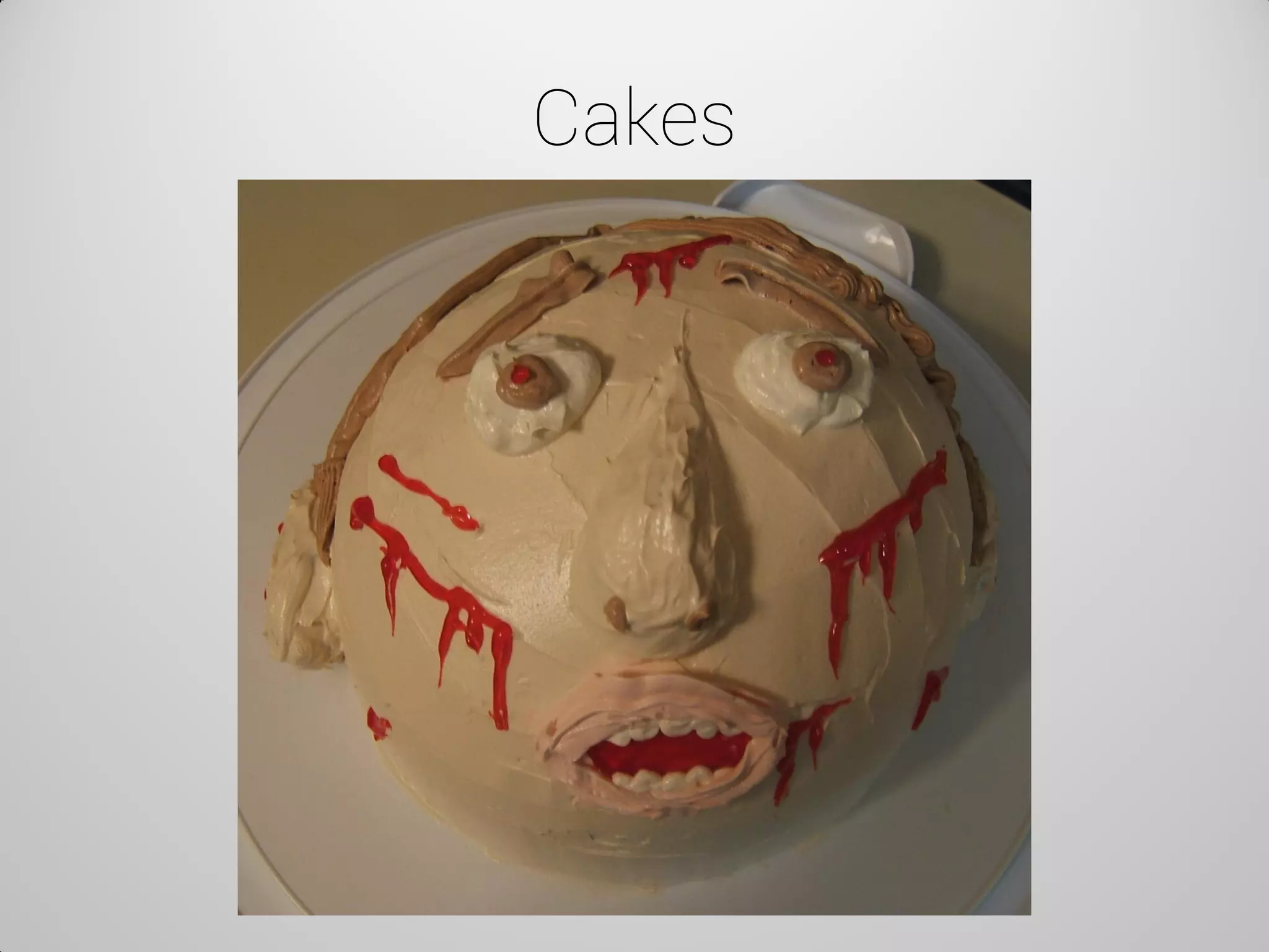
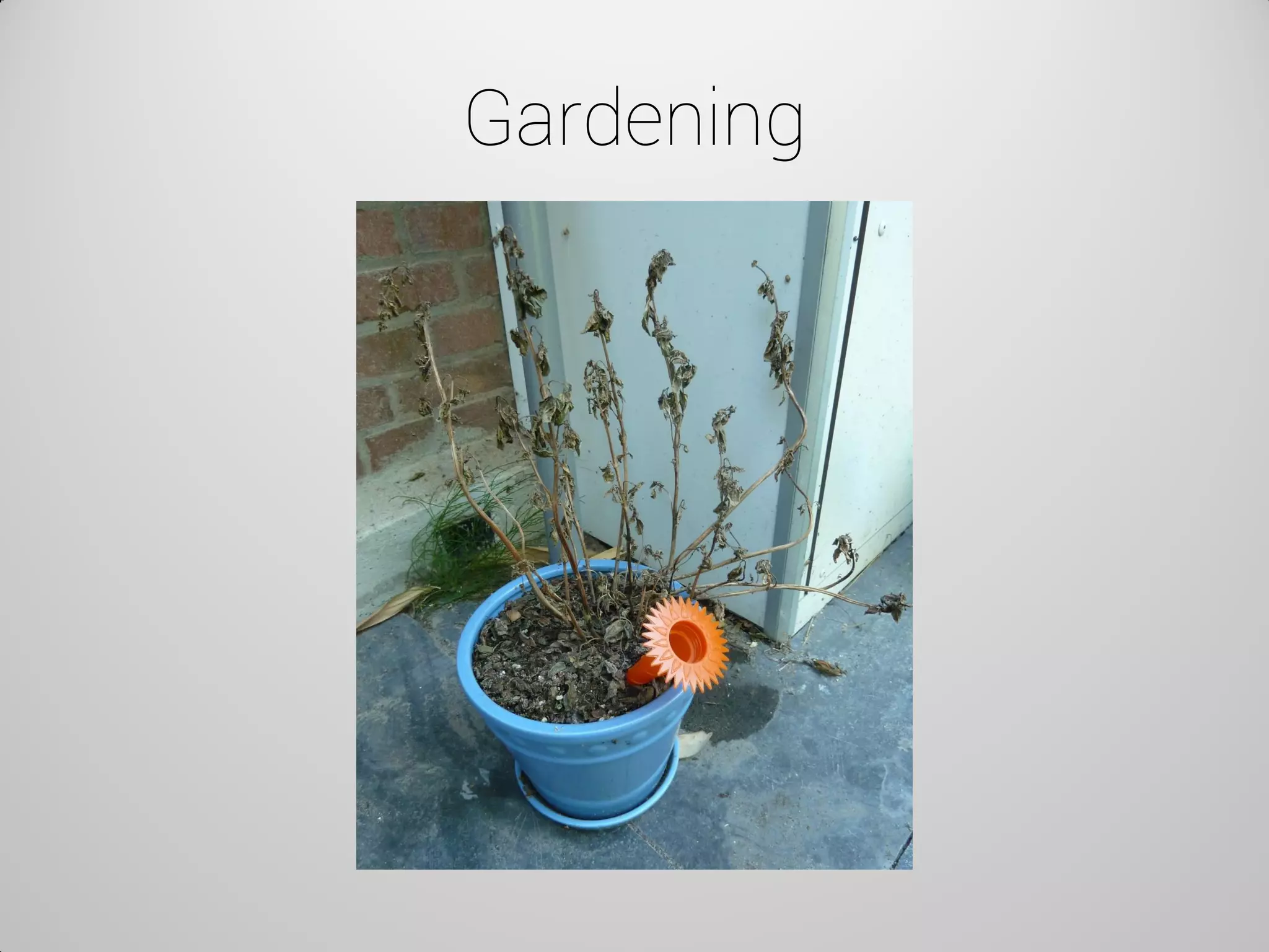
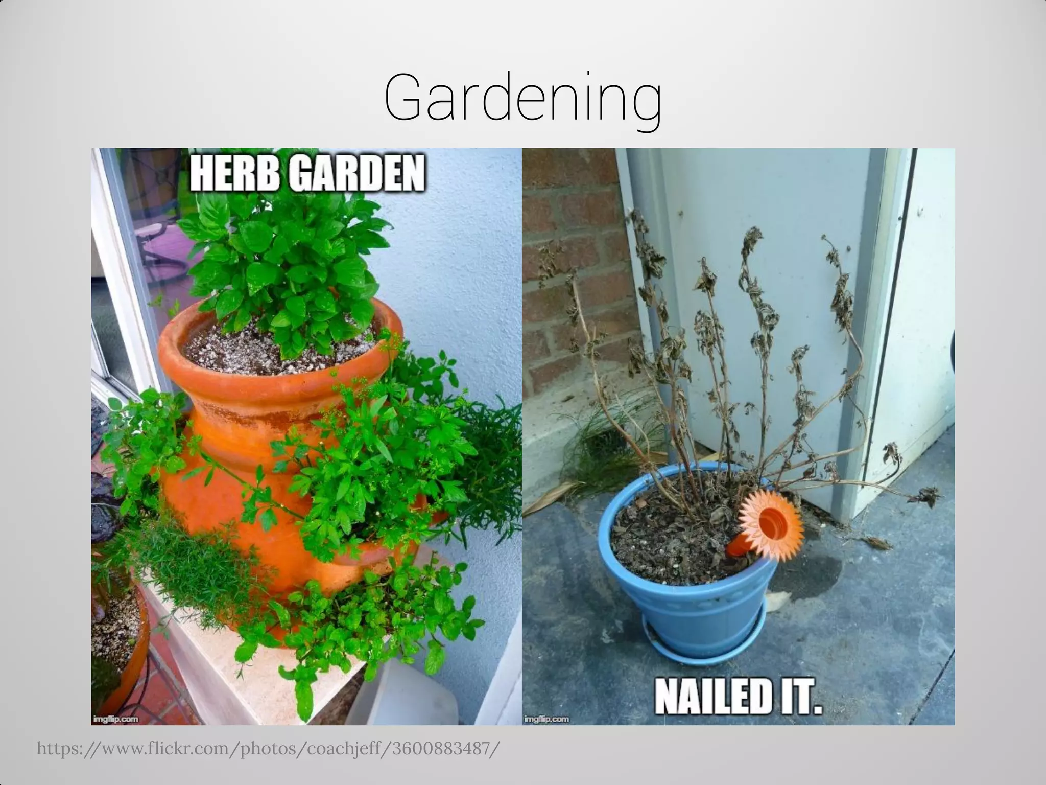
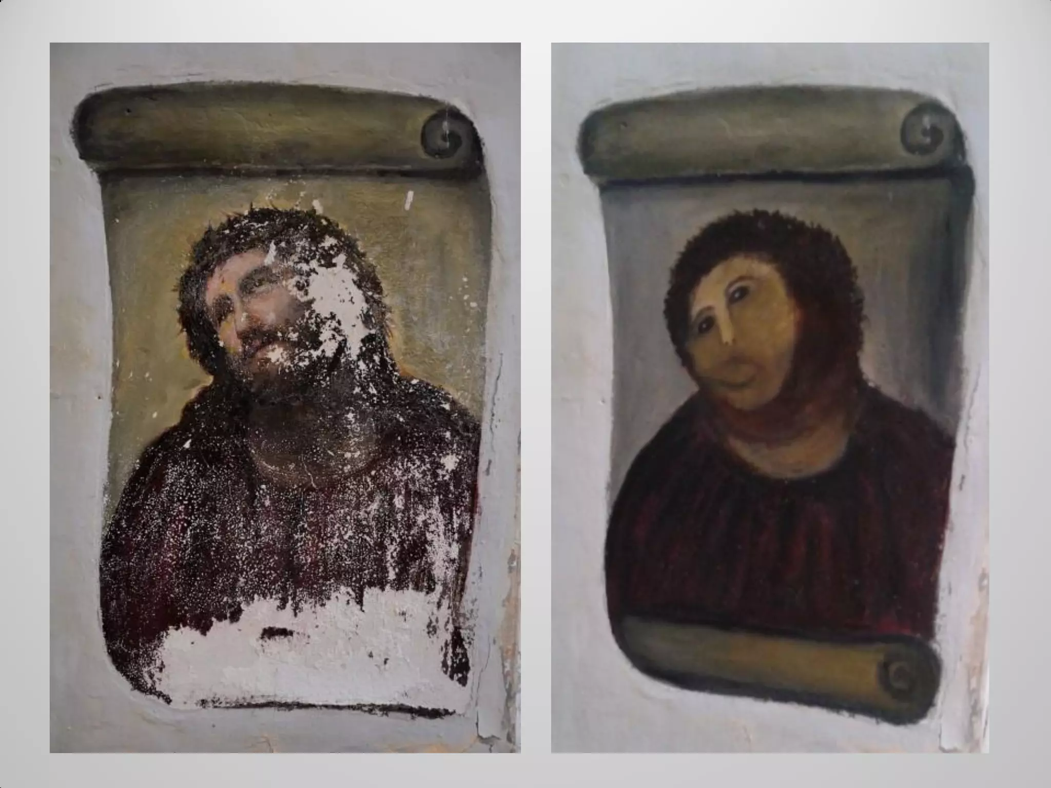
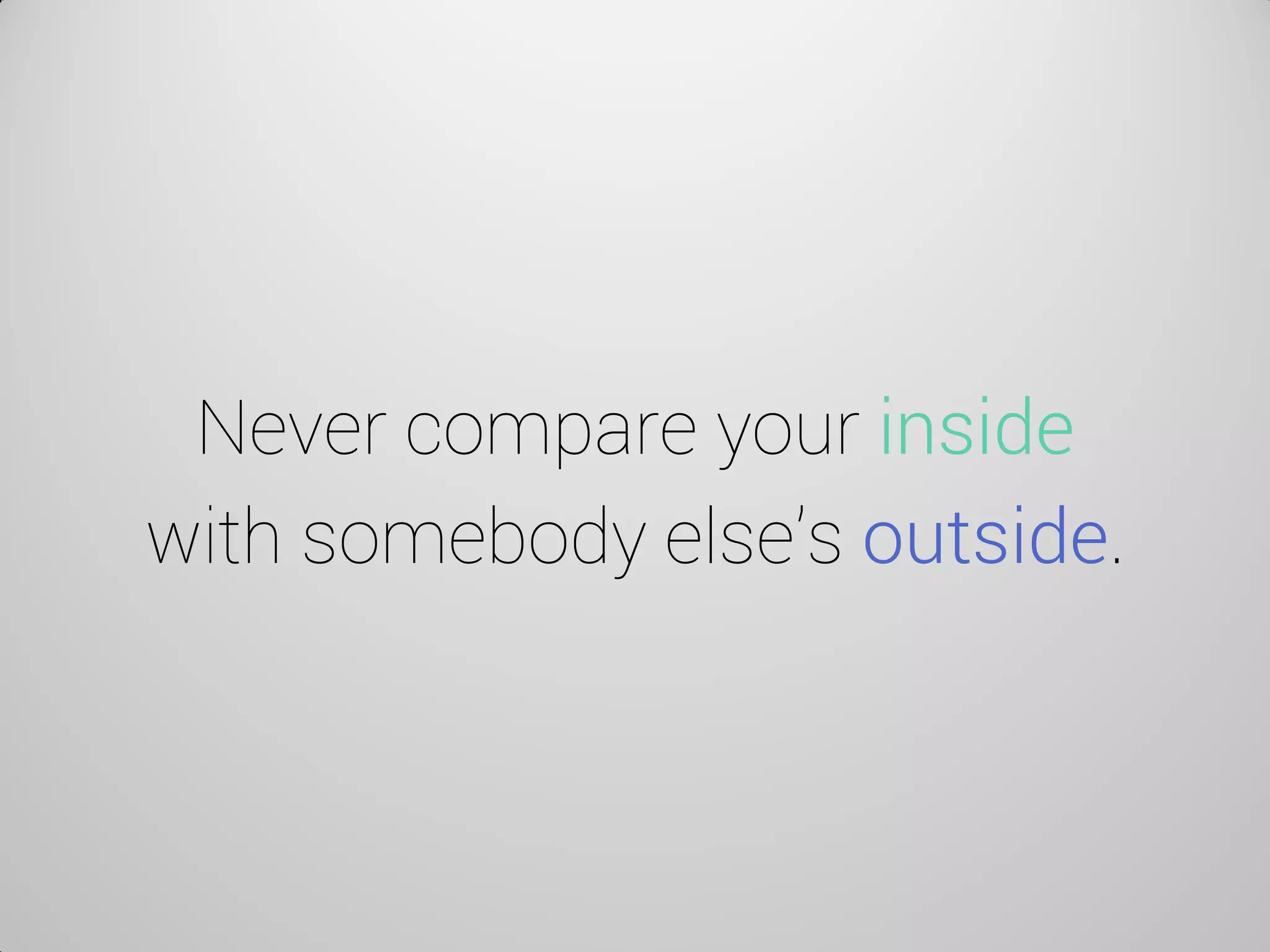
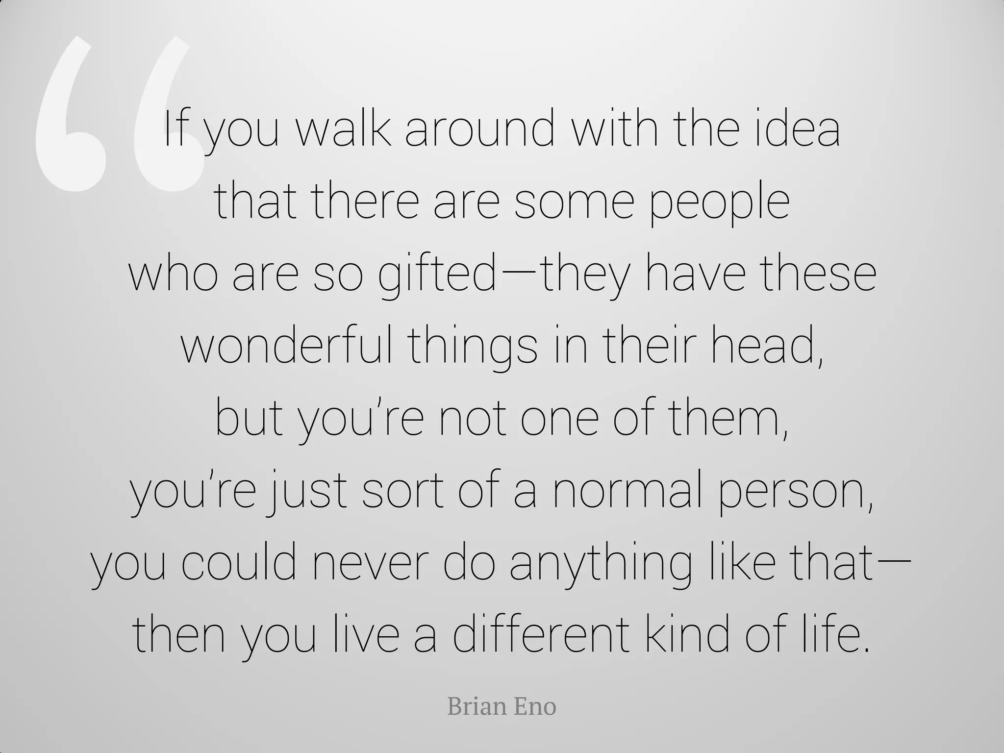
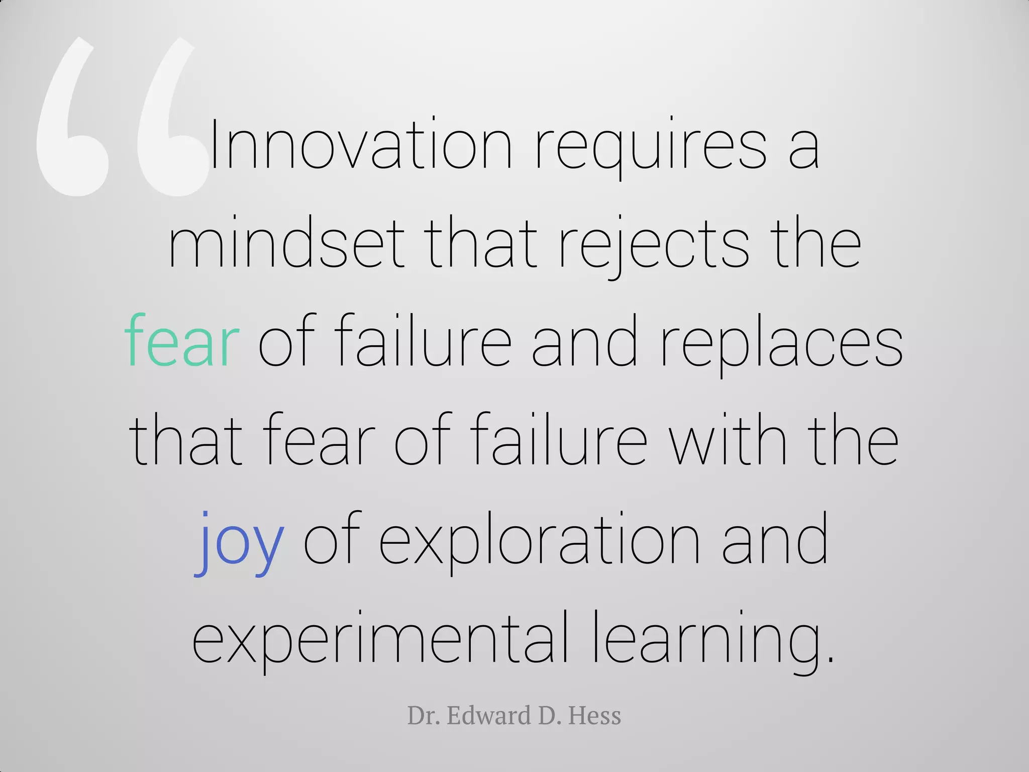
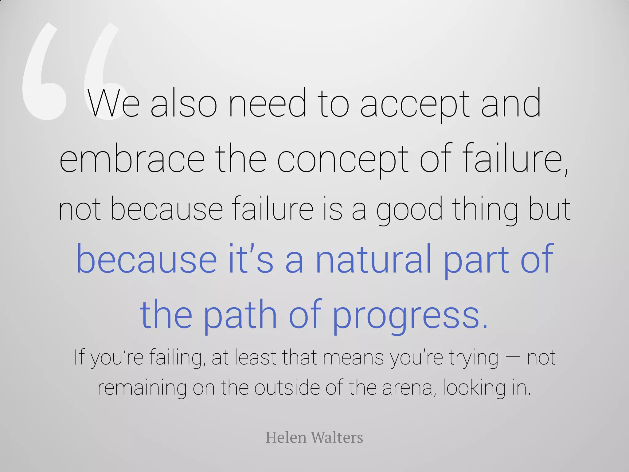
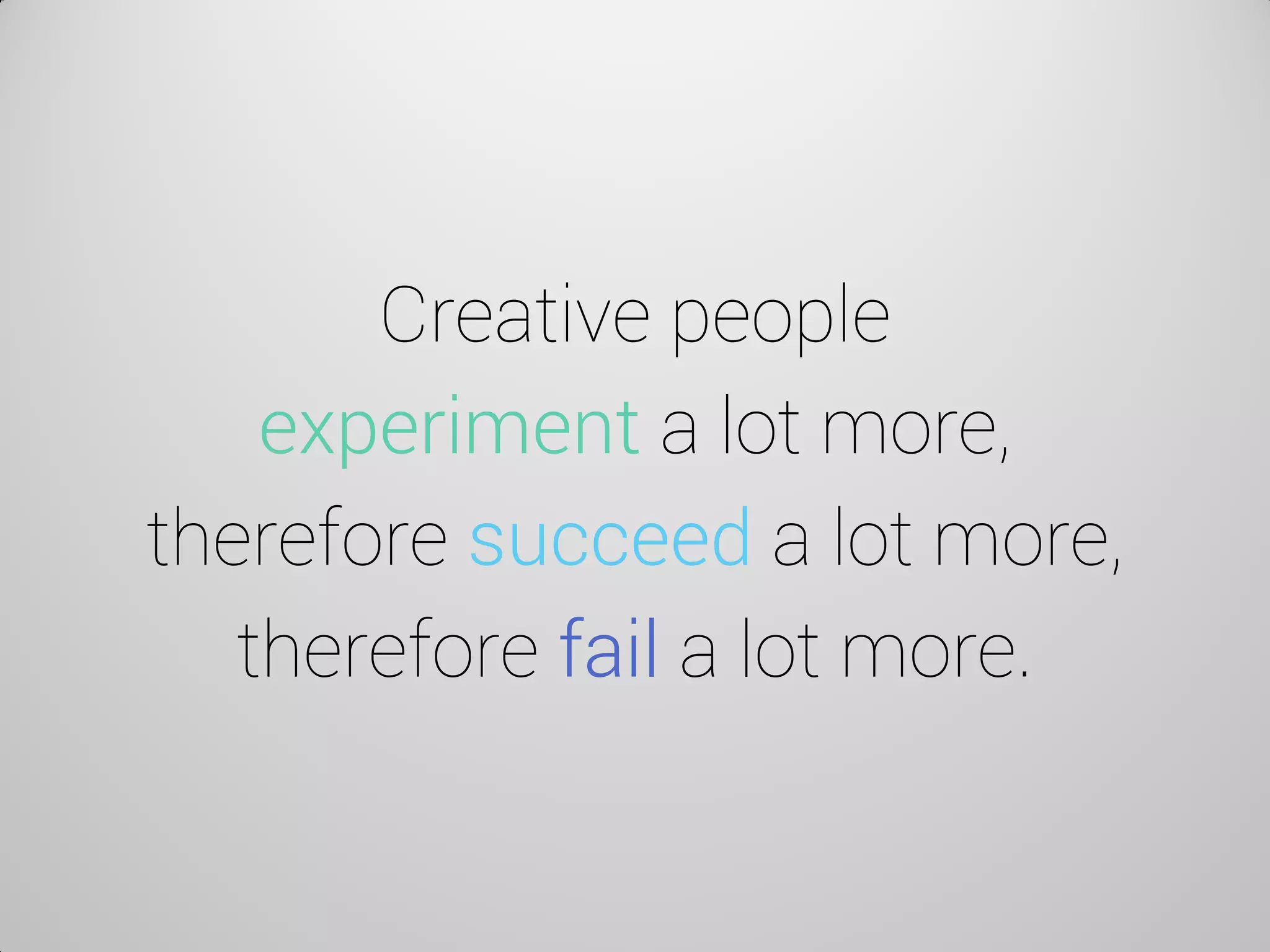
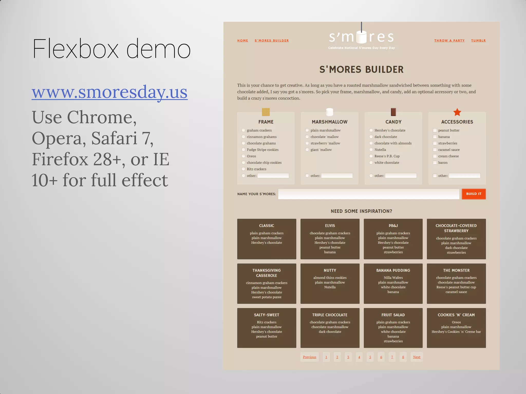
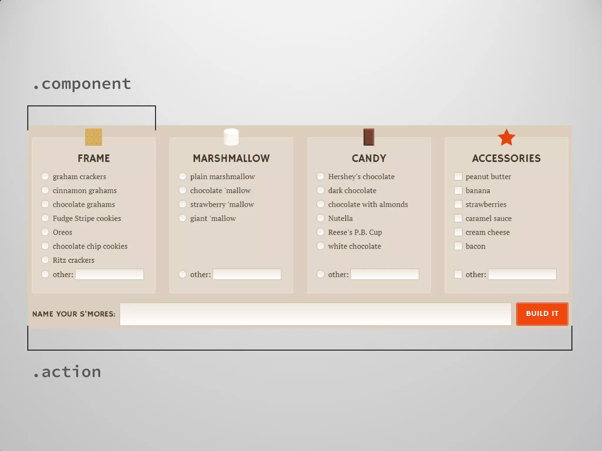

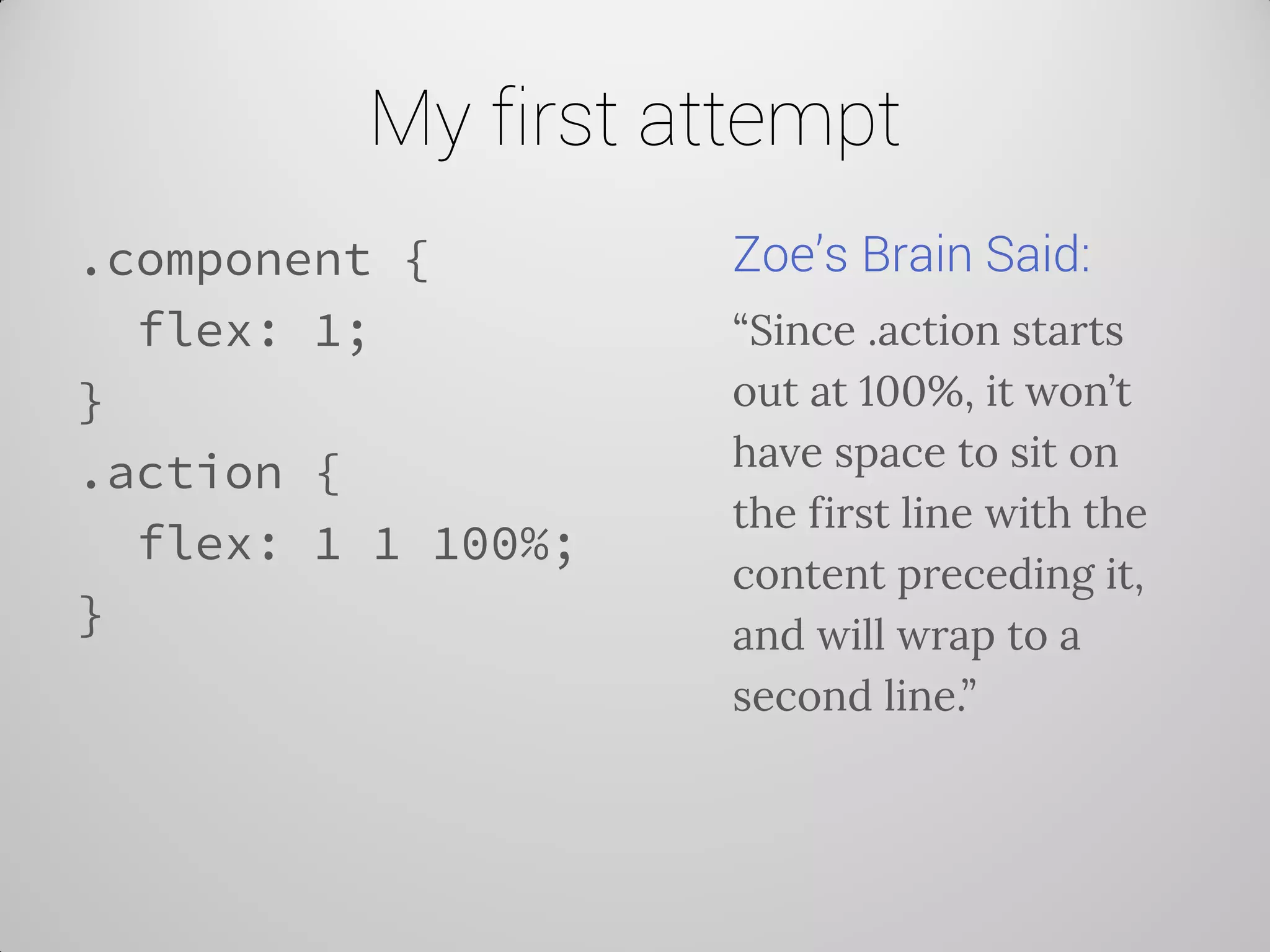
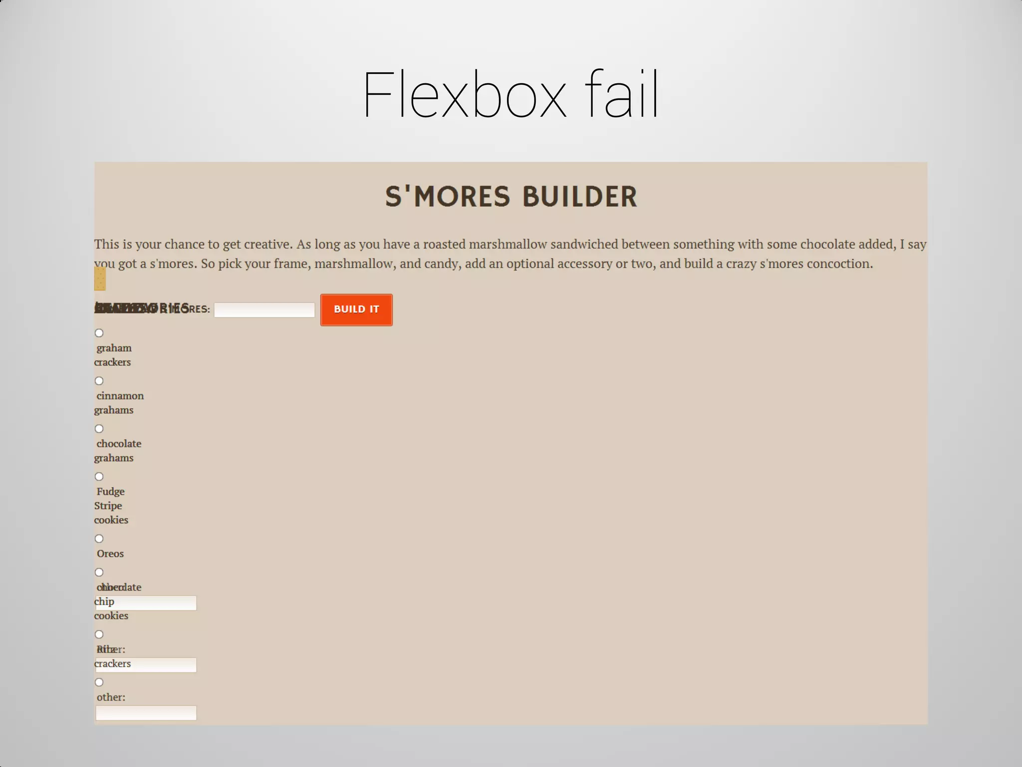
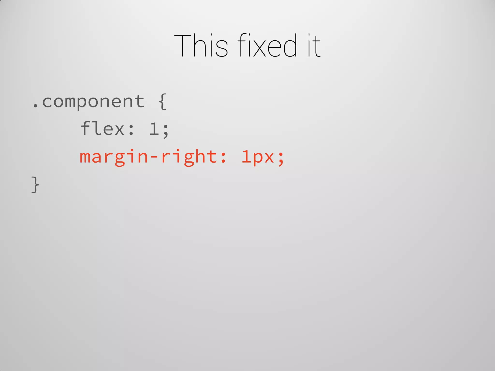
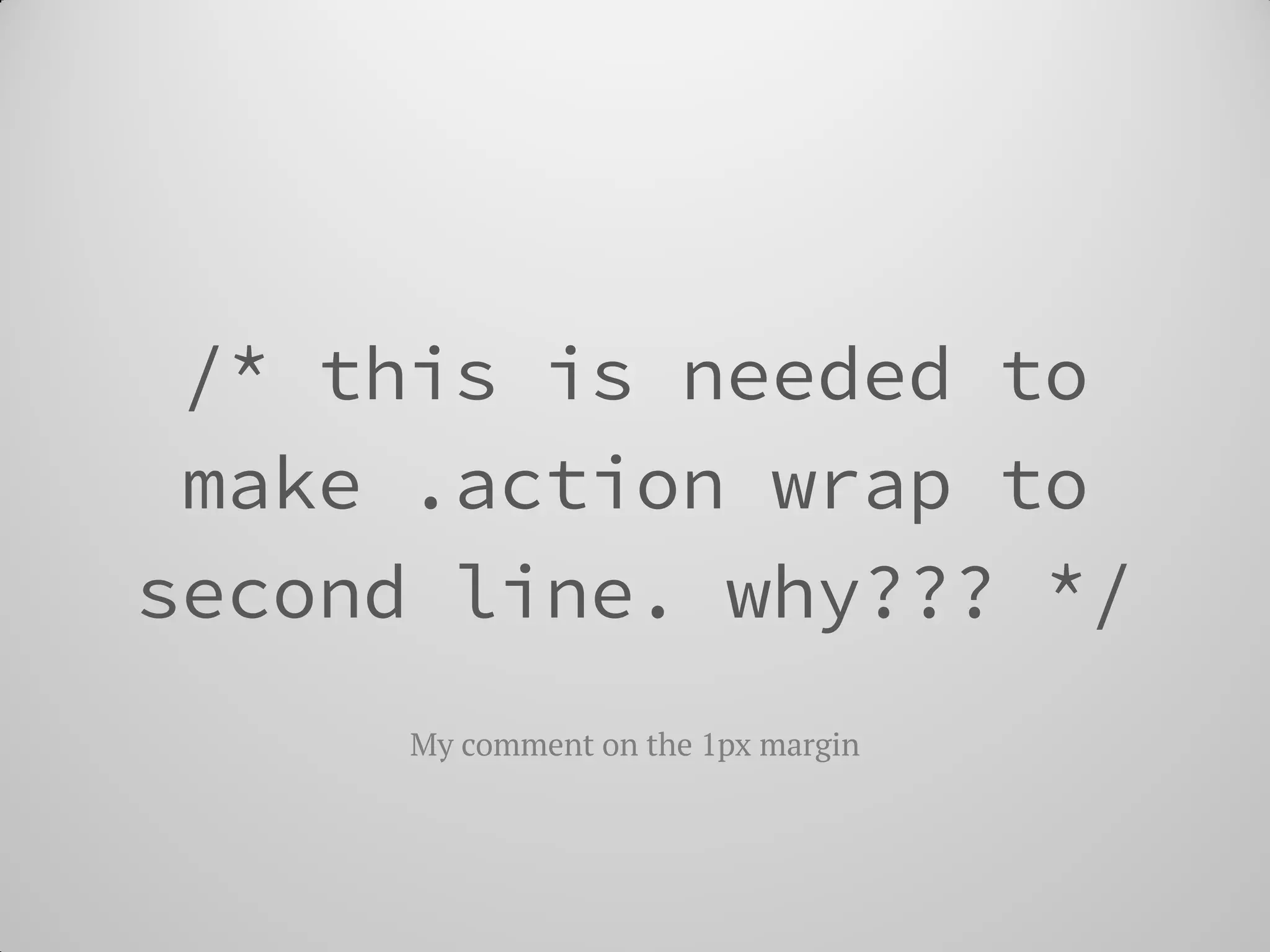
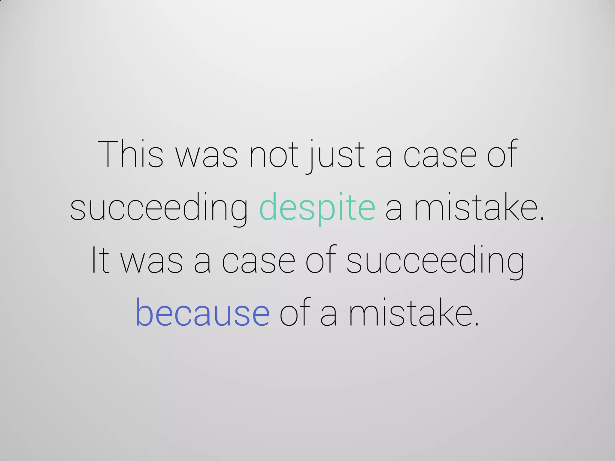

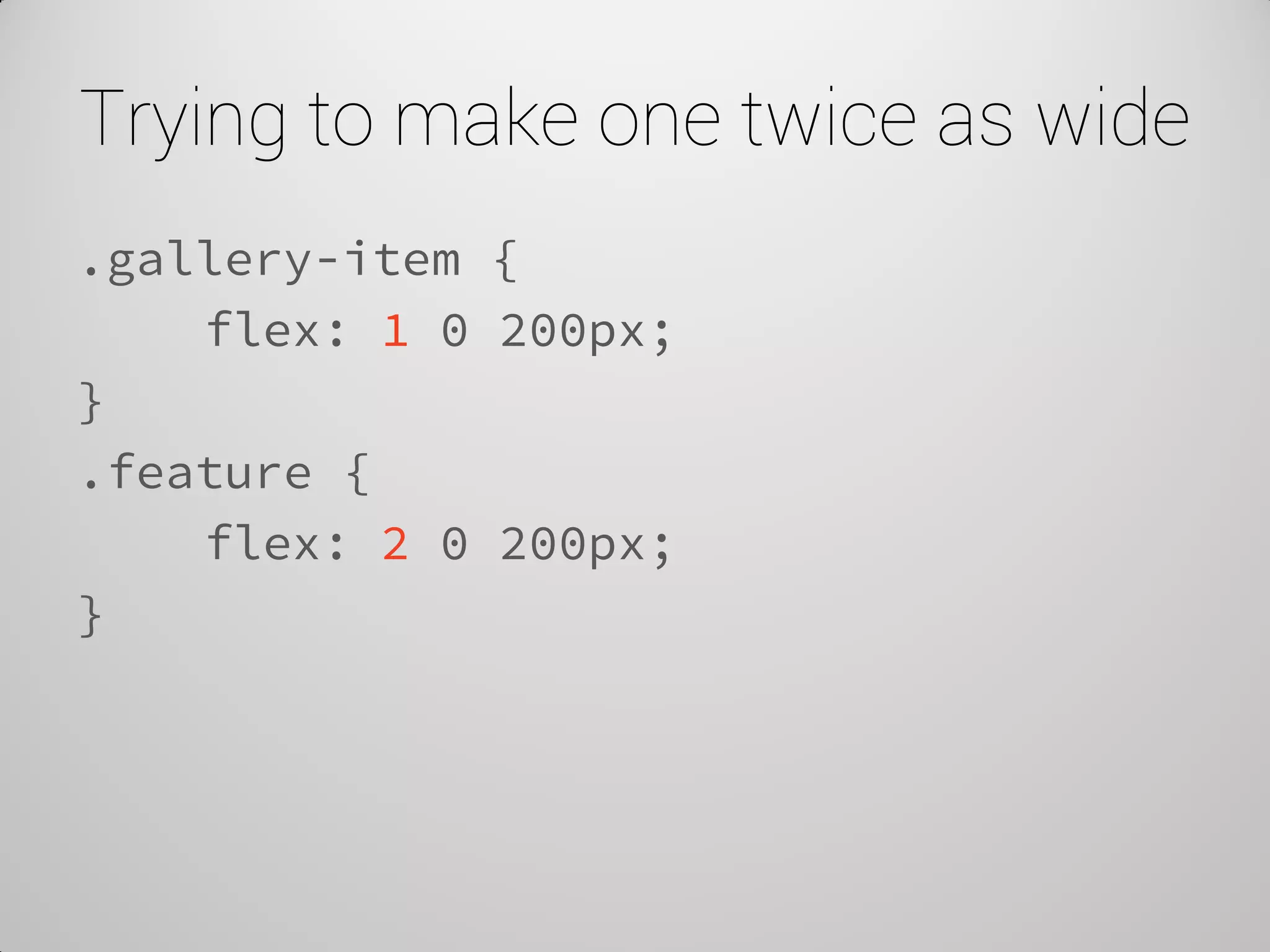
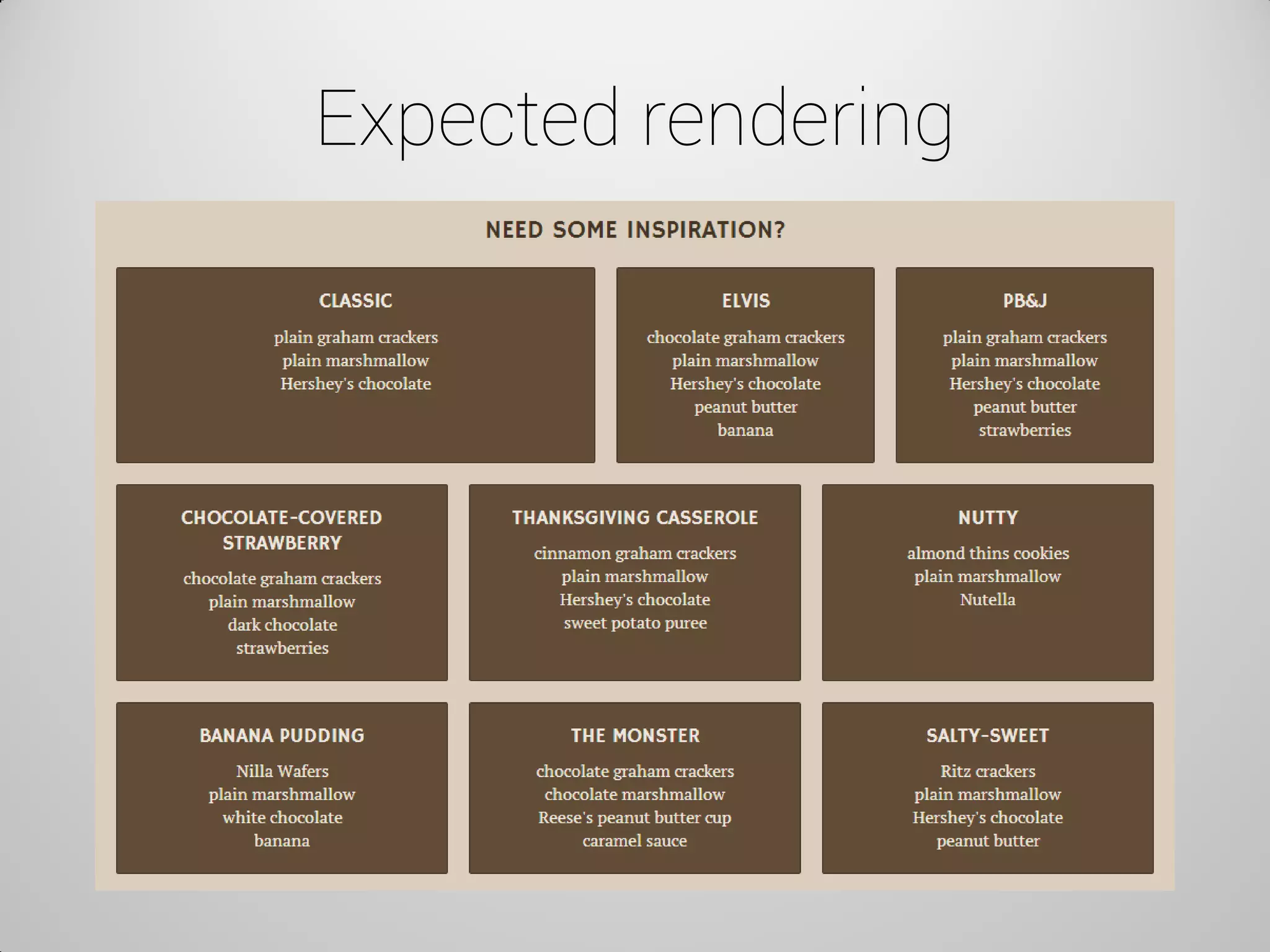
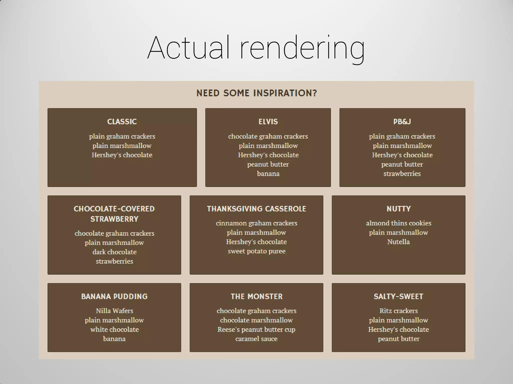

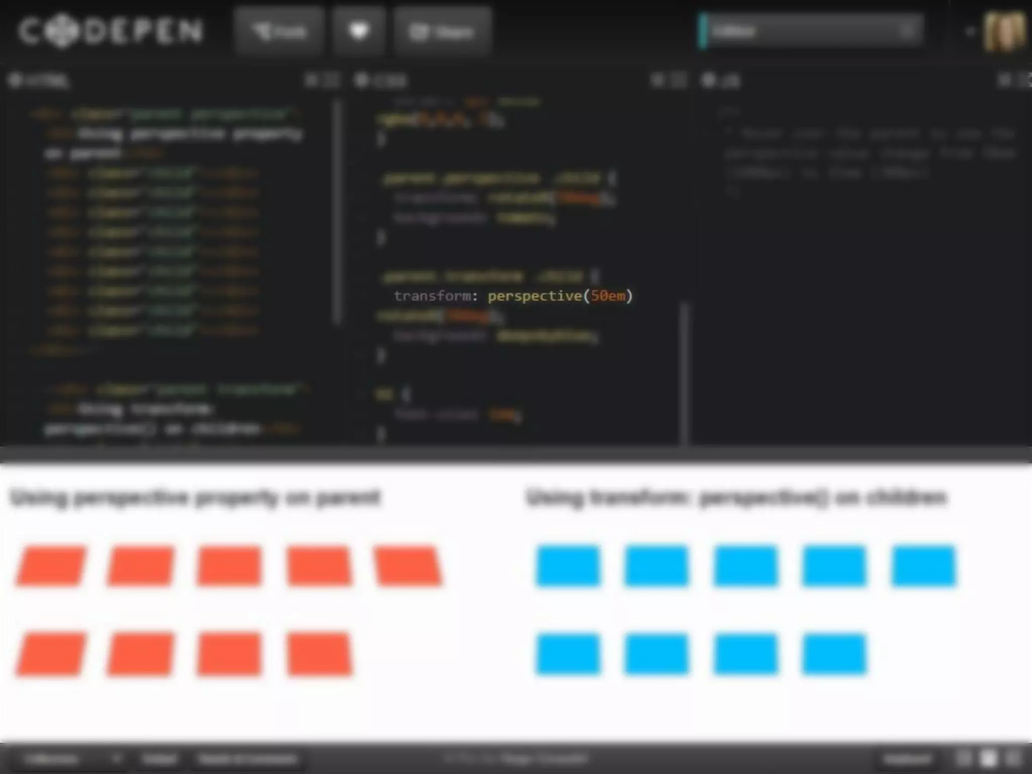
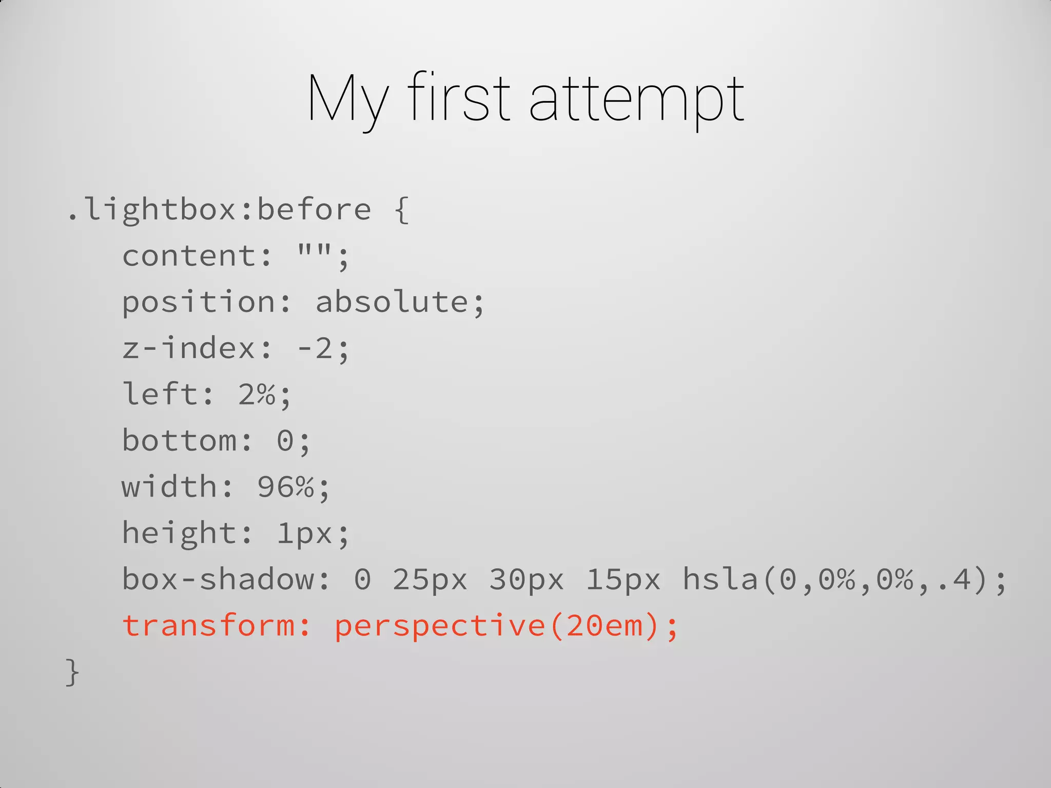
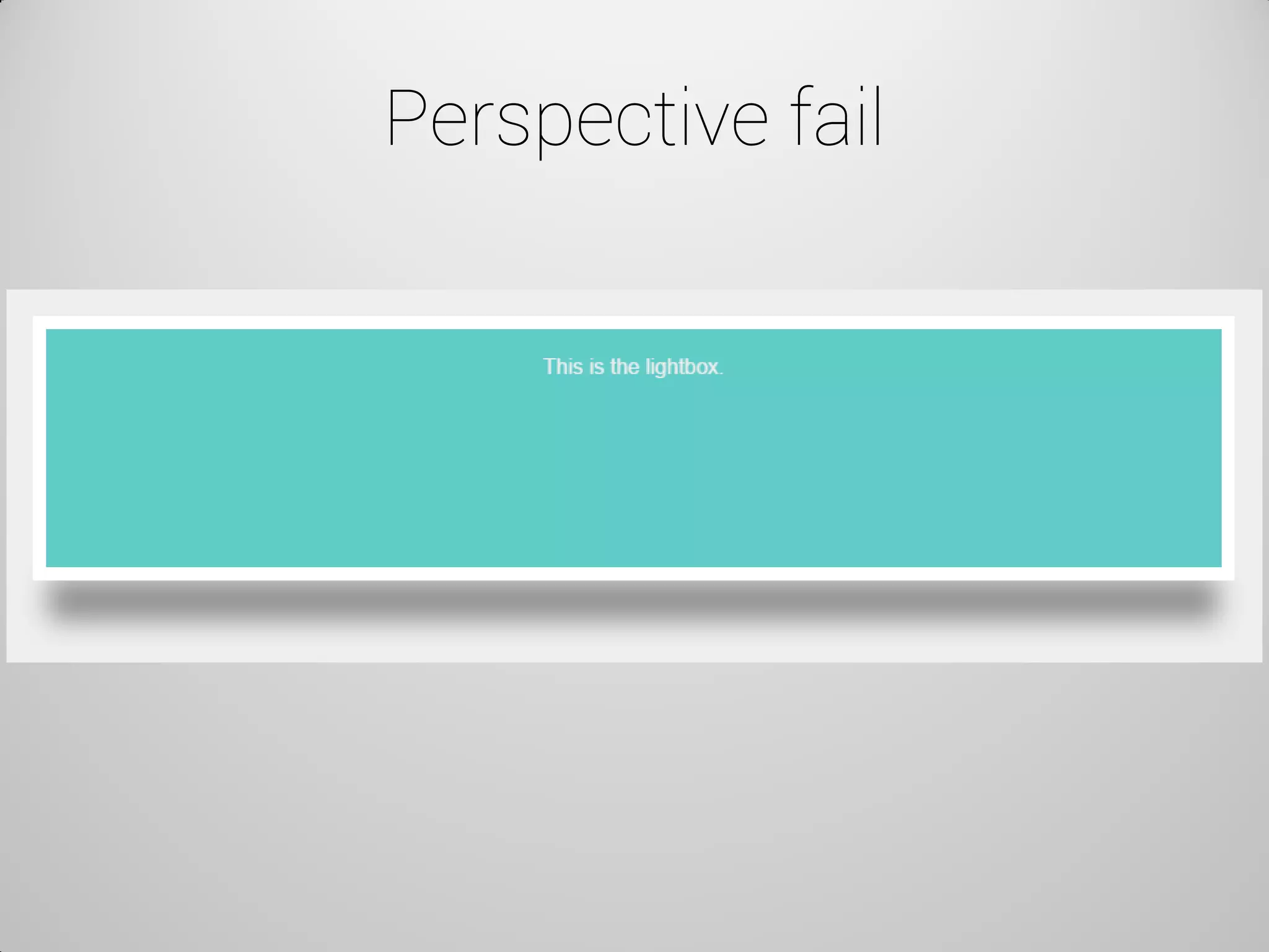

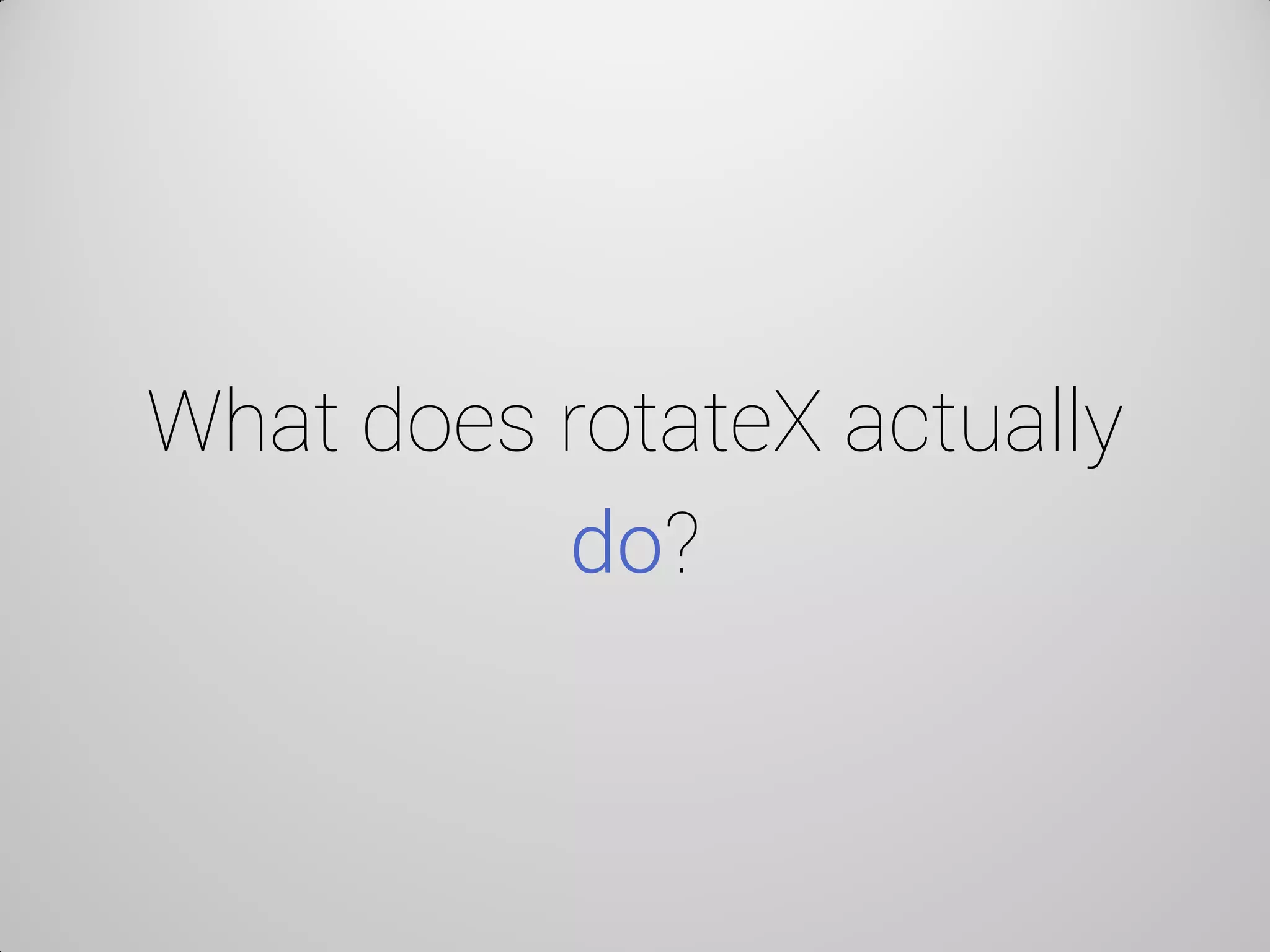
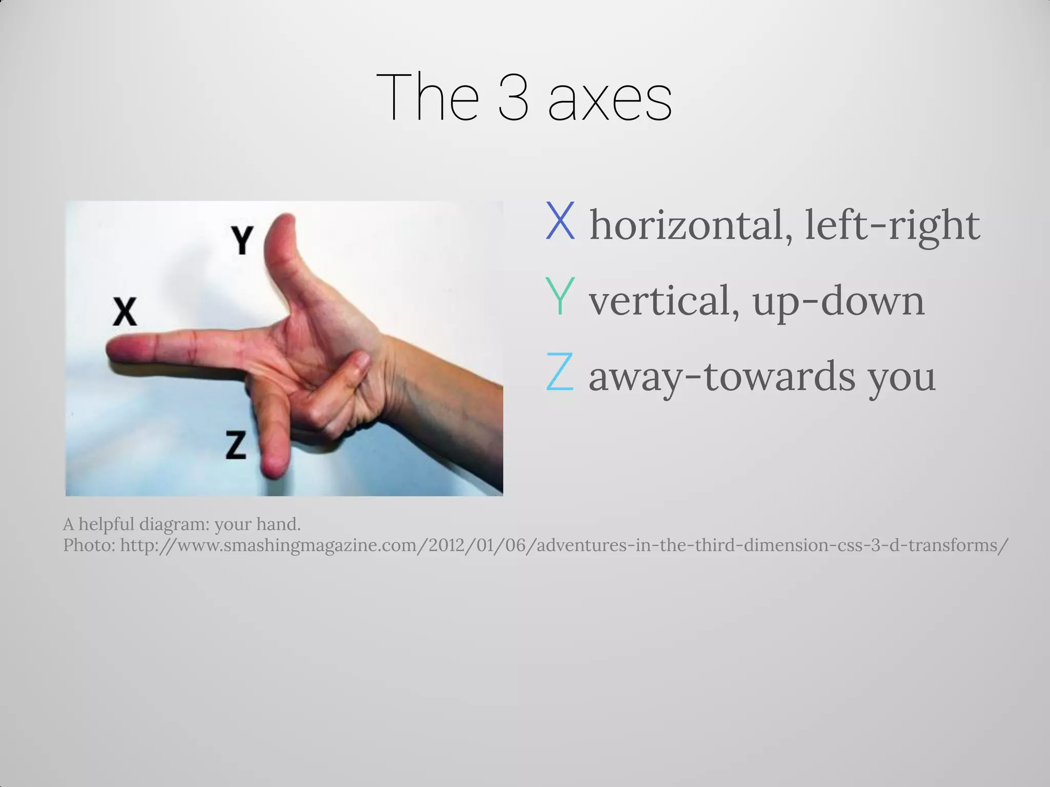
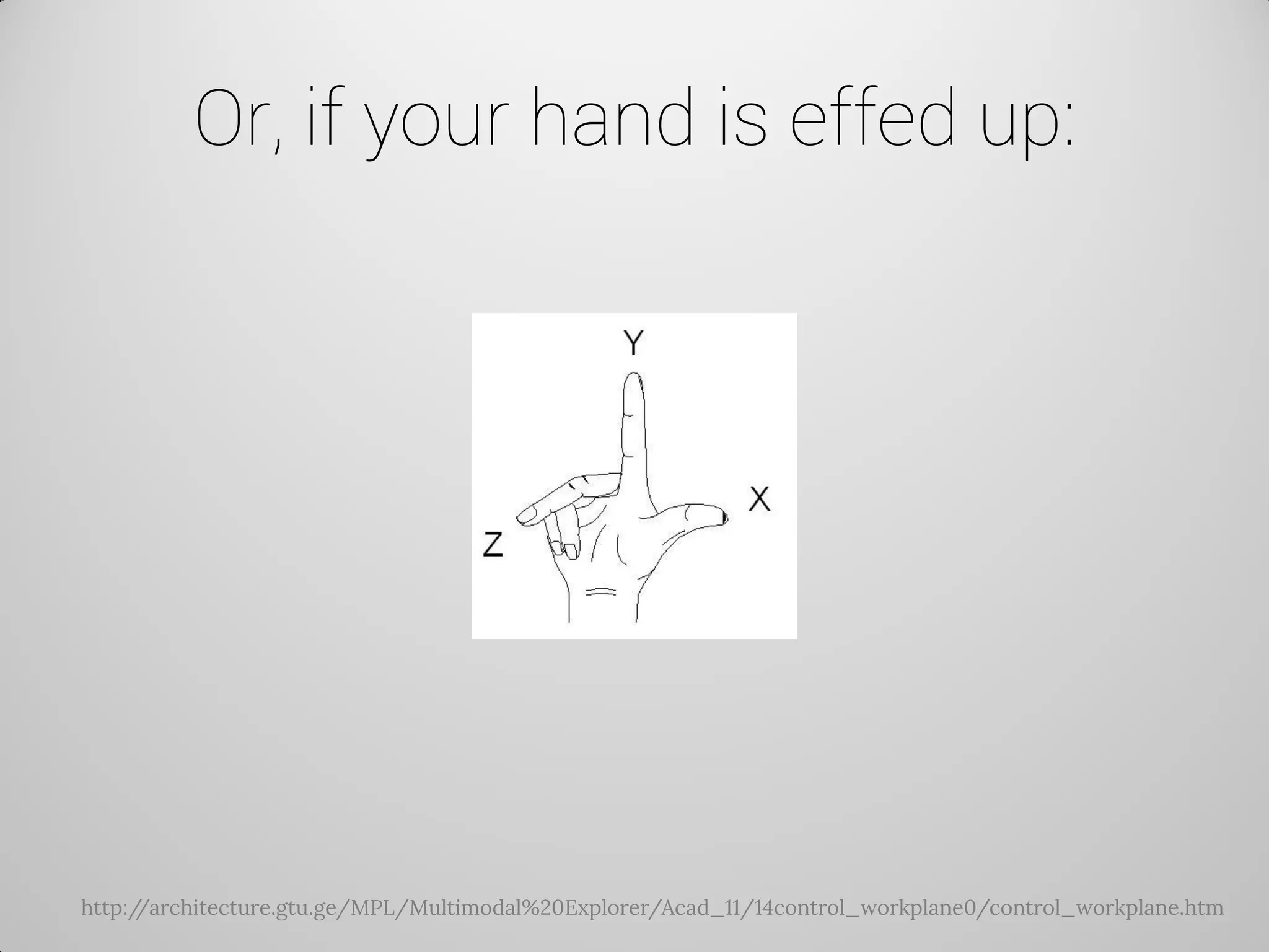
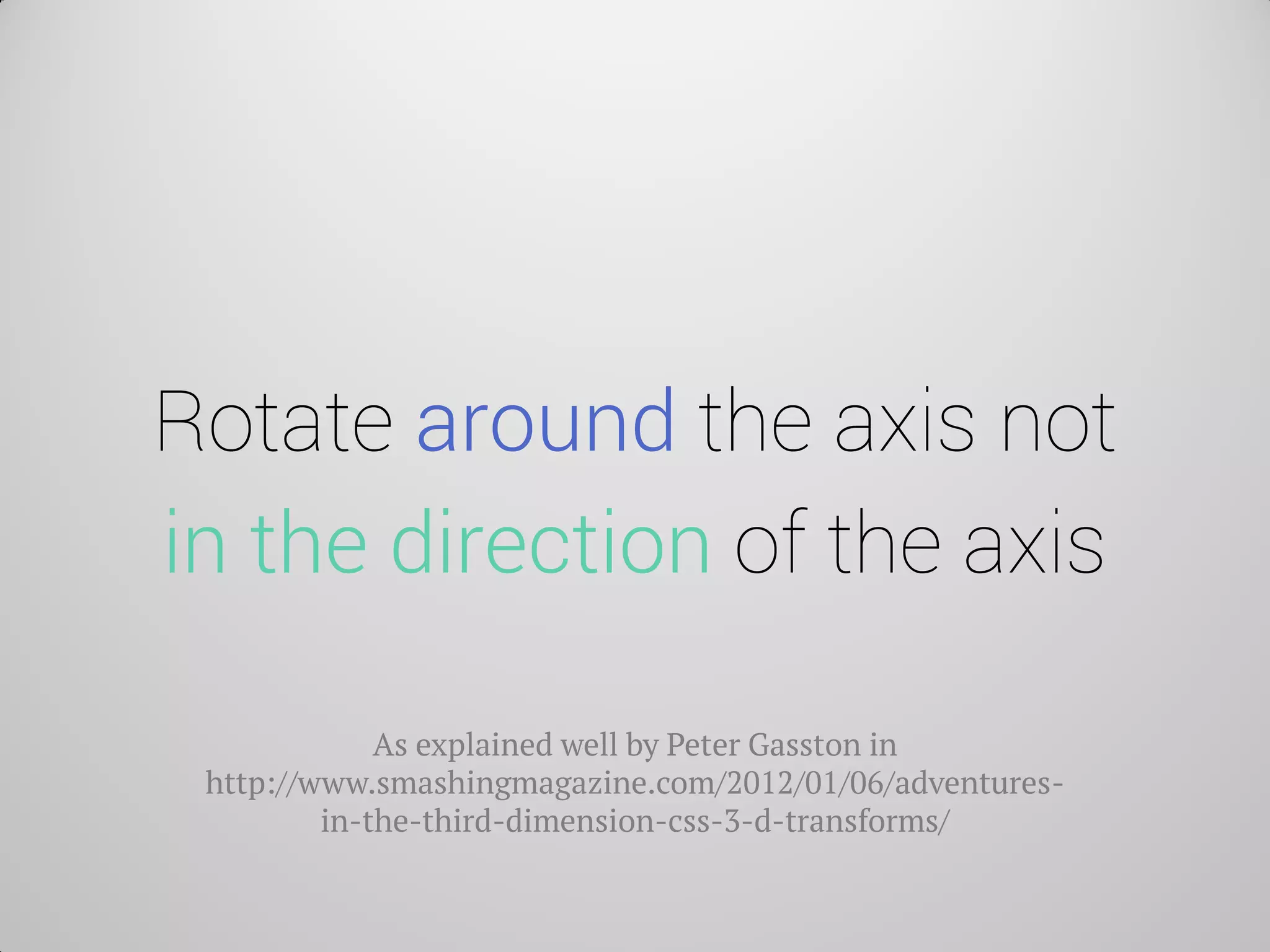
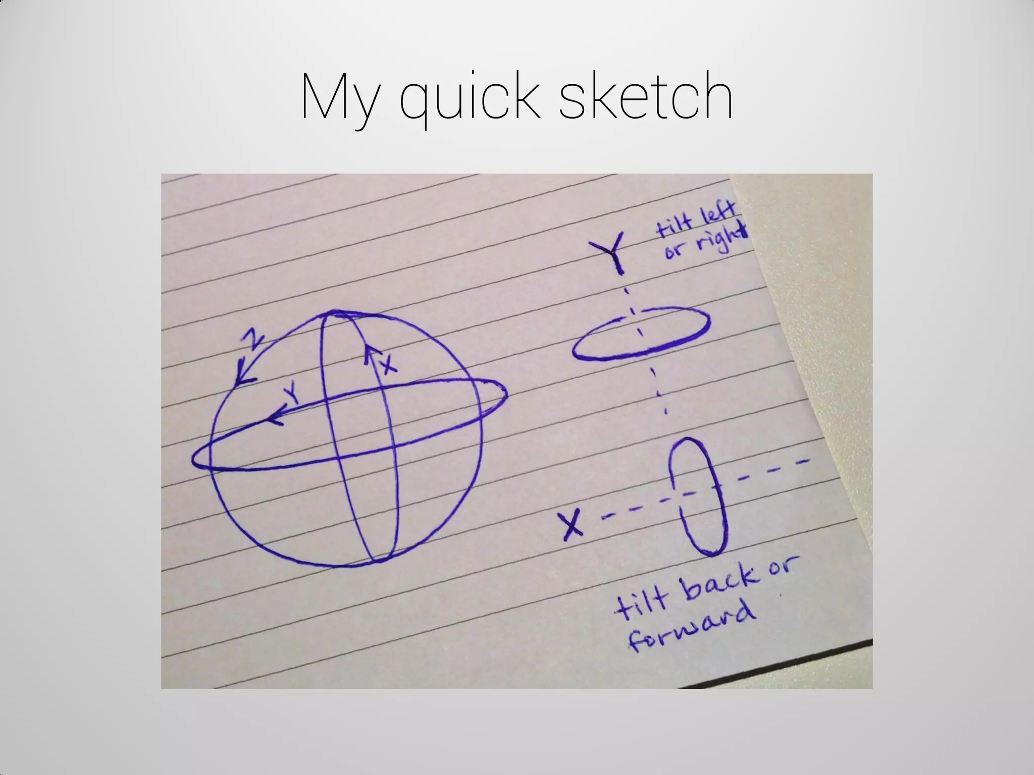
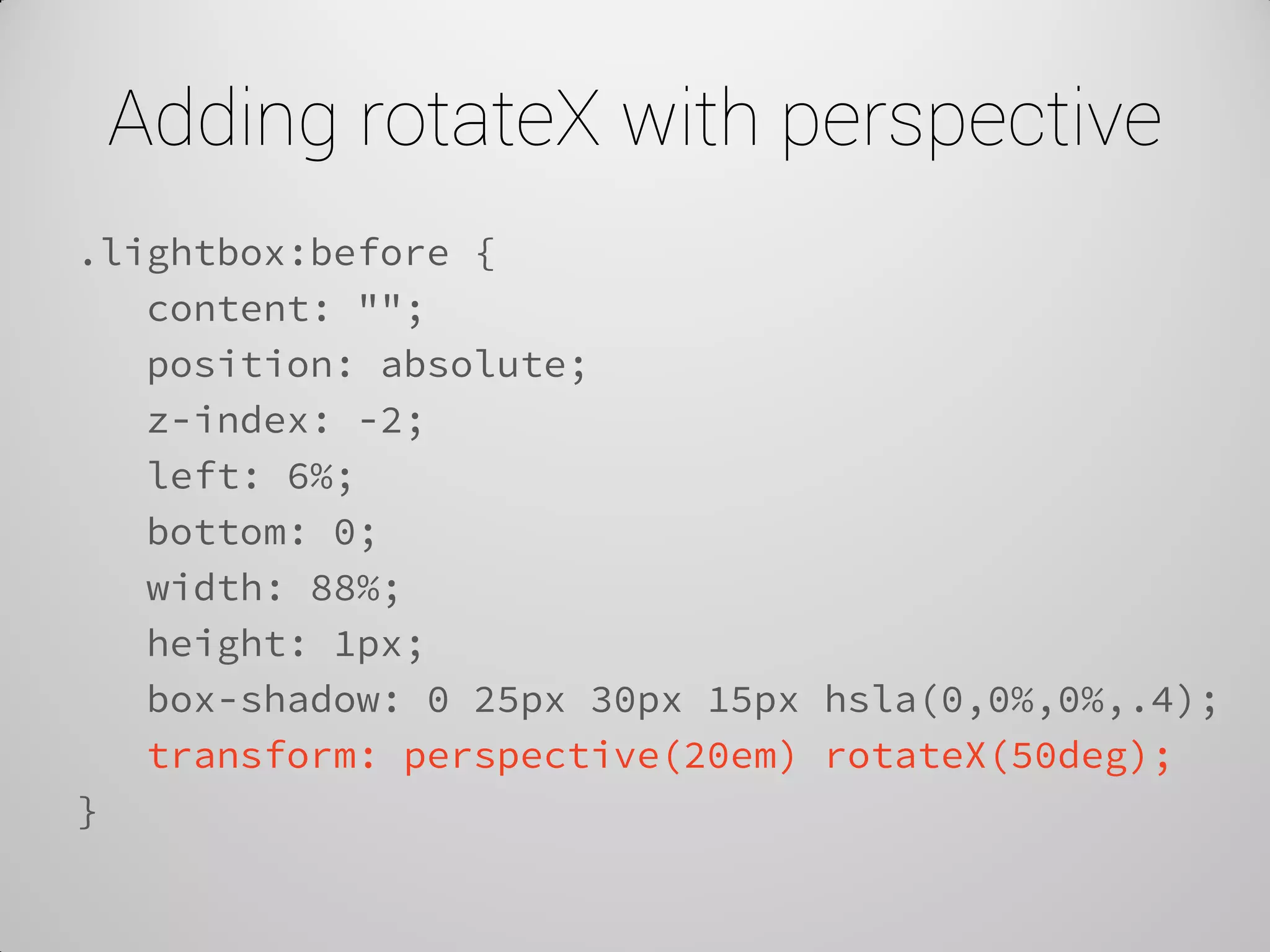
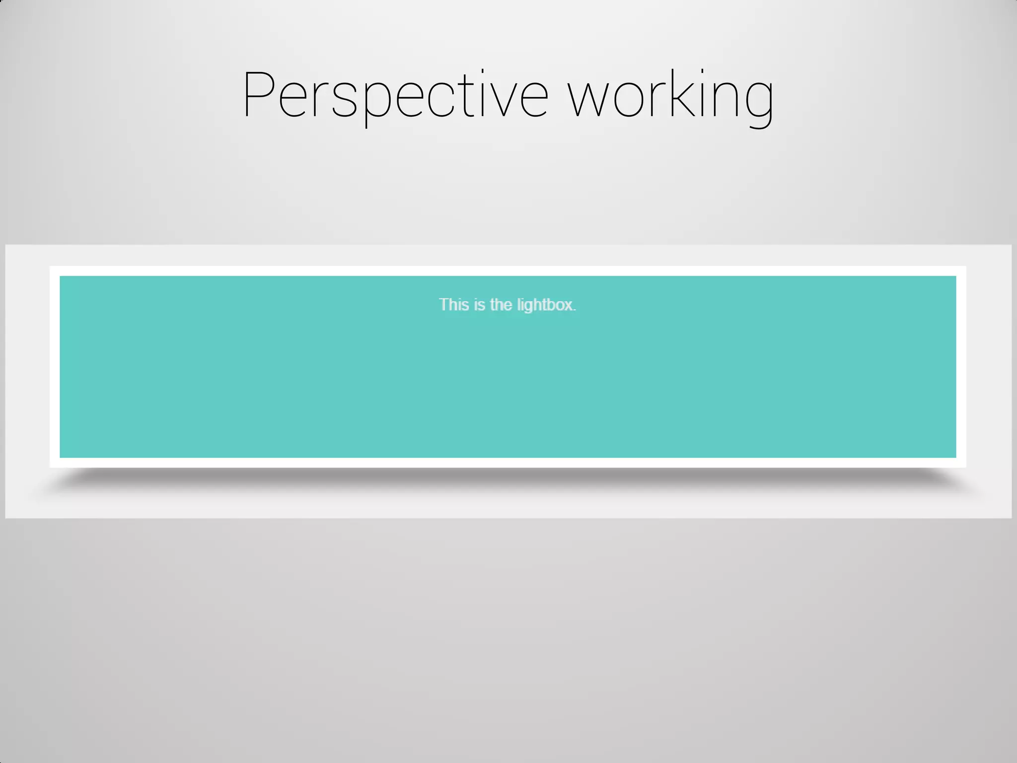
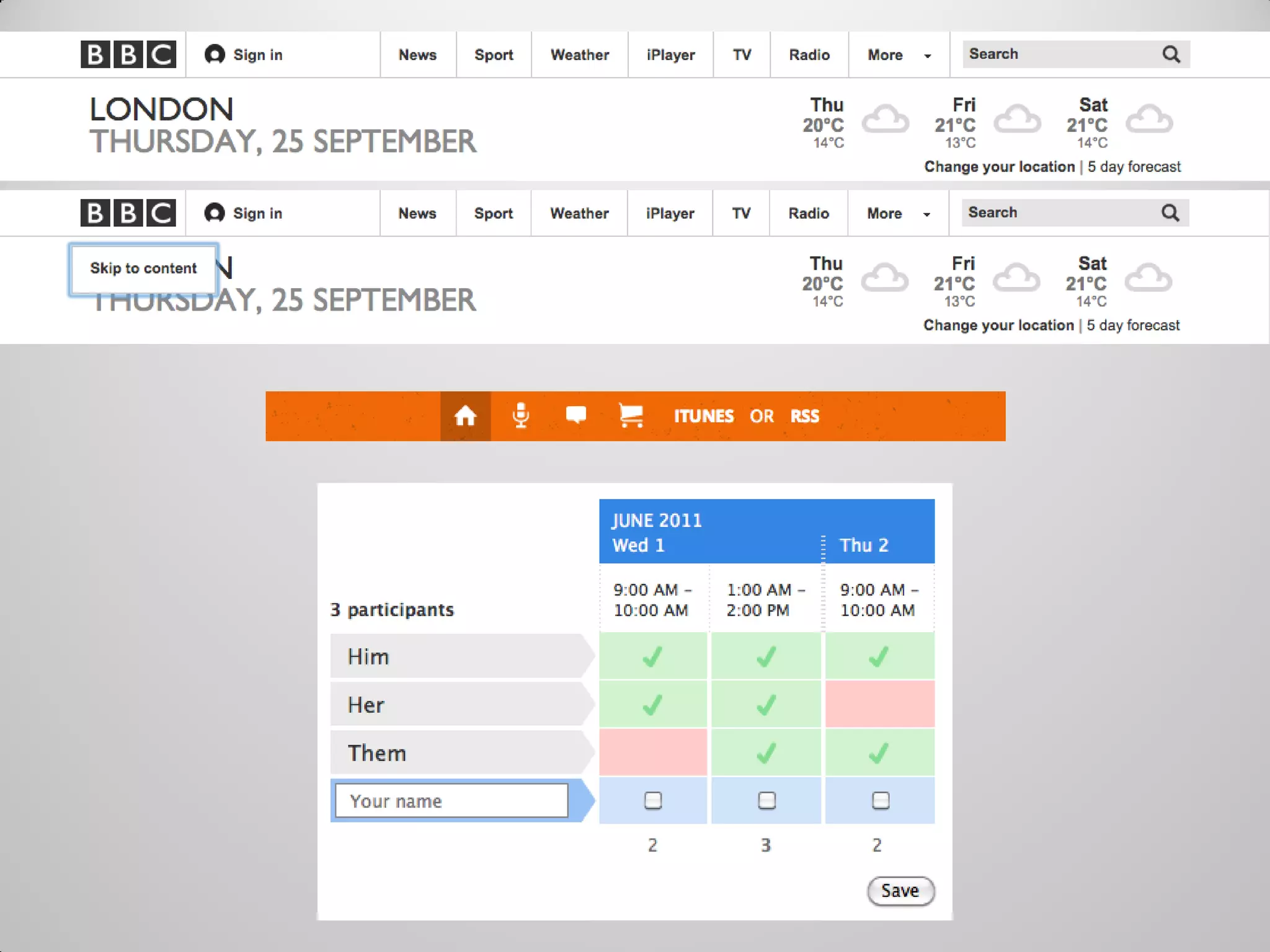
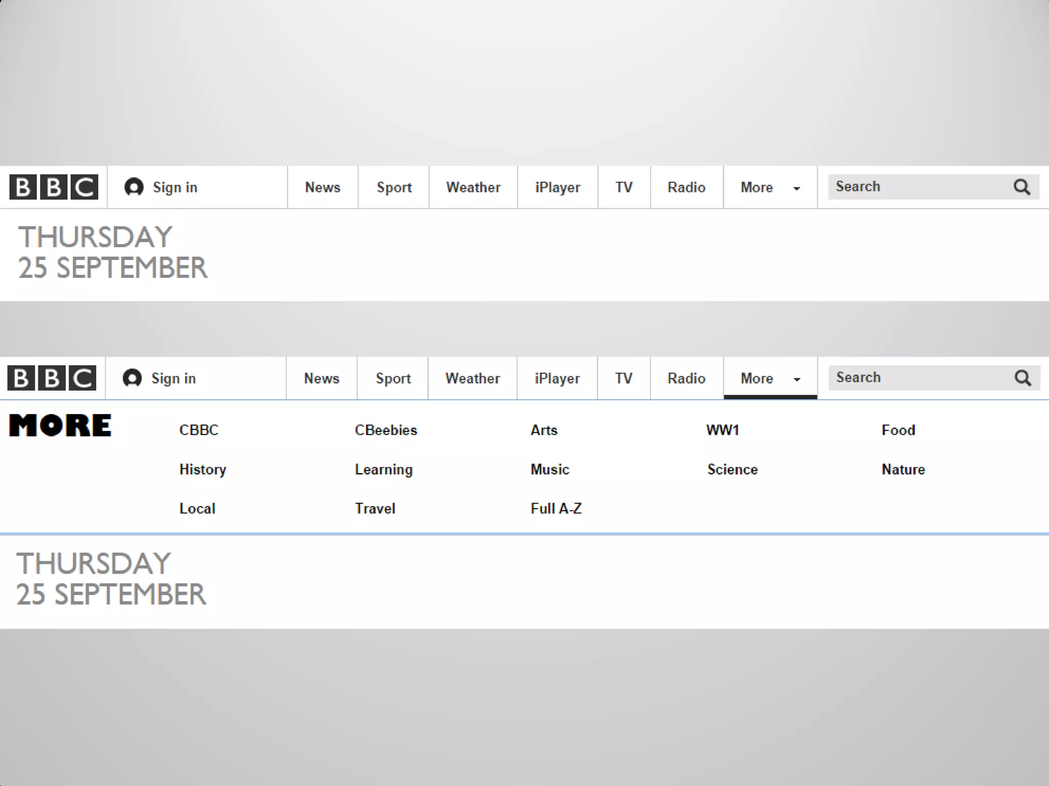
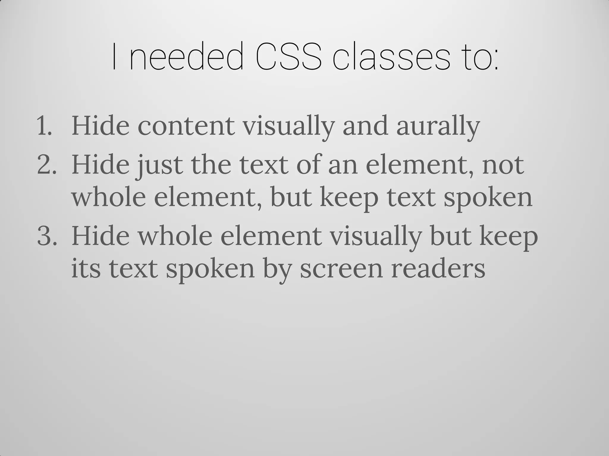
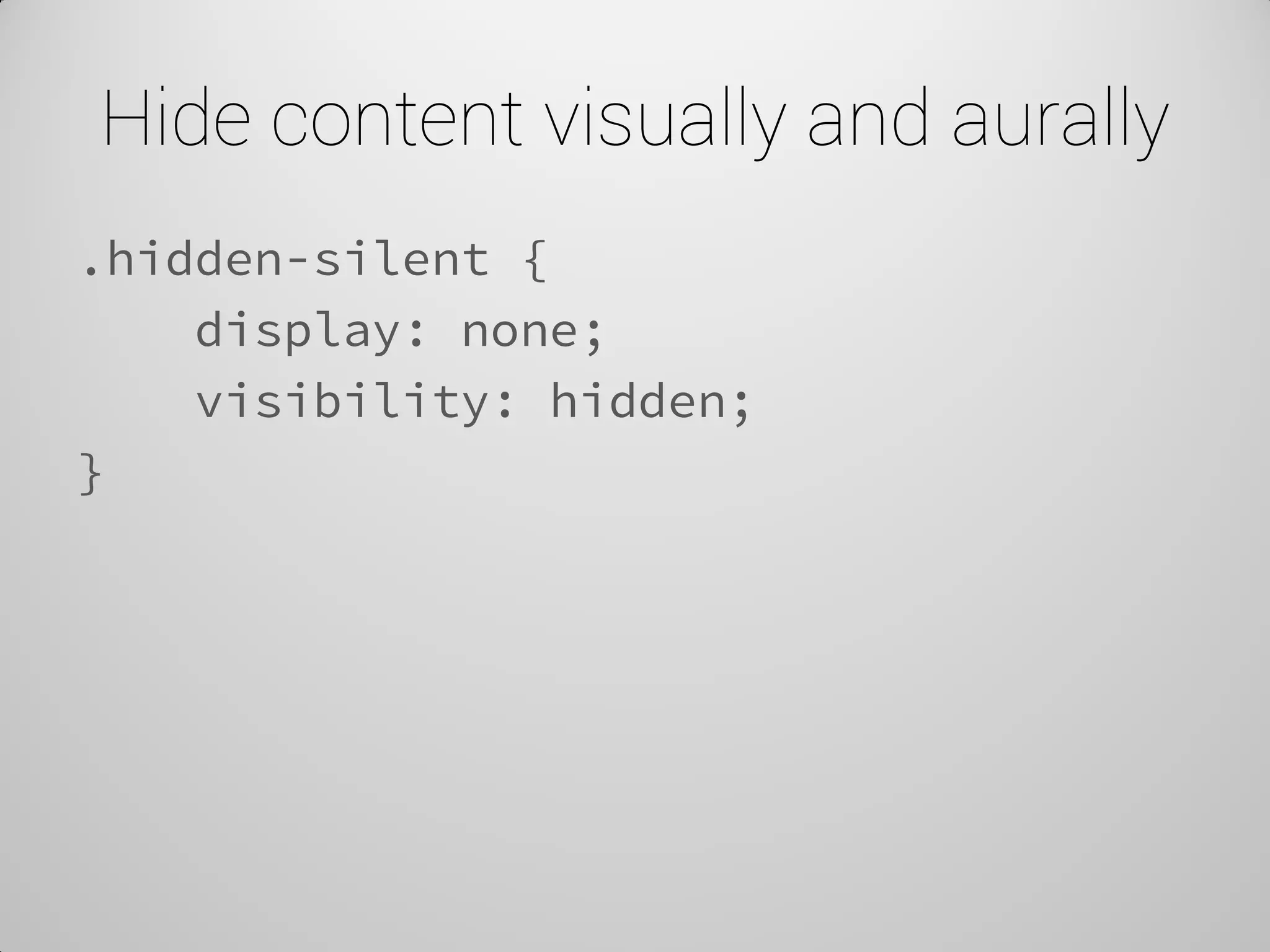
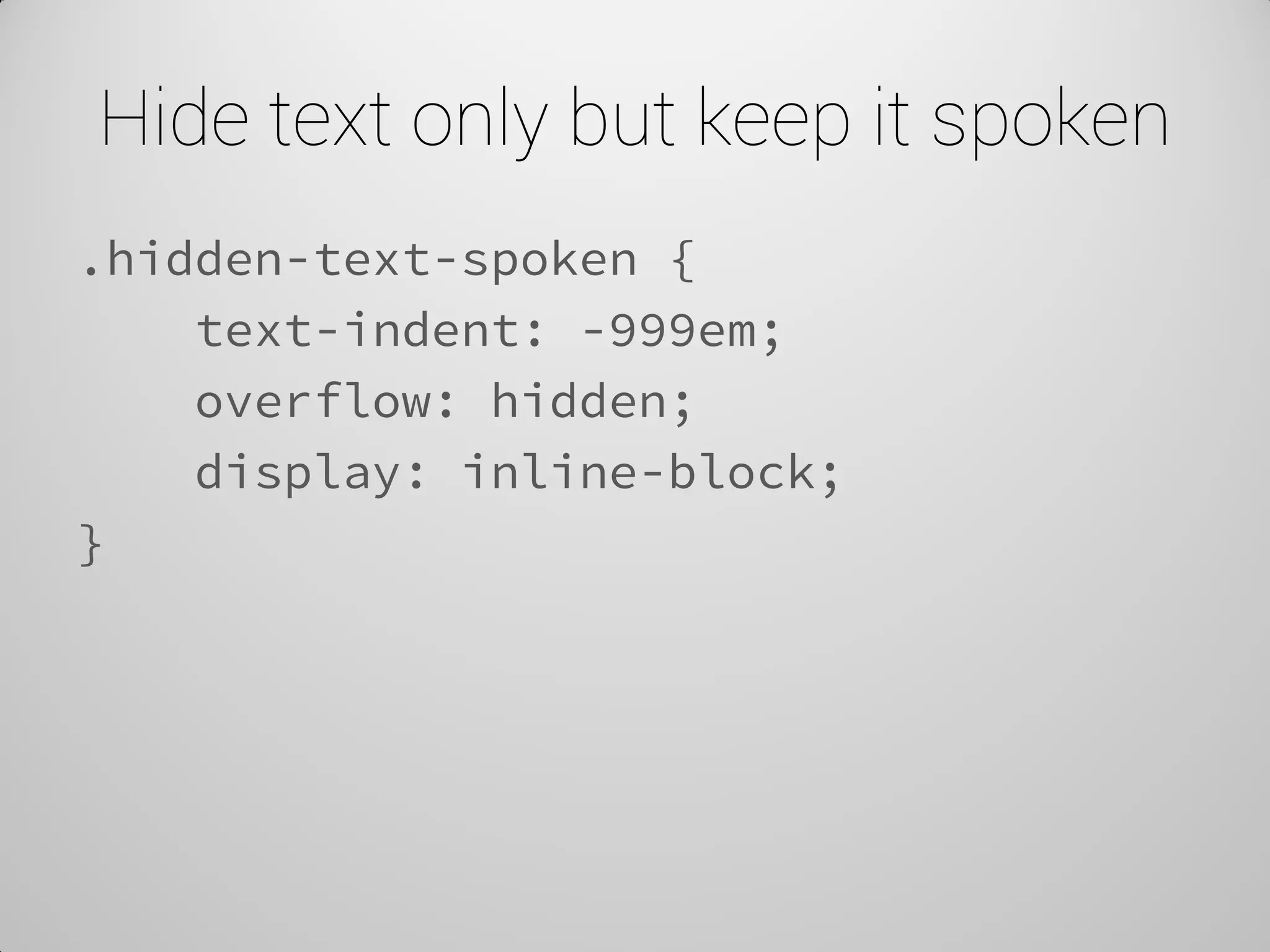
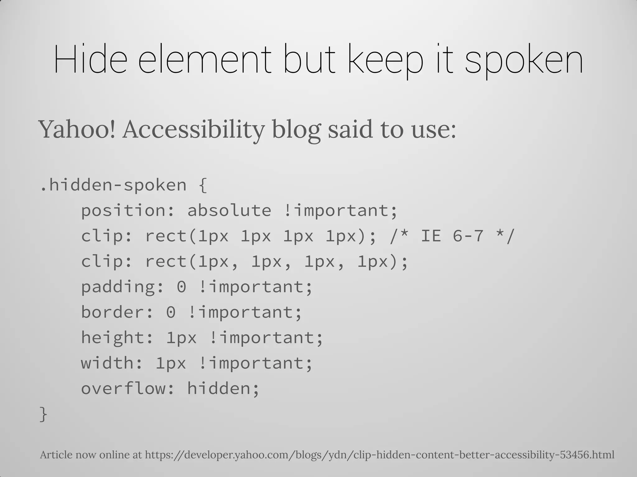
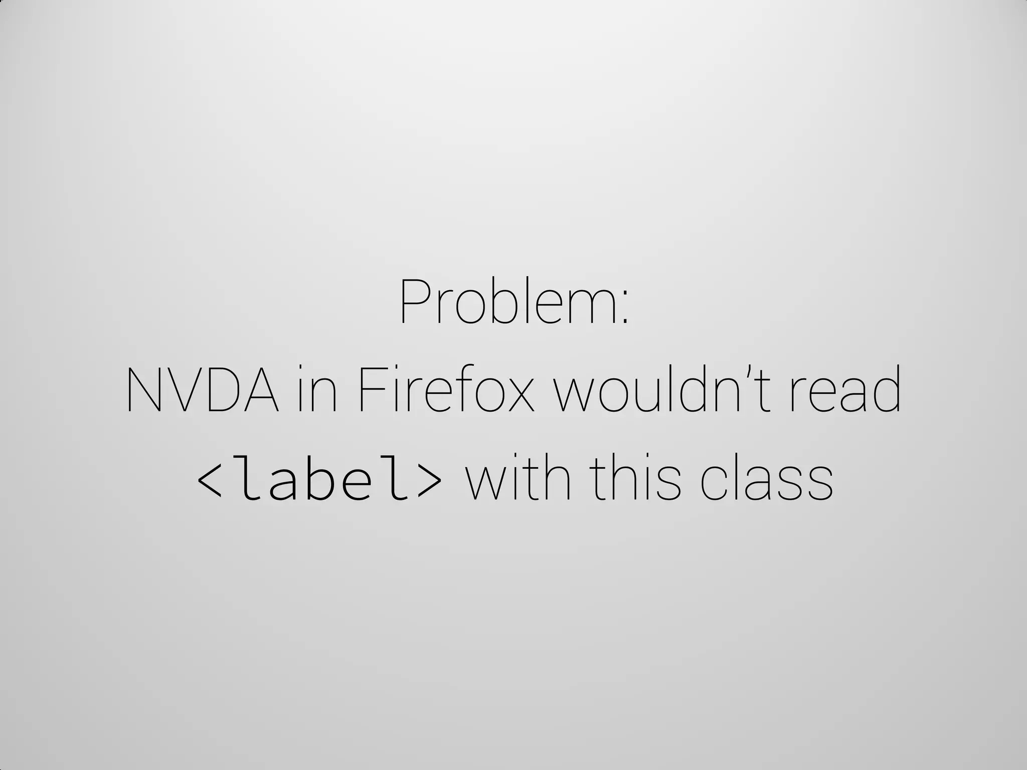

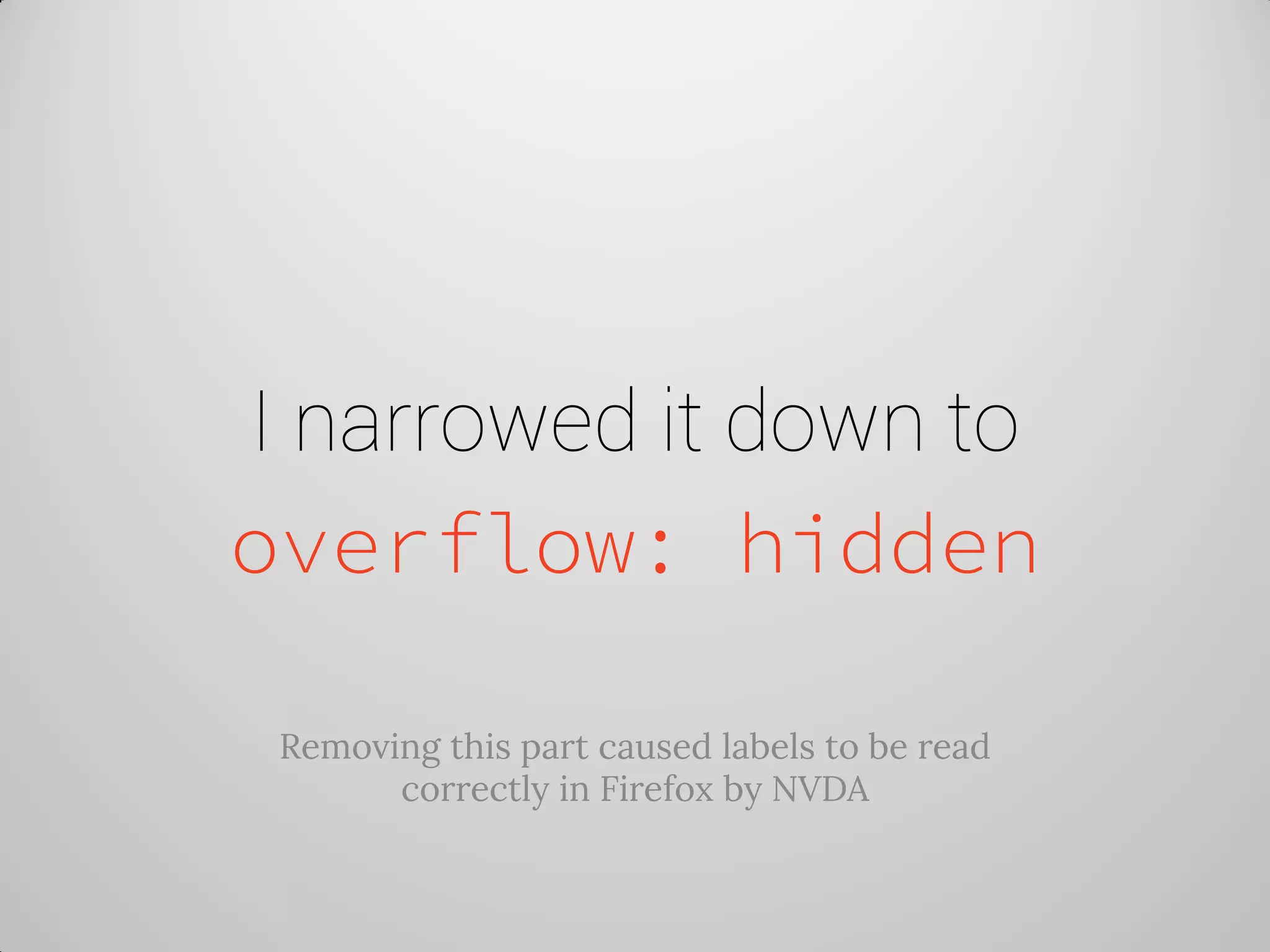
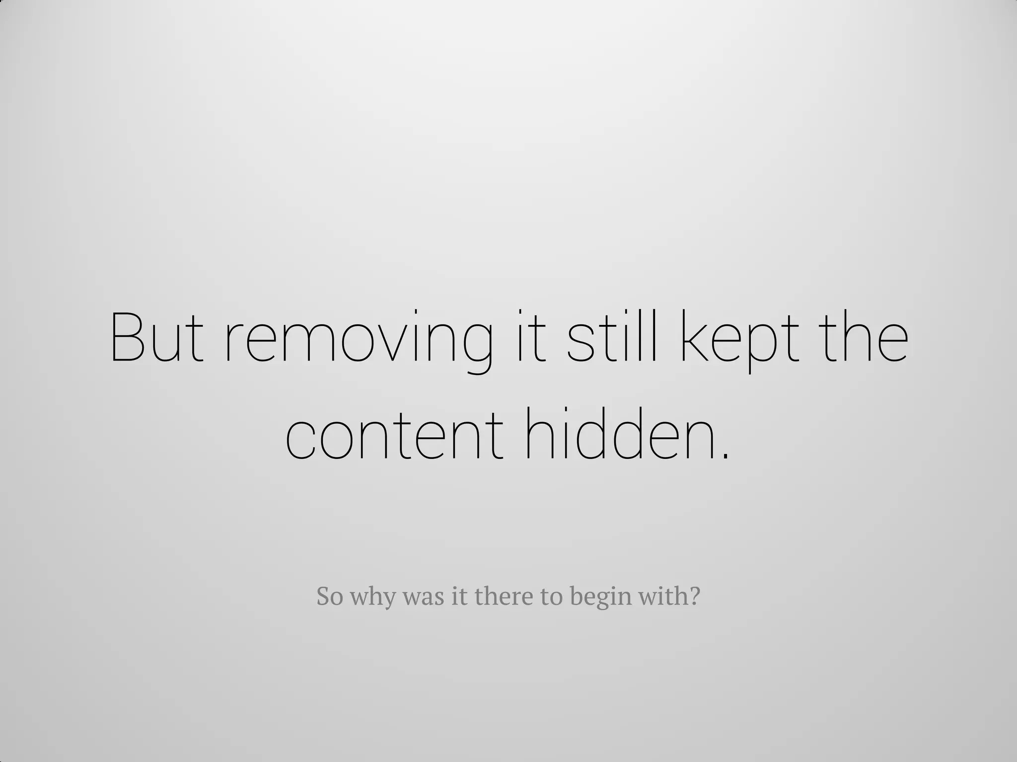
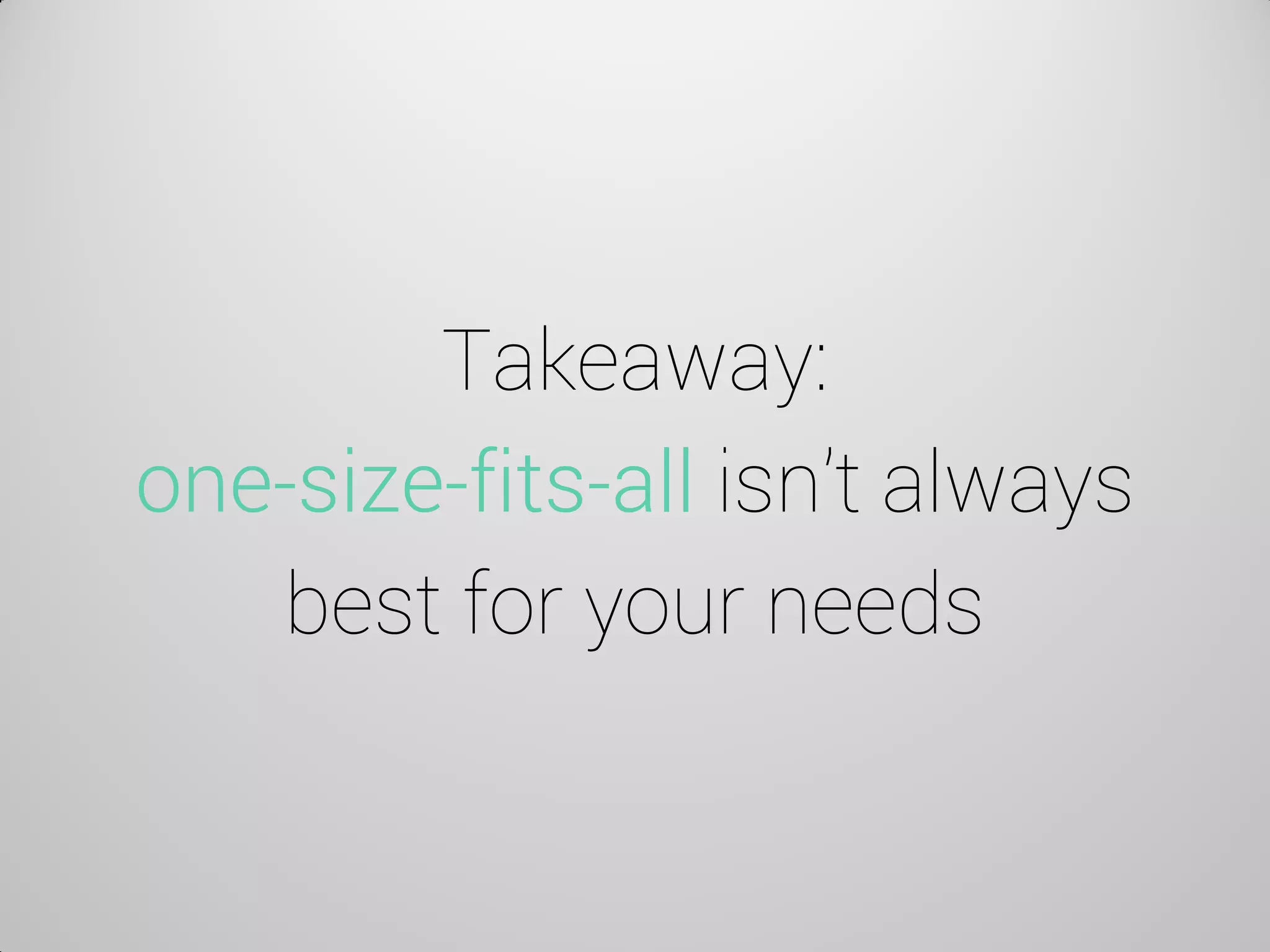
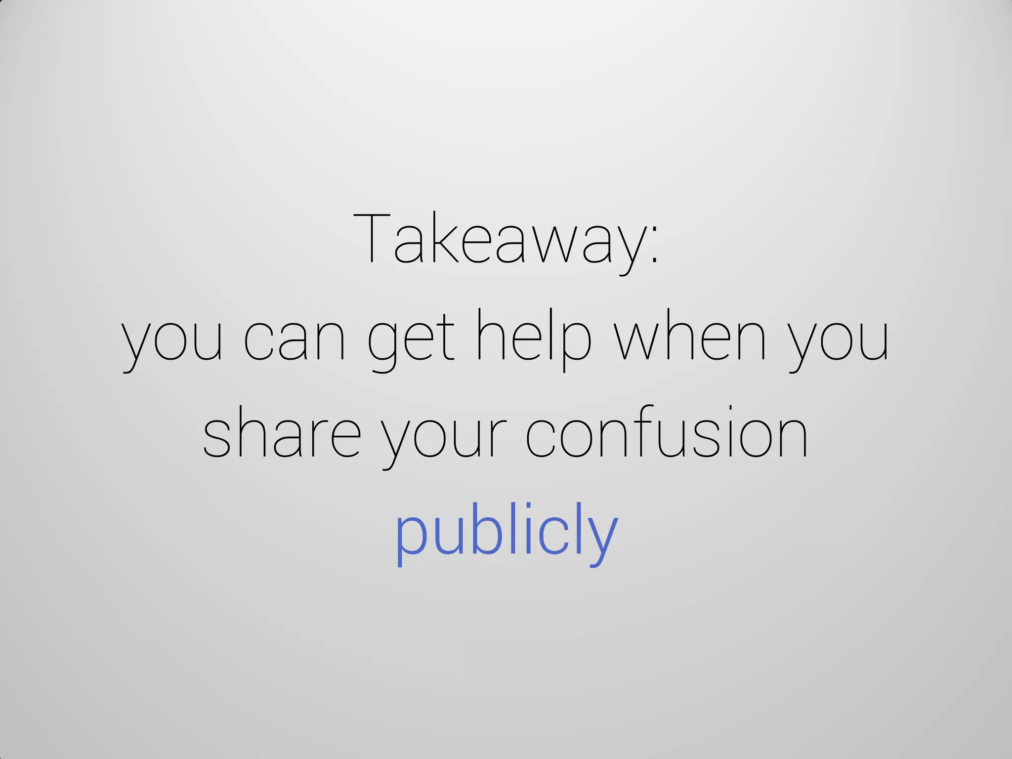

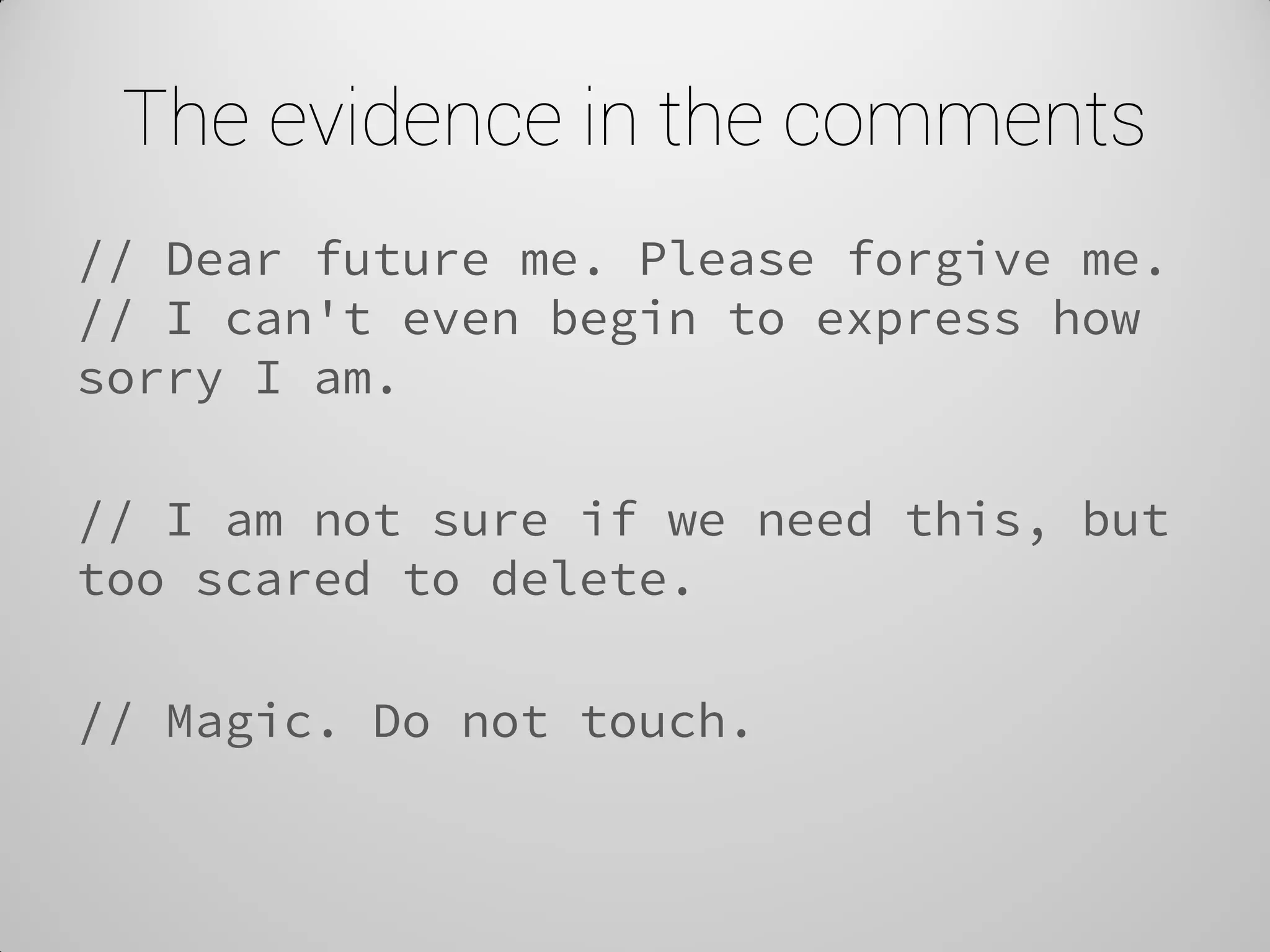
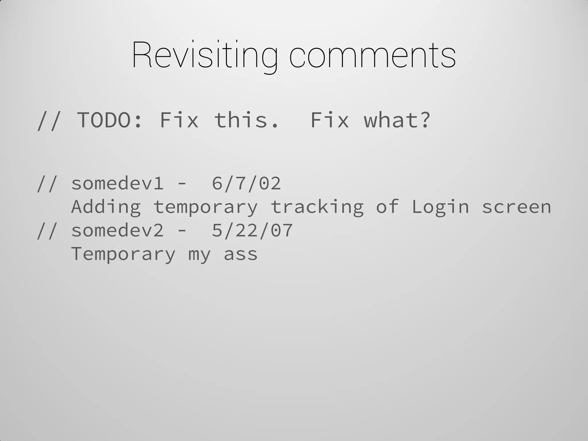
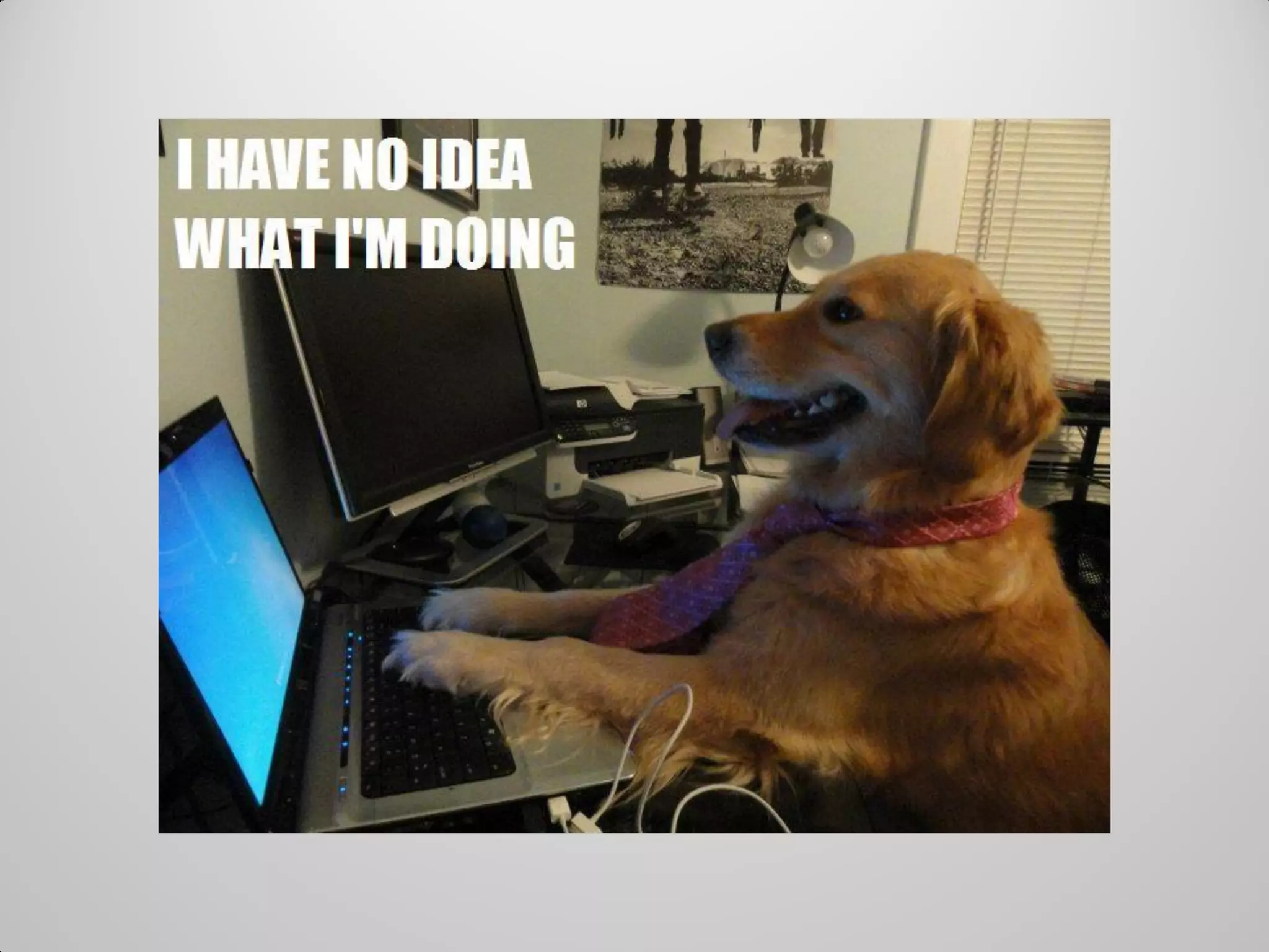
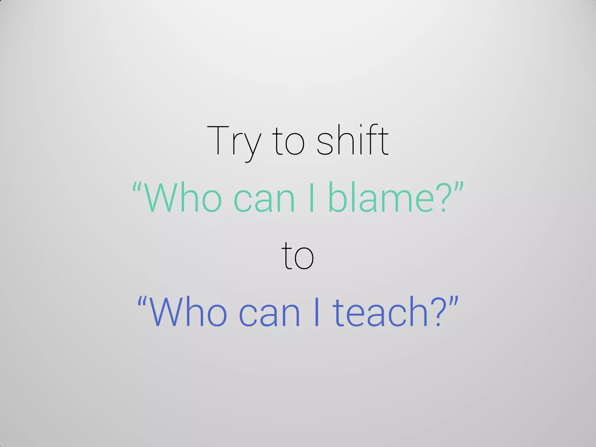
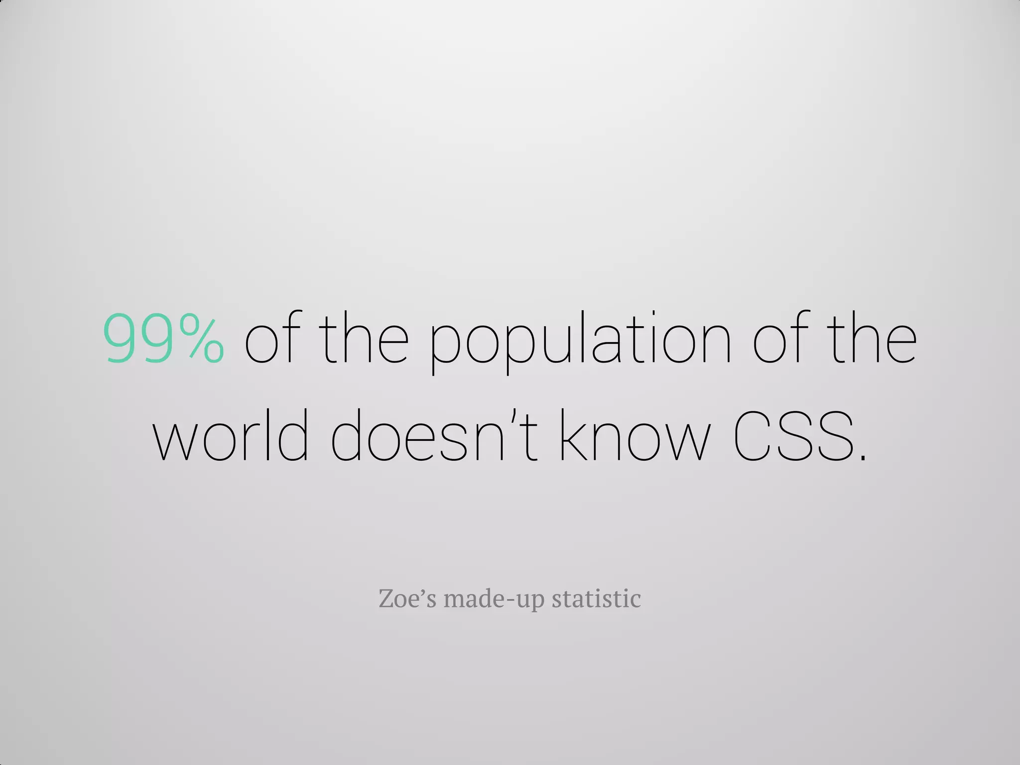
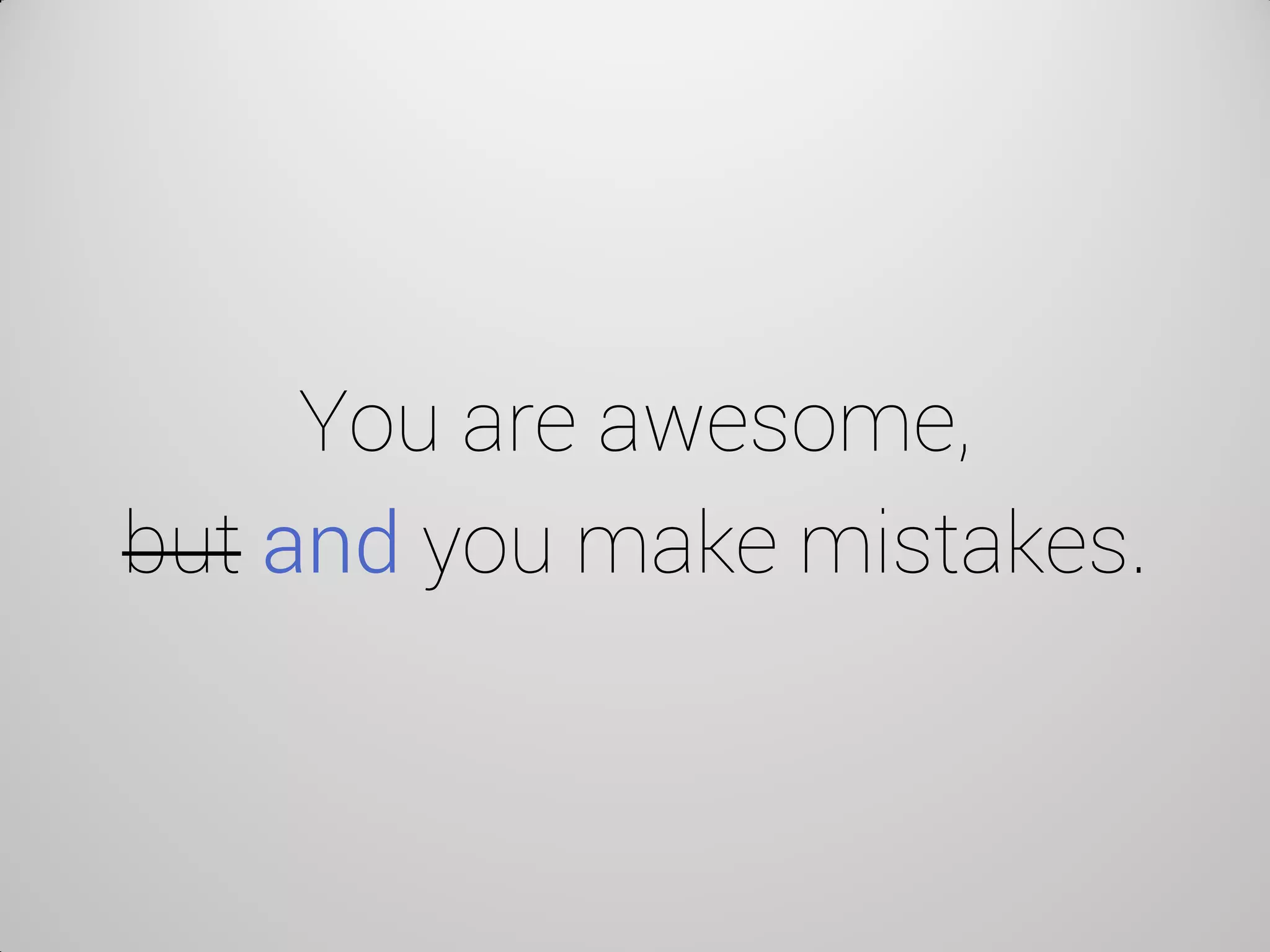
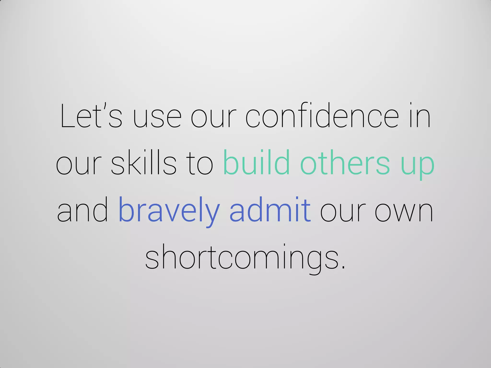

Zoe Mickley Gillenwater gave a talk at Generate Conference in London where she shared several mistakes she made while learning CSS flexbox and other techniques. These included misunderstanding how flex-basis works, incorrectly using CSS transforms like rotateX, and making assumptions about screen reader support that caused accessibility issues. She emphasized that vulnerability and sharing mistakes openly can help both oneself and others learn. Making mistakes is a natural part of the learning process, and perfection should not be expected or feared.


![[HEWEBAR 2012] Beyond Desktop Browsing (HTML5)](https://cdn.slidesharecdn.com/ss_thumbnails/hewebar-2012-beyond-desktop-browsing-120729151254-phpapp01-thumbnail.jpg?width=600ounds&width=560&fit=bounds)


