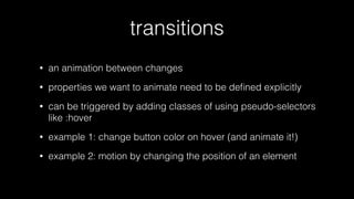
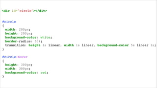
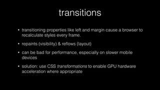
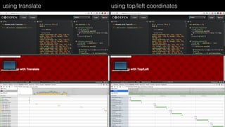
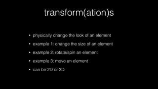
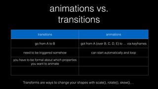
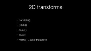
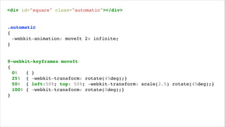
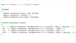
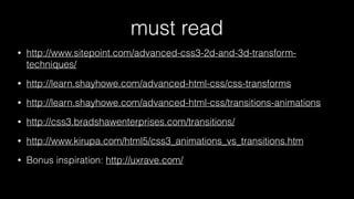
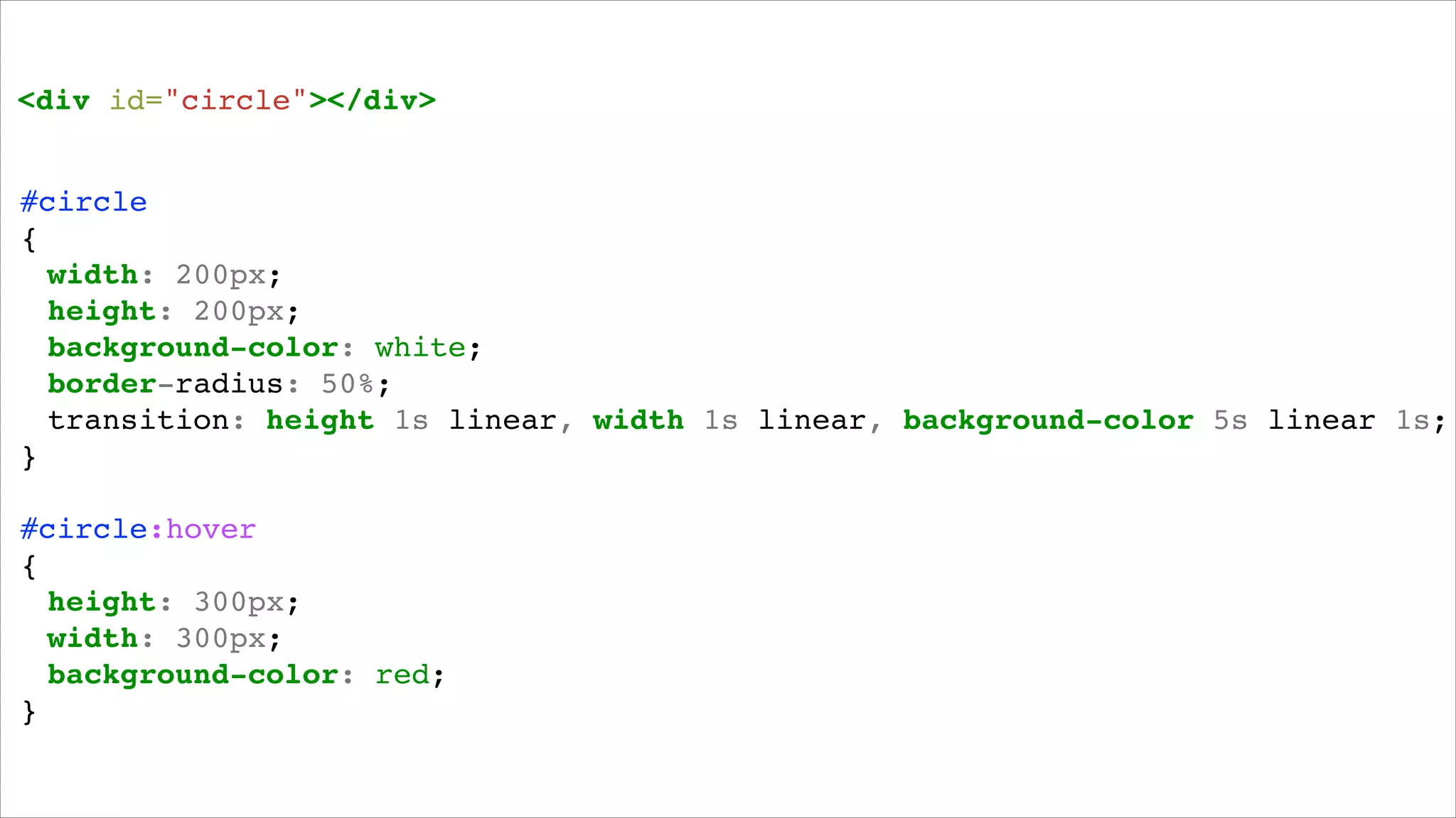
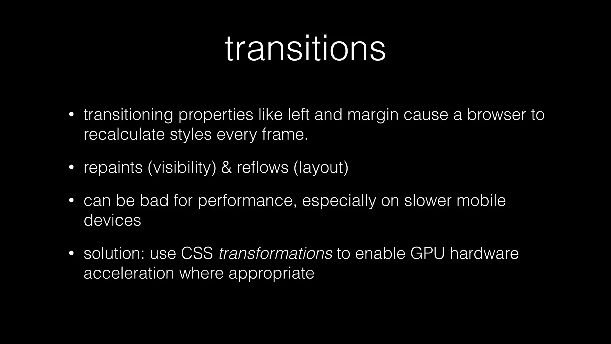
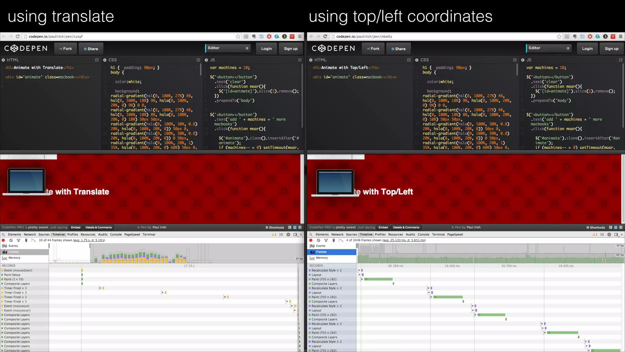
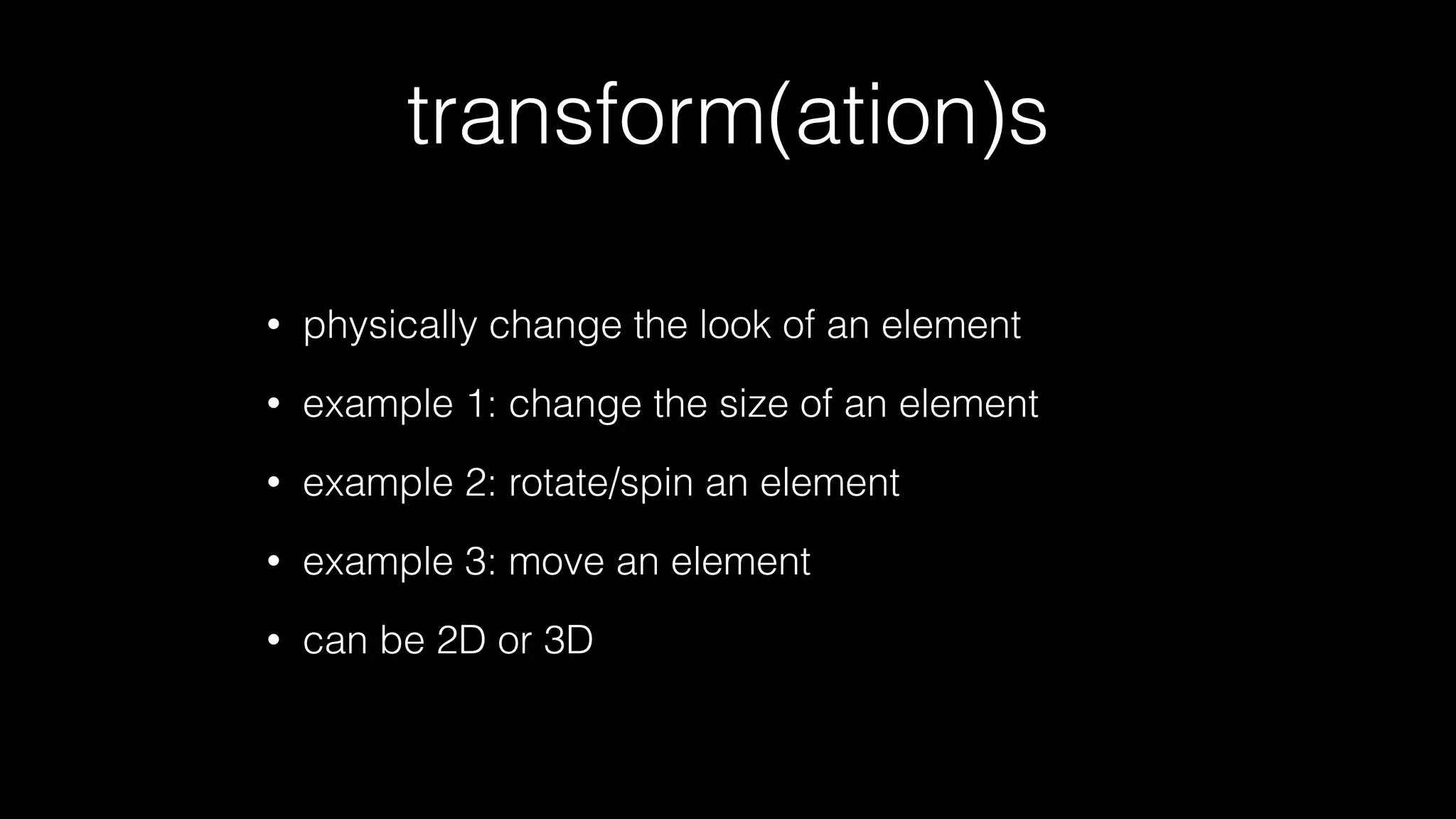
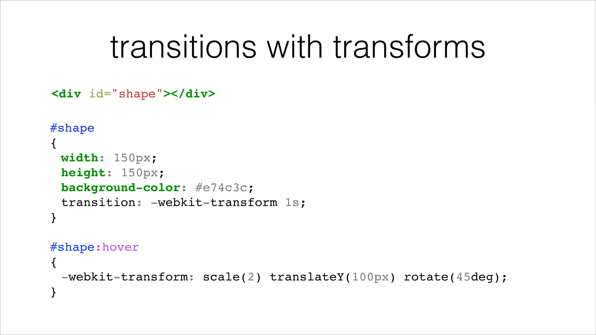
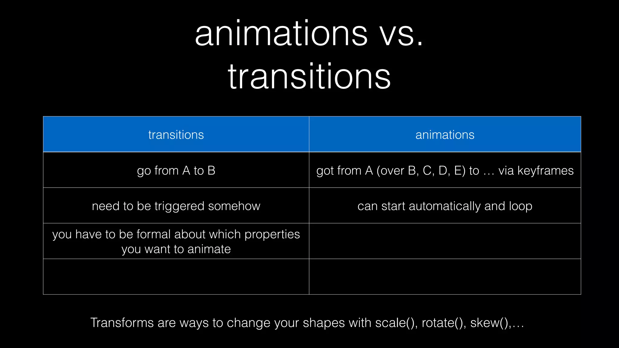
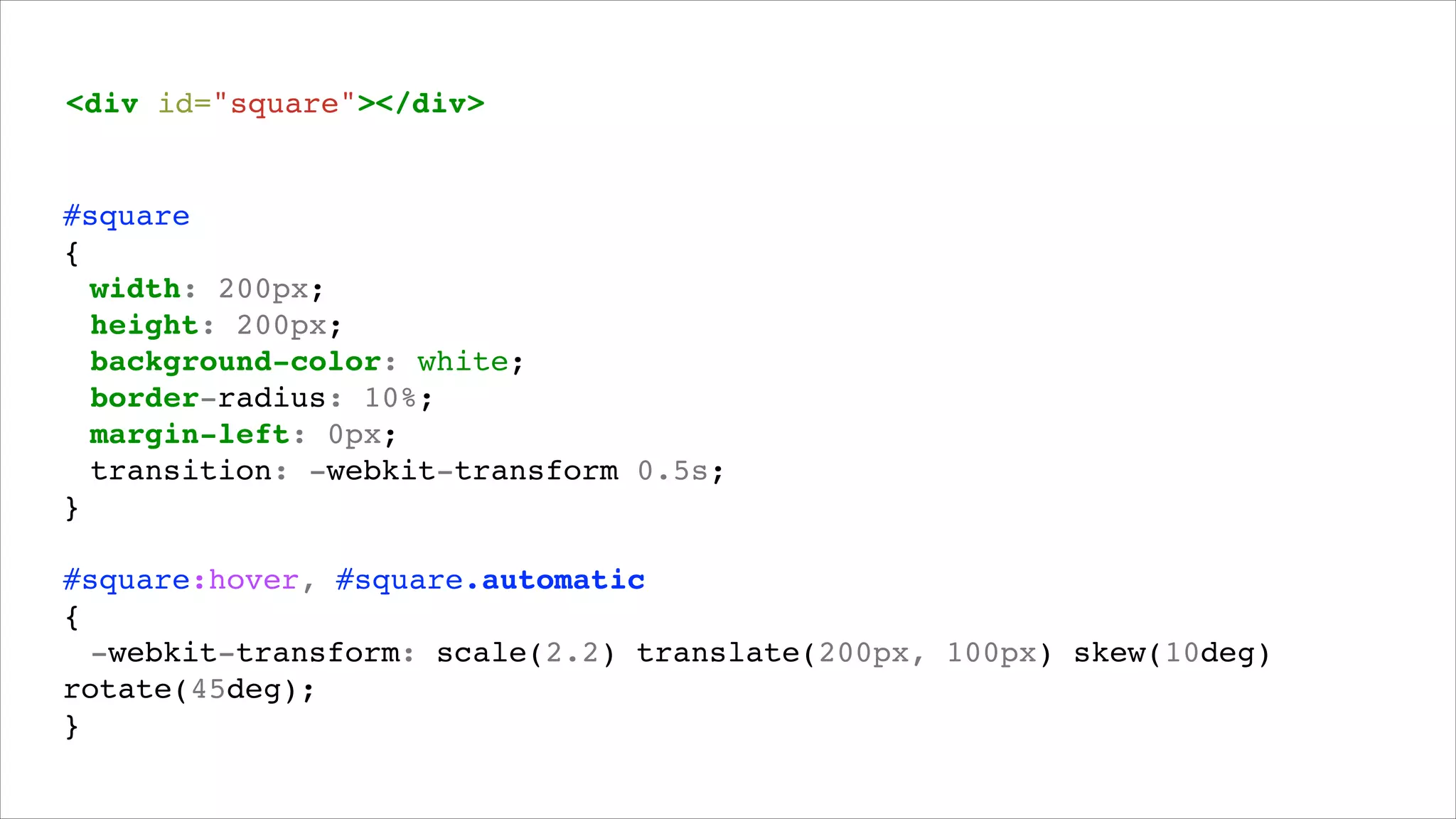
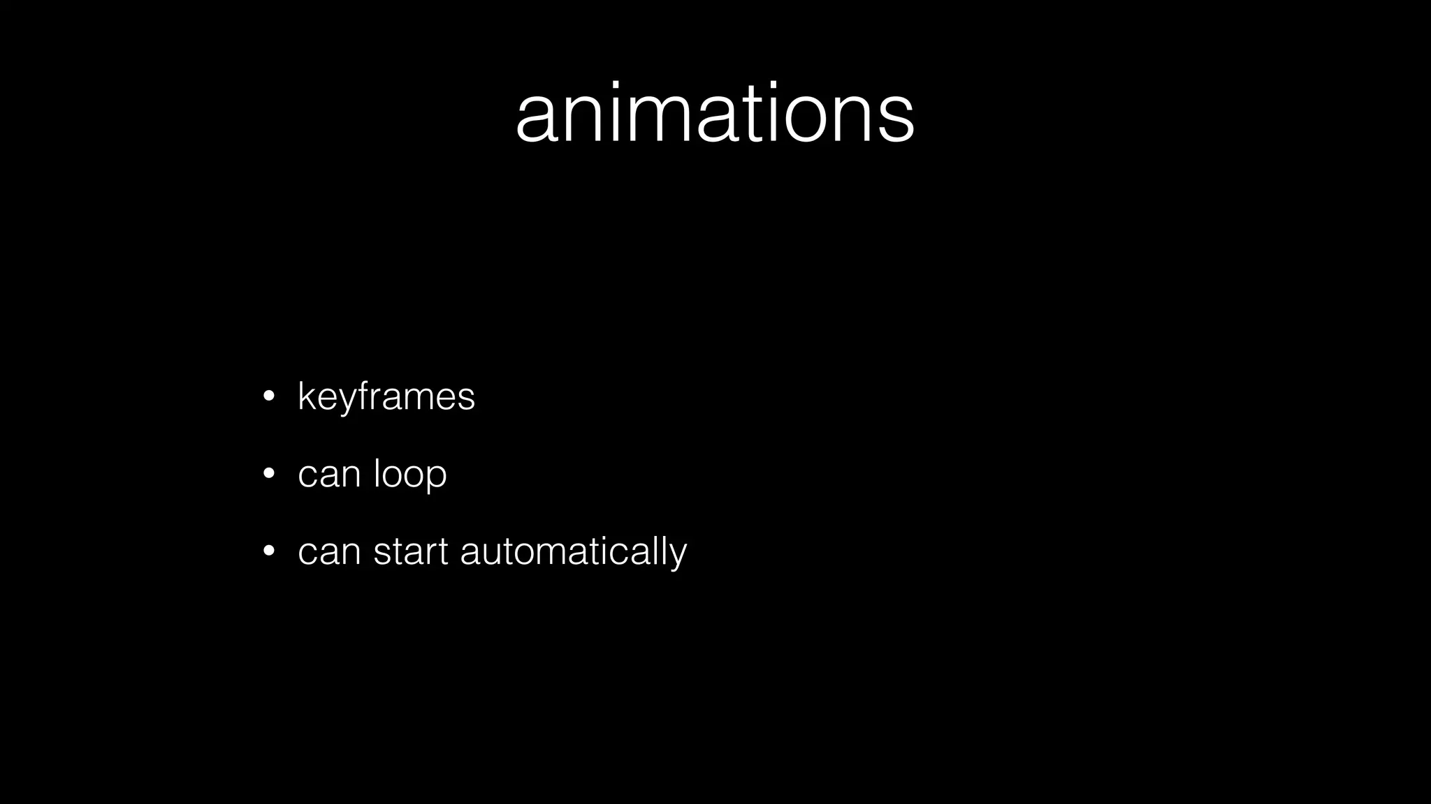
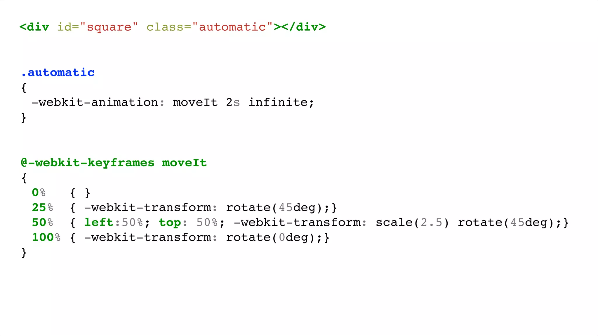
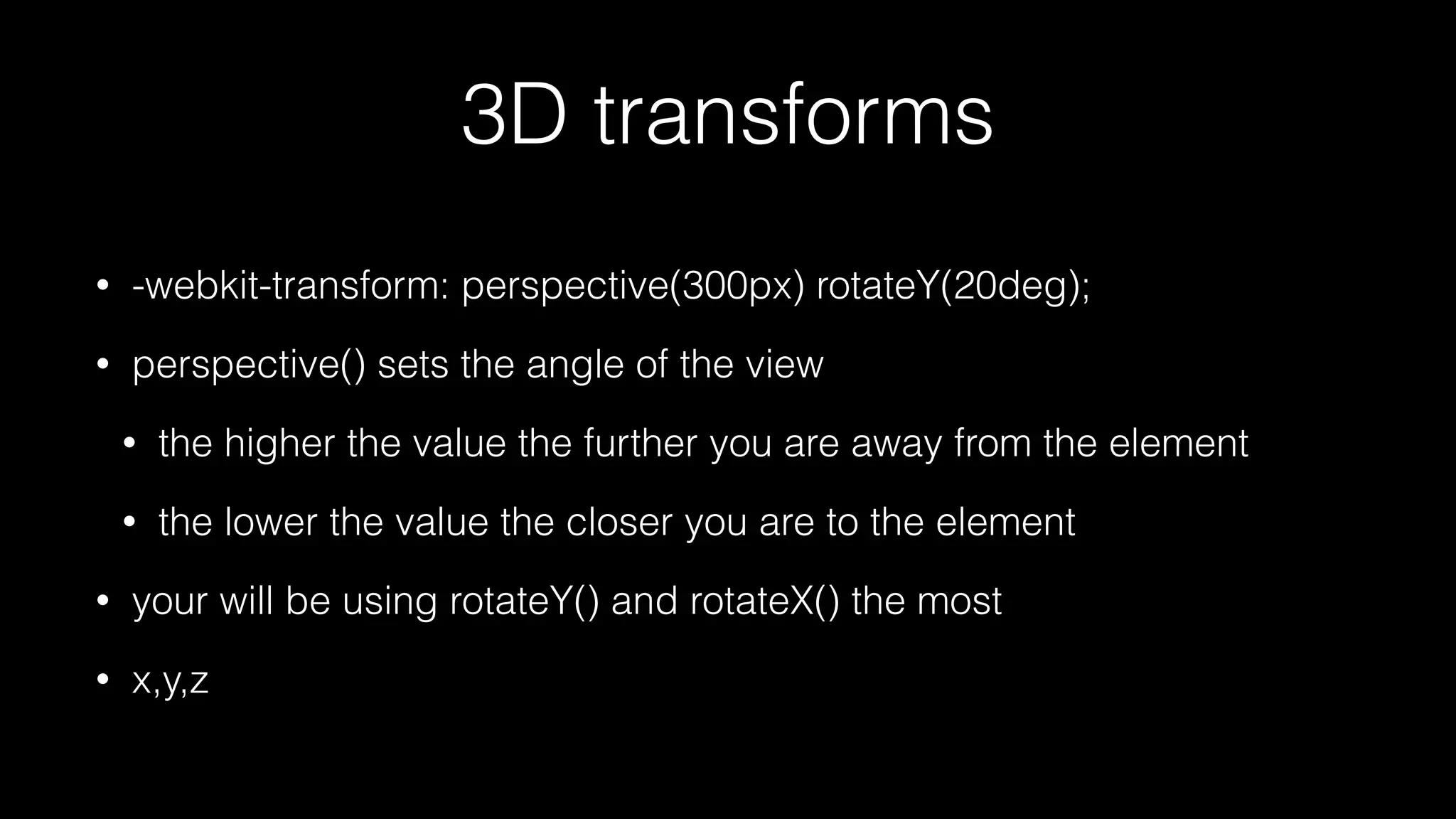
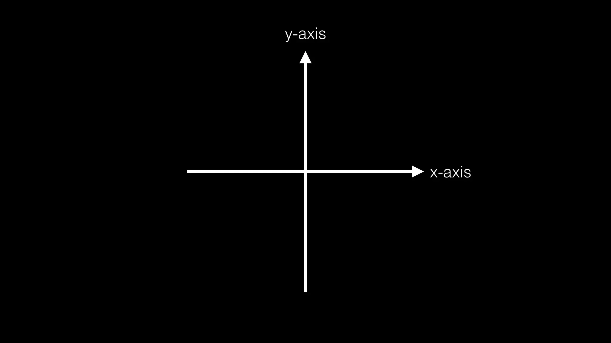
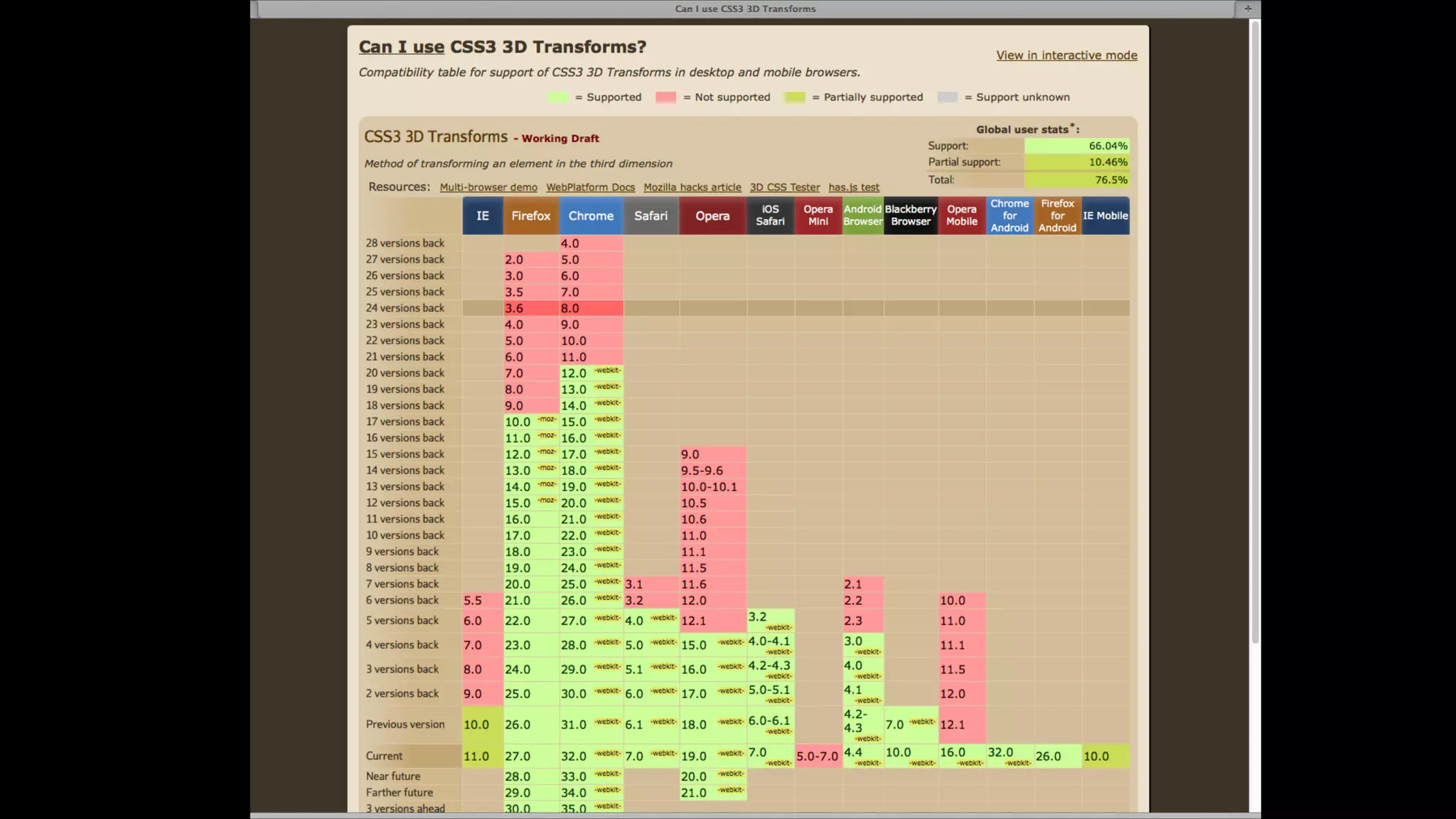
KEMBAR78
Mastering CSS Animations | PDF
Mastering CSS
animations and
transitions
About me
•

Hi, I’m GoodBytes

•

I teach web development to my Interactive Multimedia Design students in
Mechelen, Belgium. More info at http://www.weareimd.be

•

I’m a freelance web developer, get in touch via http://www.goodbytes.be
or just shoot me a message on Twitter @GoodBytes
About this slide deck
•

I used this slide deck during a workshop I gave about CSS
animations and uploaded them upon request

•

The slides will probably lose about 80% of their meaning without the
accompanying explanation and demo’s given during the workshop

•

All screenshots you see are actually video’s to demo an animation.
Like I said, this deck will lose about 80% of its meaning without the
videos and matching explanation

•

If you’d like to get a thorough workshop about CSS animations, feel
free to get in touch with me at http://www.goodbytes.be
When was the last time something
on the web delighted you?
http://uxrave.com/
http://uxrave.com/
Live icon

http://dribbble.com/pattern
http://space.angrybirds.com/launch/

http://joelb.me/scrollpath/
http://dribbble.com/shots/419244-Login-animation
http://www.smashingmagazine.com
animations, transitions,
transformations,
translates
you will be creating animations
where you call a transform that
uses a translate function
transitions
•

an animation between changes

•

properties we want to animate need to be defined explicitly

•

can be triggered by adding classes of using pseudo-selectors
like :hover

•

example 1: change button color on hover (and animate it!)

•

example 2: motion by changing the position of an element
transitions

•

transition: property duration timing-function delay;

transition: background-color 5s linear 1s;
<div id="circle"></div>!

#circle!
{!
! width: 200px;!
! height: 200px;!
! background-color: white;!
! border-radius: 50%;!
! transition: height 1s linear, width 1s linear, background-color 5s linear 1s;!
}!
!

#circle:hover!
{!
! height: 300px;!!
! width: 300px;!
! background-color: red;!
}!
transitions
•

transitioning properties like left and margin cause a browser to
recalculate styles every frame.

•

repaints (visibility) & reflows (layout)

•

can be bad for performance, especially on slower mobile
devices

•

solution: use CSS transformations to enable GPU hardware
acceleration where appropriate
using translate

using top/left coordinates
transform(ation)s
•

physically change the look of an element

•

example 1: change the size of an element

•

example 2: rotate/spin an element

•

example 3: move an element

•

can be 2D or 3D
transitions with transforms
<div id="shape"></div>!
#shape!
{!
! width: 150px;!
! height: 150px;!
! background-color: #e74c3c;!
! transition: -webkit-transform 1s;!
}!
!

#shape:hover!
{!
! -webkit-transform: scale(2) translateY(100px) rotate(45deg);!
}!
you will be creating animations
where you call a transform that
uses a translate function
animations vs.
transitions
transitions

animations

go from A to B

got from A (over B, C, D, E) to … via keyframes

need to be triggered somehow

can start automatically and loop

you have to be formal about which properties
you want to animate

Transforms are ways to change your shapes with scale(), rotate(), skew(),…
2D transforms
•

translate()

•

rotate()

•

scale()

•

skew()

•

matrix() = all of the above
<div id="square"></div>!

#square!
{!
! width: 200px;!
! height: 200px;!
! background-color: white;!
! border-radius: 10%;!
! margin-left: 0px;!
! transition: -webkit-transform 0.5s;!
}!
!

#square:hover, #square.automatic!
{!
! -webkit-transform: scale(2.2) translate(200px, 100px) skew(10deg)
rotate(45deg);!
}!
animations

•

keyframes

•

can loop

•

can start automatically
<div id="square" class="automatic"></div>!

.automatic!
{!
! -webkit-animation: moveIt 2s infinite;!
}!

@-webkit-keyframes moveIt!
{!
! 0%
{ }!
! 25% { -webkit-transform: rotate(45deg);}!
! 50% { left:50%; top: 50%; -webkit-transform: scale(2.5) rotate(45deg);}!
! 100% { -webkit-transform: rotate(0deg);}!
}!
3D transforms
•

-webkit-transform: perspective(300px) rotateY(20deg);

•

perspective() sets the angle of the view
•

the higher the value the further you are away from the element

•

the lower the value the closer you are to the element

•

your will be using rotateY() and rotateX() the most

•

x,y,z
y-axis

x-axis
http://flisterz.com/foldcover/
http://codepen.io/s8770125/pen/gLrux
https://developer.mozilla.org/en-US/demos/detail/paperfold-css/launch
<div id="element" class="flipInY"></div>!
.flipInY!
{!
! -webkit-transform-origin: left bottom;!!
! -webkit-animation: flipInY 1s;! ! ! !
! -webkit-animation-fill-mode: forwards;!
}!
!

@-webkit-keyframes flipInY!
{!
! 0%
{ -webkit-transform: perspective(400px) rotateY( 90deg ); opacity: 0; }!
! 40%
{ -webkit-transform: perspective(400px) rotateY( -10deg ); }!
! 70%
{ -webkit-transform: perspective(400px) rotateY( 10deg ); }!
! 100%
{ -webkit-transform: perspective(400px) rotateY( 0deg ); opacity: 1; }!
}!
you will be creating animations
where you call a transform that
uses a translate function
Get to work: animation1
Get to work: animation2
pitfalls
web dev hell
browser support
•

do I need vendor prefixes?

•

fallbacks? jQuery’s .animate()?

•

transforms on older browsers: cssSandpaper

•

performance (especially on mobile)
•

test test test!

•

use transforms instead of top/left/margin
considerations
•

does the animation distract from the information it
should be supporting?

•

does your solution work on *any* device?

•

what’s the worst case scenario?
must read
•

http://www.sitepoint.com/advanced-css3-2d-and-3d-transformtechniques/

•

http://learn.shayhowe.com/advanced-html-css/css-transforms

•

http://learn.shayhowe.com/advanced-html-css/transitions-animations

•

http://css3.bradshawenterprises.com/transitions/

•

http://www.kirupa.com/html5/css3_animations_vs_transitions.htm

•

Bonus inspiration: http://uxrave.com/

Mastering CSS Animations